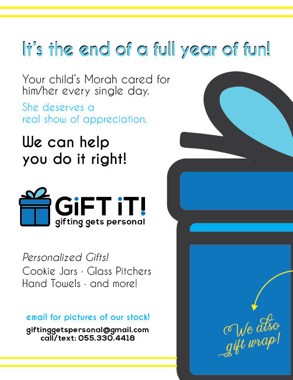
I am having a really hard time with this ad… Dont know why. Can someone help me?
Its looking super plain and flat… 
Maybe its the title? Font?
It’s also not aligning right. Its like bottom-right heavy…
I did the copy so critique on that too 
(also, she wants to send it out asap so would be a huge help!)
THANKS!
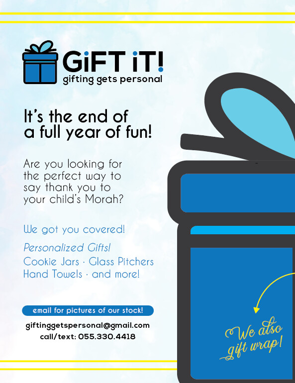
i like the logo - did u make it?
how about adding a lovely subtle background, marble/watercolor? adding product photos i guess is not an option… maybe the main headline should be all caps or a font like the logo. i would not do that shadow.
there’s quite a lot of competing text at the top - do u need it all?
i would try putting the logo at the top left b/c it clearly shows what the ad is about.
then text could simply say
‘Treat your child’s Morah to a thoughtful gift’ or ‘to the perfect gift’
Or you could do the classic problem/solution idea e.g. ‘stuck trying to find the perfect morah gift?’
‘Look no further - order your custom gift today!’
Then below say
Choose from personalized:
- cookie jars
- glass pitchers
- hand towels
- and more!
you can leave more white space
email for pictures of our stock could be on a background perhaps more like a bar/button to make it stand out as the call to action…
hatzlacha!
Thanks so much!
Yes I made the logo
Here is an updated version. Like it so much better already! Thank you!
Anything else? Feel like it could use a pop of color maybe? It feels very one-dimensional.
Ps. It will not be sent to print. It will be sent out via email.
Thanks!!
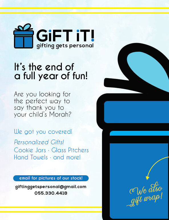
This is the final version.
I just made the big icon full opacity and I think it helped a lot.
Thanks for the really helpful feedback @rivkah!!
Really nice! I like the logo as well
yay looks great! well done!