Any feedback, comments, suggestions appreciated.
Thanks!
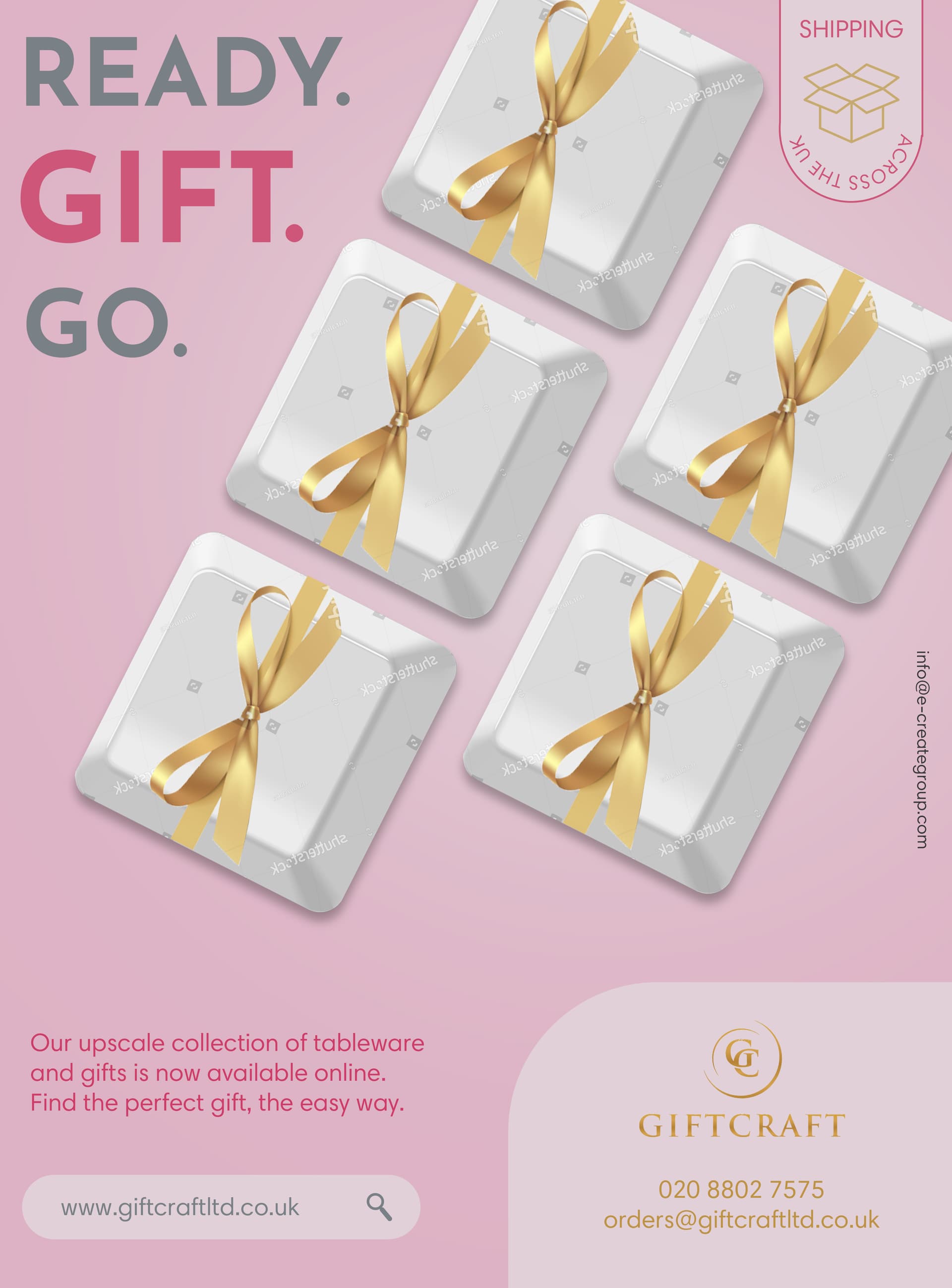
(not a graphic designer… but just wanted to tell you I think this is beautiful) In my humble opinion… having it say across the uk upside down is a little hard to read. I would change that…
I agree that ‘across the uk’ is hard to read.
I think the gifts a little like blank keys on a keyboard. Am I the only one who sees that? Is it on purpose? If not maybe try to find different boxes…
Thanks Shevy and shevi!
You’re right about across the UK! it looks really wrong now that I’m looking at it, I’ll change that.
I used keys on purpose, because the advert is about their online store. IS that not noticeable? what do people think?
Beautiful, soft look!
I personally didn’t realize that the gift boxes were keyboard keys right away…
Maybe add photos of some of the type of gifts that they offer?
Also can add more margin for text on the top and left
Hatzlacha!!
Very nice design
I also thought it looked like keyboard keys (good to hear it was meant to) but I was trying to work out y it would be keyboard keys - I didn’t make the online connection but it’s a good idea! Trying to think how it can be clearer
I didn’t either notice that it was keyboard boxes - to me it looked like flat boxes and was wondering why you would be advertising such flat looking boxes. I think you don’t really need to show that you can shop online because it says right underneath “our upscale…available online…etc.”
Looks like keys to me!
I like the ad, I would focus more on making the text stand out more. Maybe use a font that has blocky letters…
I did not realize they were keys… I was trying to figure out what those boxes had to do with tableware… maybe show what some of the gifts actually are (however I must say it was a very creative idea to use keys!.. I also don’t think it’s so necessary cuz you say on the bottom that its available online…)
overall really nice design! Great job!
I agree with Shevi and the others that mentioned the keyboard… at first I didn’t specifically think of keys (though once she mentioned it I did!) but was wondering at the unusual shape of the packages, coupled with the dotted print, that makes it look like a very specific item is packaged in there and being marketed, if that makes sense.
Really nice!
I like how you put the website in a search bar- very creative:)
Just adding another thing: make sure that the text is not too close to the edges.
You can probably make the main words much bigger and have them be the focal point.
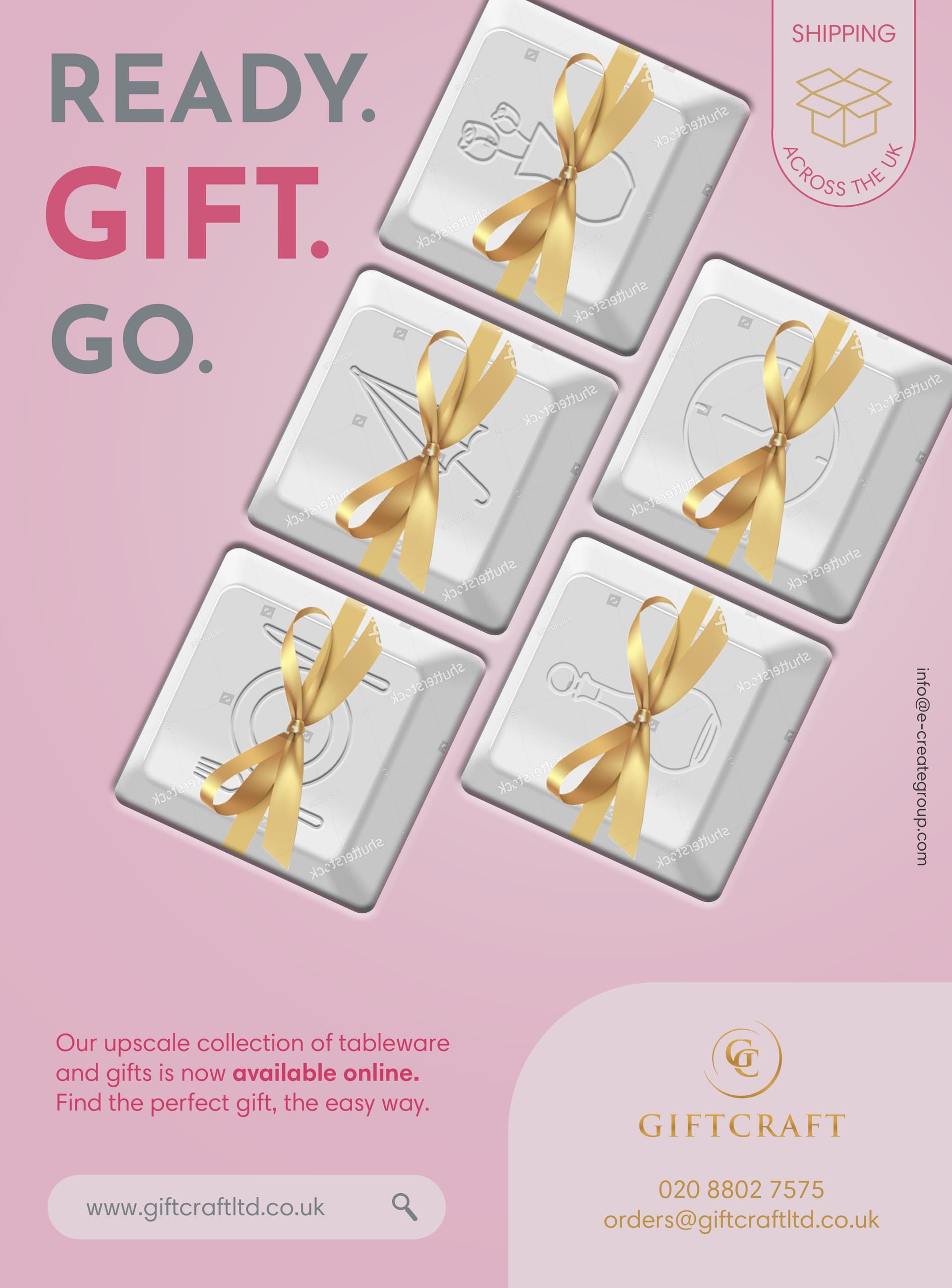
The “dotted print” is actually a watermark and will go once I buy the image 
Really nice job! 
I really like it with the icons! Great job!
And nice line ‘ready. gift. go.’
And I agree with @al1 that the search bar is cute and creative
it now looks so effective! well done!!
Really nice. I would “white space” around the keys and give the Readey. Gift. Go. more space and padding. It will make it easier to see right away whats going on.
Really creative solution!!
Looking great!
Would you consider putting the keys in regular horizontal position instead of rotated?
(May be easier to recognize that way)
So well done!
Really nice ad! I had trouble when I tried to flip around text like you did here with the across the uk. How did you do that?