Hi,
This question is for Shosh.
It has to do with a specific project of mine, but is also something I have been wondering in general and figured others might benefit - so am posting here on the JDF.
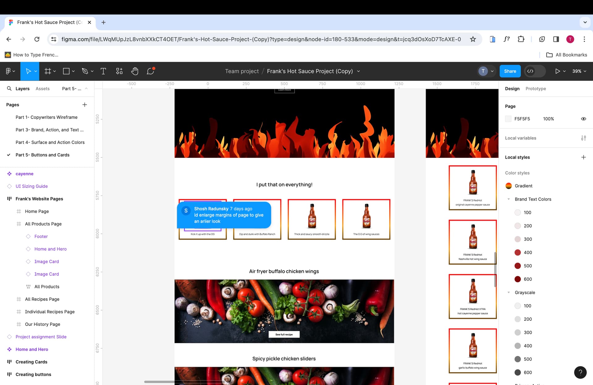
On my franks web design mockup, there was a comment that it would be advised to create more margin on the page for a more airy look.
My question is, the size of my frame was the preset Mackbook pro 14" size, adding more margin would make it a random size that would not fit any screen…
It is something I am confused about in general…
When developing in wordpress, will I need to create different designs for each specific computer screen size? Similarly, does it matter what the frame size of my mockup is in Figma? Will I need to create various designs for various screen sizes there as well?
And can I draw out a random size and not use any of the pre-sets?
How does it work exactly?
Thanks,
Tova
This was the comment for reference
@sradunsky not sure if you saw this, please ignore if you handled offline! 
Still wondering about this if anyone knows…
Thank you!
I can answer part of your question. I am a developer and work with designers. There are different schools of thought on mockups, and here’s mine
There are proponents of “mobile-first,” which would mean designing for mobile and expanding for websites. My experience is that clients have a harder time connecting to a mobile mockup, so designers generally make desktop/laptop size mockups. (You should always keep mobile in mind while designing, and think about how a design would collapse for mobile.)
I’m sure there are large agencies that design multiple mockups, but the designers I work with typically make 1 desktop version and some of them make mobile as well.
The size of your frame matters for a few reasons:
- If sized appropriately, you can copy the exact font sizes and other widths/sizes while developing
- It’s important for proportions. Without the correct sizing, designers (especially beginners) tend to make things completely disproportionate to an actual screen size, which messes up the design when you try to develop it.
Which screen size should you be developing in? That is definitely an opinionated question 1920x1080 is popular. I generally tell people to do 1440 with a 1200px content width. At 1920, designers often made designs that didn’t collapse nicely for laptops, it was packed too full, but 1440 screens could expand nicely to 1920+.
Thank you for this!
As a designer, I definitely understand the importance of sizing etc. and so I was wondering about this the whole time.
Once the size changes, the whole design, font sizes and proportions change… and so I want to be able to make sure that my designs and mockups are accurate and also want to prevent having to re-design it afterwards to fit the proper screen size. Also, for development purposes to make sure that the website turns out how I intended and to make the development process simpler as you explained.
Up until now I have just been using the MackBook 14" frame size because that is the computer I have and I was not sure what size was proper…
For future projects I will use a 1440px frame. Was that 1440 in the width or height…? what would the height be? and what exactly did you mean by content width?
Also, when you said 1920x1080, was that 1920 width and 1080 in the height?
(It is helpful to know though that that size does not shrink well to laptops, and so I will most probably not be using that… but just so I know in general).
So just to clarify, for desktops you would develop in one size - the 1440 for instance - (and therefore also make your mockup in that size), and then it will shrink and enlarge automatically to accommodate the various screen sizes.
What about mobile? Do we also develop in one size for the various phone models - like Samsung vs apple? Because we also learned in visual foundations that Samsung and Apple have different recommended button sizing for clickability reasons… so how does that come into play with design mockups and also with development?
Know theres a lot here… sorry!!
Want to make sure that I really know my stuff by the end of this! 
Thank you!!
I also realized - just as you said - that I am very not attuned to screen size proportions. I just came across this the other day with one of the Homeworks.
Is it safe to say that I should always just use the 1440 px size as my desktop mockup size?
Mobile responsive is very important. Having said that. I design for desktop (1440 or 1420) and once the design is final (and built), i adjust it to mobile view. It takes a few hours, but is not so hard. Adjusting font sizes, padding and margins. Sections with images take a bit more work, but you get the hang of it.
I have a figma mockup with a bunch of examples of how a website can respond to screen sizes which I made for designers I work with a few years ago. I recorded an explanation here.
I didn’t prep so it’s a bit off the cuff, but if you watch it through I think it will explain some of your questions!