Hi all!
Doing this logo for a client who is opening a school supplies gemach (non-profit). she doesn’t have a name for it, she told me i can come up with one, she basically left the whole thing to me, she’s not very picky…so this is my first attempt…please give critiques/comments/suggestions…even with regard to changing the name of the gemach!! Thanks!!!
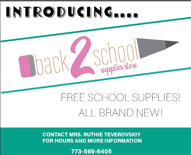
Too much happening for one logo. Too many colors. I would use the pencil as accent.
i think it’s probably good to do a range even if she only wants one. at the end of the day you want it to come out great as it’s good for your portfolio/yourself and i feel that the process of creating a range of ideas in itself helps you get that great logo that you’ll both be happy with.
i like the ‘back 2 school’ but not so sure about the pencil or the thin text for ‘supplies gemach’. maybe try fewer colors…
hatzlacha!
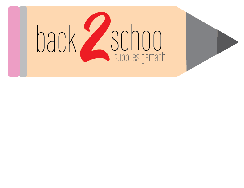
my client has decided that she likes this.

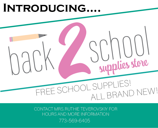
Now she wants me to go ahead and create a postcard that she will send out to people, I would appreciate any comments/suggestions on it! Thanks!
commenting on the logo:The pencil should be made neater - you shouldn’t see 4 boxes and 2 triangles…
the pencil also looks a little out of place. I think you should bring it down more and make it longer so it reaches the top of the 2. You can also try to make the end and front of the pencil using the text - “back 2 school” is already sort of a rectangle - You can just add the end of the pencil before the words back and then add the tip of the pencil after the word school - I think that idea might give it a more cohesive and neat look.
now regarding the postcard:
I’m not crazy over the Introducing font - can you use a font that is more exciting?
I think there should be a little more space on the postcard - the logo doesn’t have to take up all the space - those green diagonal lines can if you want to…
“Free school supplies…etc” shouldn’t slant… I would left align it
contact info - put for on the next line. Does the last name have an I before the Y? It doesn’t look correct like that… I also think you should make it a drop bolder - it doesn’t have such great contrast but could be a moniter thing…
Good Luck!!
thanks @schlomithsassoon @Breindy-S @rivkah
How’s this?
Both postcards are the same design, however note the differences between the logos on each one. What do people think?
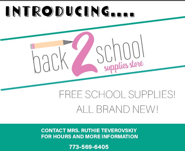
i really like the new color scheme 
i kind of like the second one more with words through the pencil but if you can make it a bit smoother on pencil tip and eraser would be good.
i think there are too many fonts happening on the postcard - can you reduce or keep to similar font families? Maybe introducing can be same font as ‘supplies store’ of the logo…
so nice that it’s a really gemach of free supplies - i thought it’d be for pay but just cheaper than stores… that text is a bit thin doing some optical illusions for me…
same - I also like the second logo, but you should try to work on making it smoother as @rivkah mentioned. I think maybe the words back and school should be in gray and then the box before back and the triangle after school should be in the yellow color you have in the first postcard here…
Make the text “Free school…new!” smaller and tighten the leading and I think to left align it.
The number on the bottom looks like it’s going to get cut off because its so close to the edge… bring it up a little