


The text kind of blends in but I want to put in on the image and not add a box or border if possible

What about making the image smaller and creating some sort of space, like a frame around it. Then put the text on the framing area. It’ll allow the eye to focus on the image and the text will enhance the image vs detract.
1 Like
I’ll try that
ty
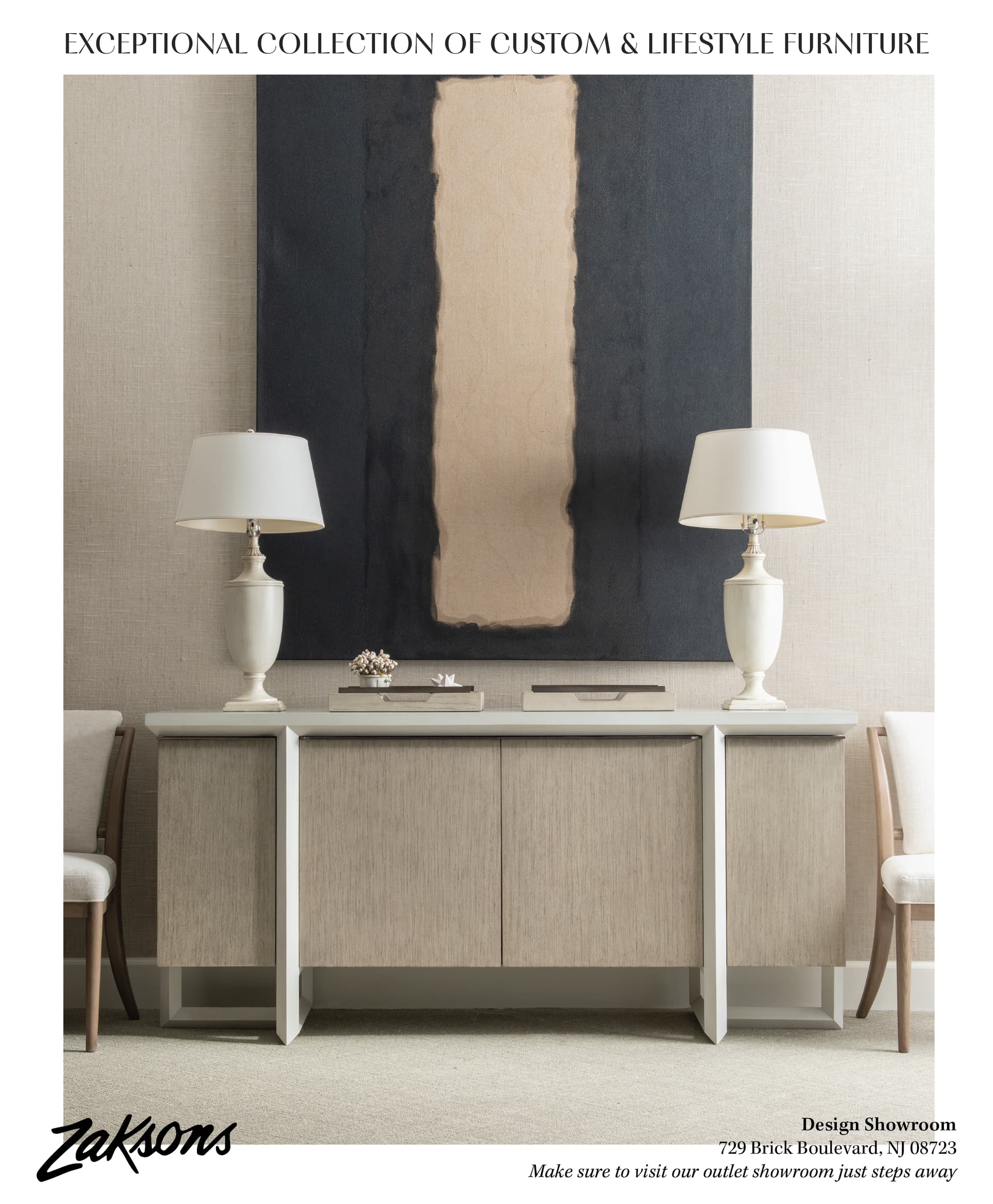
Maybe try making the margins bigger and the text bigger and not all on one line ? The text should also grab ur attention and when it’s so small you don’t really see it so well
thank you
got it
the client really wants the picture full bleed but I don’t know where to put the tagline then
any suggestions
I would make the image a little smaller so you can make the text bigger!
k
could I make the text bigger and have the image full bleed
is there a good place to put the text

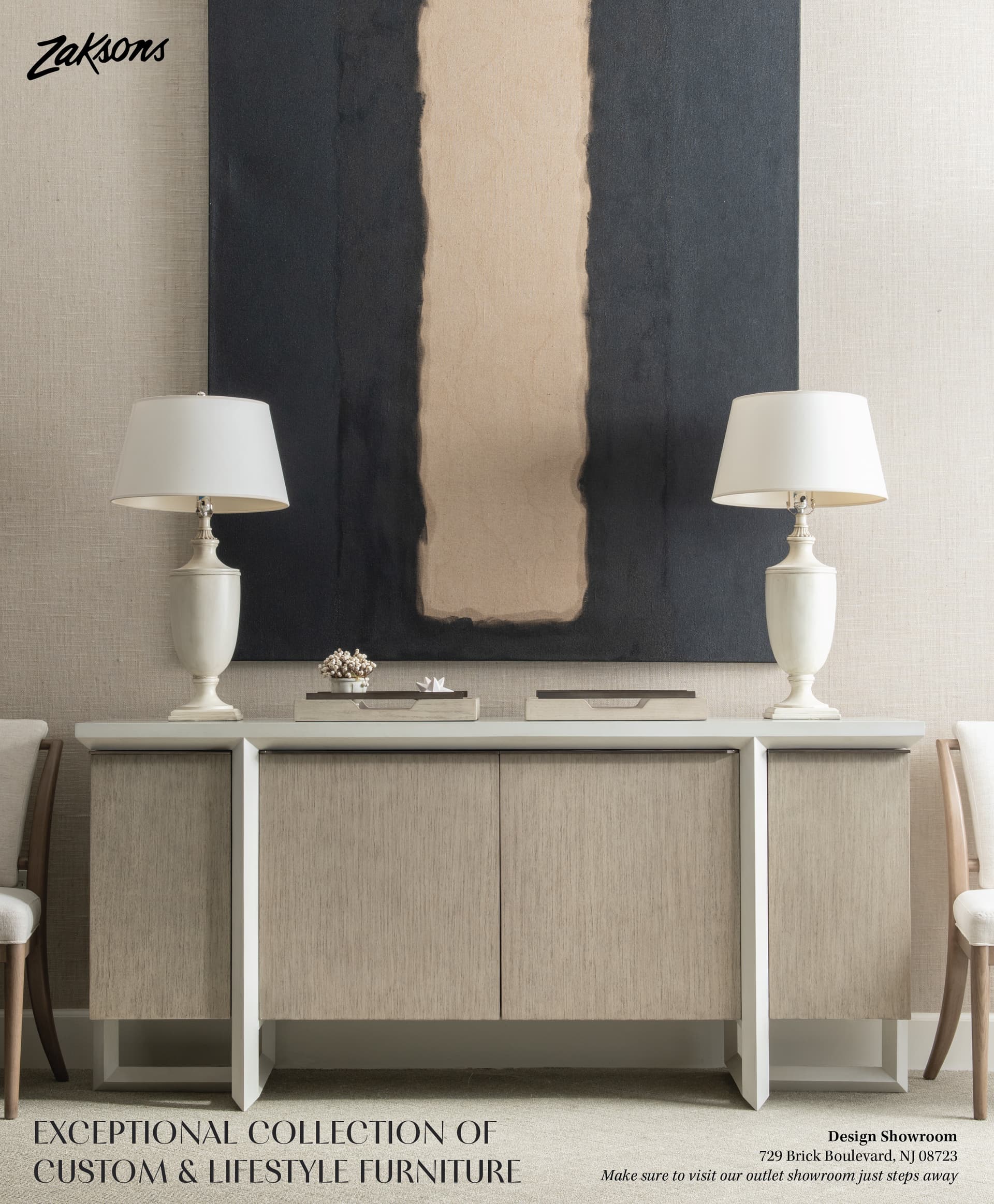

Yes this looks better !
1 Like
thank you 