Any thoughts and critique welcome on how to work on this advert…
Thank you so much
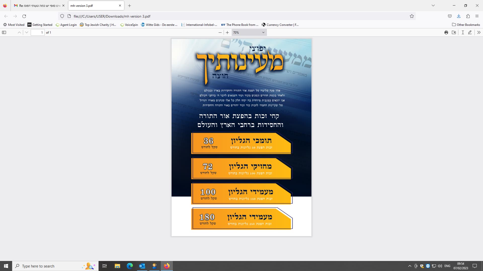
looks nice and fitting for the cause. my only q would be does it motivate ppl to give? where is the call to action? i.e. contact info on the bottom… also do the headings make people want to give? i dont know coz it’s all hebrew!
I don’t know 
I did mention to client about contact info, I think he will send it to me. where would you add that and how?
probably at the bottom section (may have to make some of the elements smaller to fit) and i’m envisioning a deep red either as a background or for the number as a contrast to the rest of the ad…
if this is for a campaign, do they need a series of ads? good to bear it in mind… also you can get inspiration from the jewish fundraising websites - a lot of times they use their in-house teams to do the designing and they know what works…
thank you
any websites you recommend?
I love the sharp colors but there is one thing bothering my eyes- that’s the words in the background on the top are too much in the way of the heading and its confusing to my eye.
Maybe fade it out a drop or move it down more…