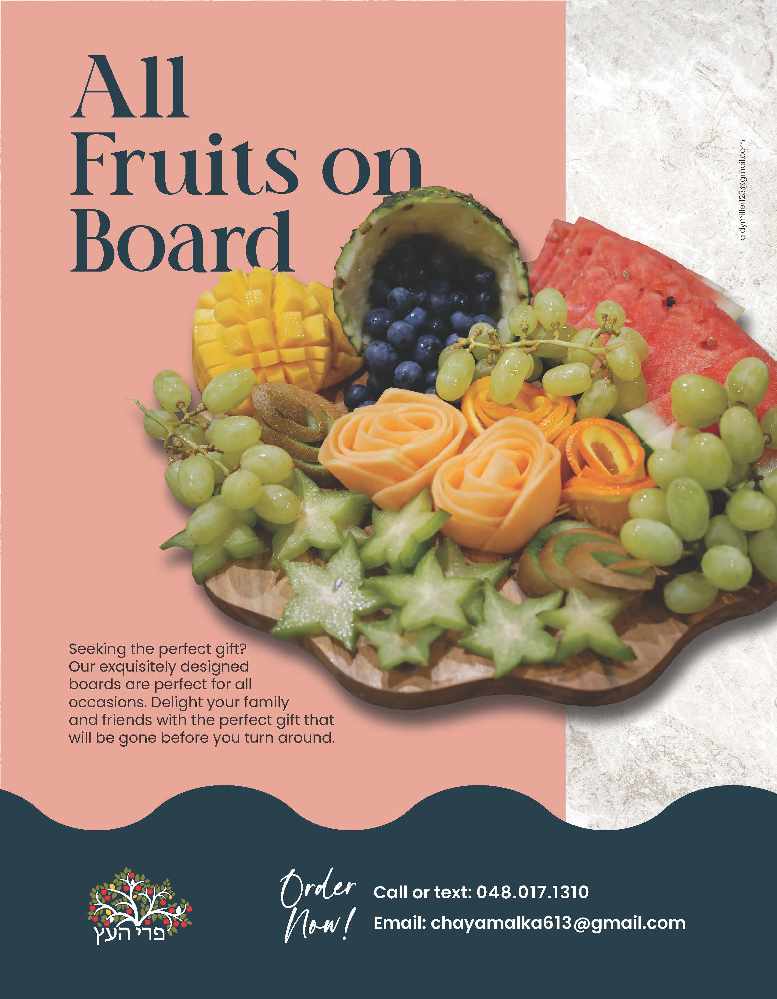
Hi, everyone, looking for critique on this ad. I’ll still be changing the logo to reversed - just waiting to get it.
Will take critique on the copy as well… Thinking of some other lines: Art you can Eat, Fruit for a Fiesta…
Thanks!
Looks great! I like how you made the bottom have the same wave as the board.
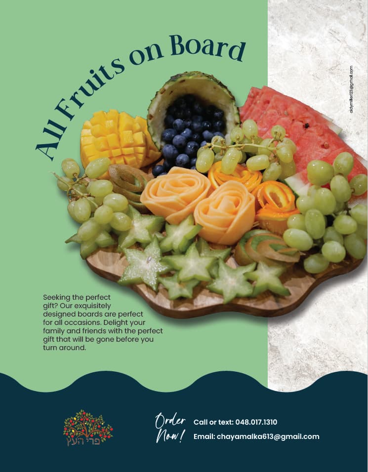
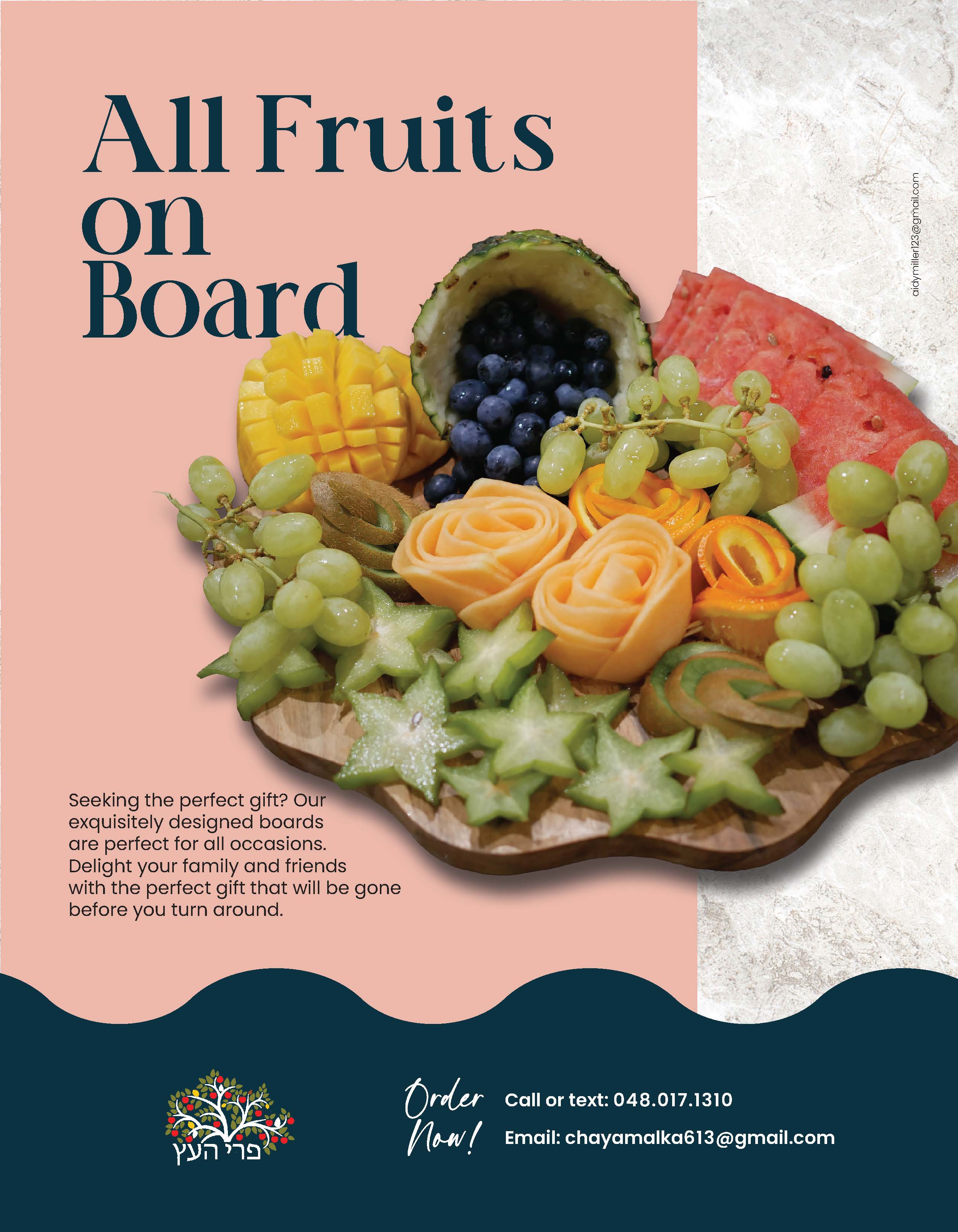
I love the colors you used (2 of my favorite actually), i just think it might be worth it to play around with a few different color options bc there is a lot of green in the fruit that is getting lost in the green background.
maybe try a very light pink from the watermelon and a darker blue (with purple tinge) from the blueberries for the bottom. or a light blue and darker brown from the actual board…
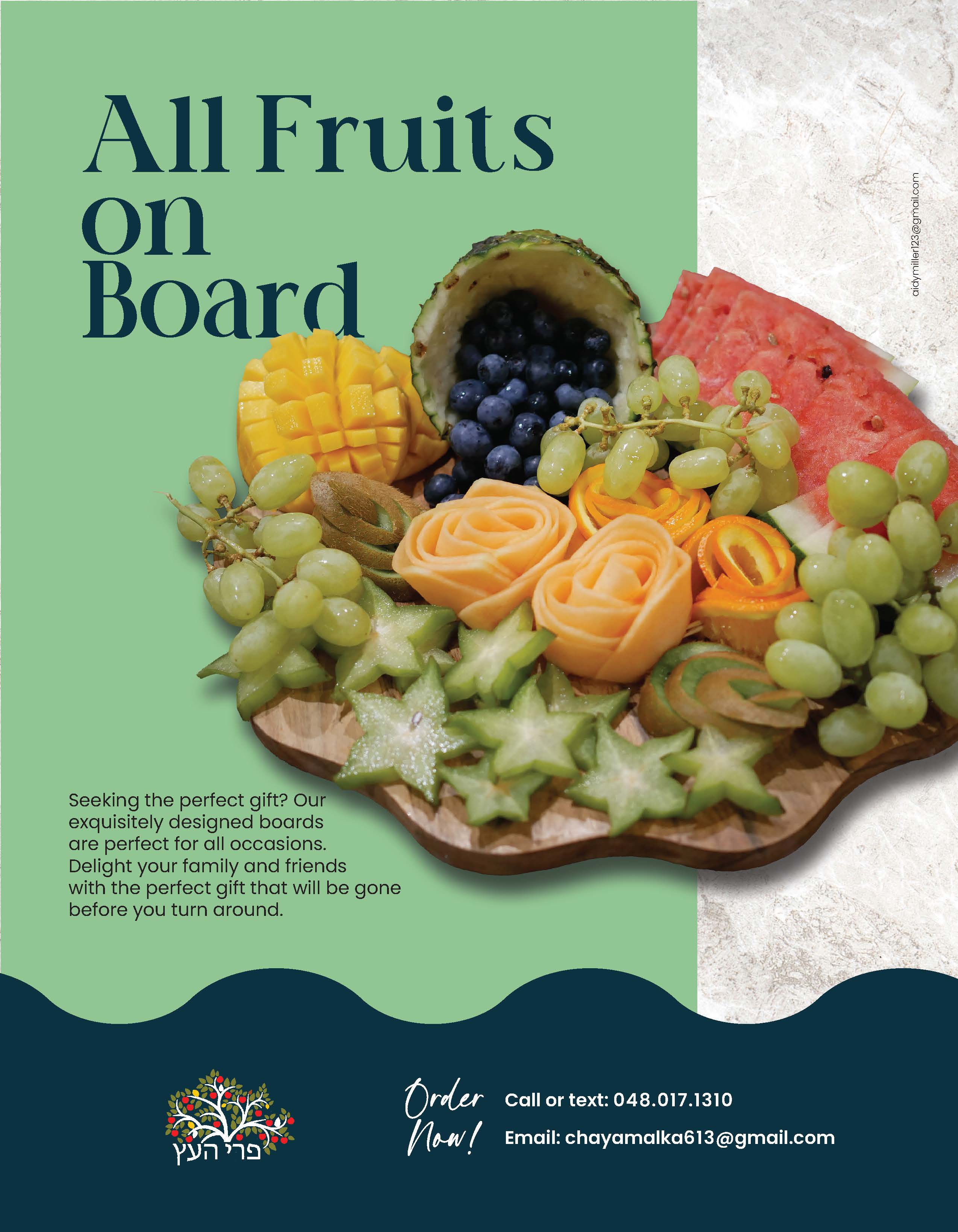
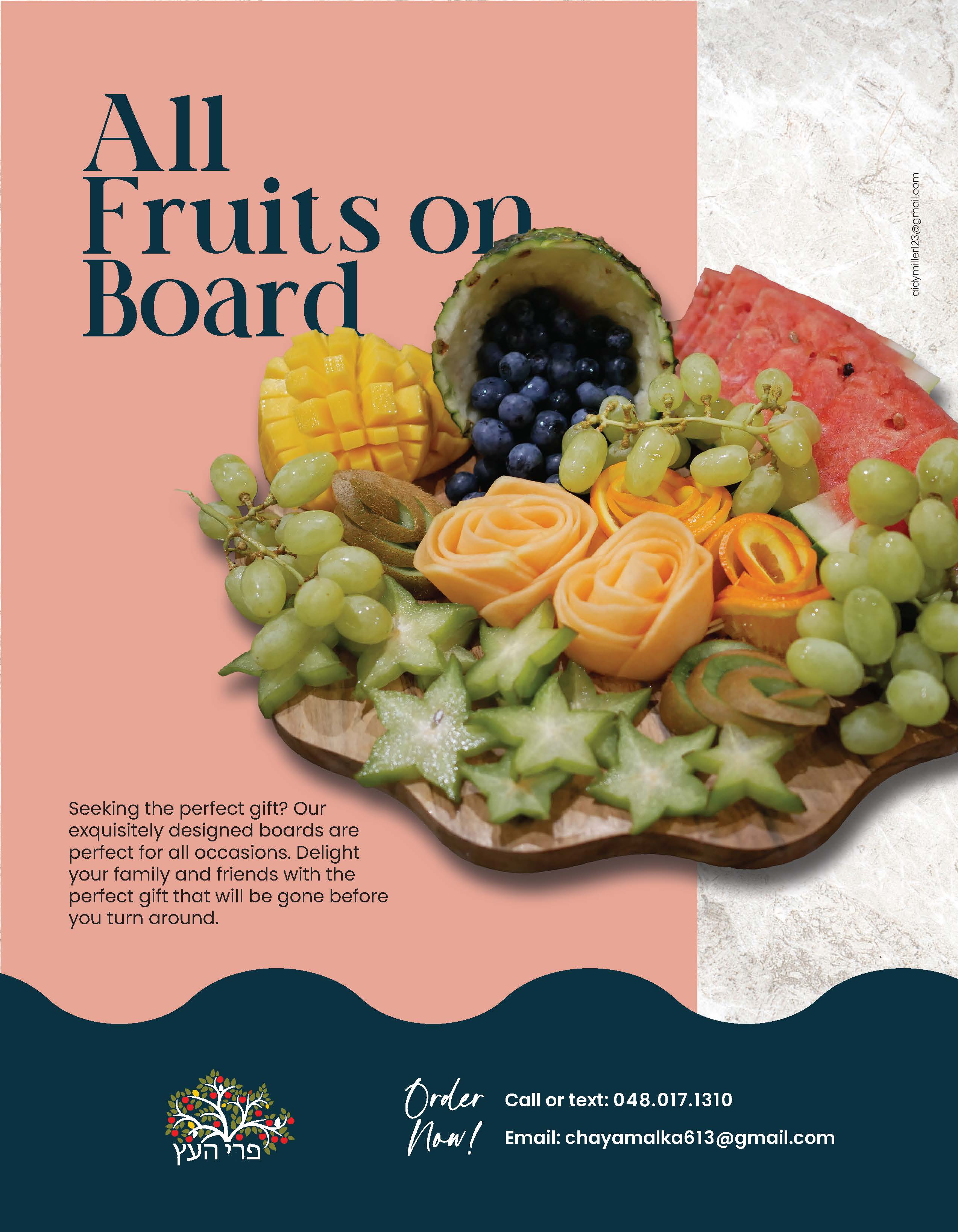
also can you try a bit of a bigger, bolder font for the heading and left align it on to 2/3 lines and have the fruit overlap a drop on the last word? I think it might give it a diff look but could be totally wrong on that…
Here are some other versions, which is better, line in a circle or overlapping the image? And which color do ppl like better, the pink or the green?
Thanks!
1 Like
I like the middle one of these last three. Maybe stick with one font?
What do you mean by stick with one font? Which one do you suggest I should change?
Can the fruit image be saturated somewhat (realistically, not over the top) so the fruit looks a bit more vibrant, enticing and juicy?!
Try Order Now bigger and possibly angled a bit, with logo more to the left aligned with the other text. Contact info overall look a bit small.
Main line looks a little squished vertically, can it be bigger/more linespacing/ come down further into the blank space? Not sure how that would work out in terms of still having it visible. Space-wise in terms of fitting the curved text works better but it should be bigger/stronger, though if it is possible to get it to work as straight text it does look cleaner. Also the kerning on the main title needs some adjusting, such as between the last two letters of FRUITS. I like the wording of the line, very cute!
Thanks, will work on it a bit more to correct these details.