Hey!
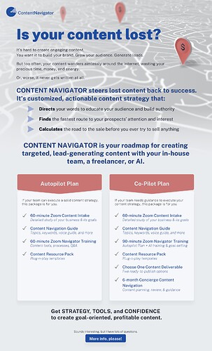
This is a flyer I made for a client starting a new service to add to her copywriting service. I designed her logo first, and then I created this flyer. Does anyone have advice on anything about it before we finalize?
Thanks!
Michal
The font under is your content lost is a little hard to read. I would make it a little bolder. Same for other text in that font.
also would move up the sound interesting so it is not so close to more info.
looks a little dull colors to me and hard to read…
logo should be more prominent
background behind words shouldn’t be so busy…

