Hi,
What do people think of this?
Thanks!
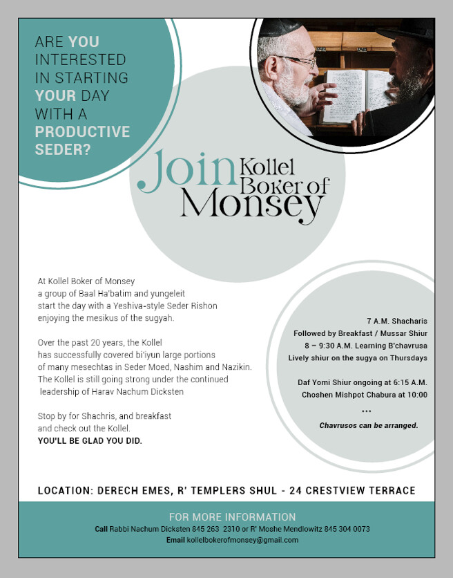
No sure, what i should be reading first after the middle circle (Join…). Missing a hiarchcy here.
Colors are nice and subtle and appropriate. Kollel Boker of Monsey is missing some line spacing.
Needs a stronger focal point and hierarchy. Hard to pick out the important info and event date etc. as it is now.
Also would suggest more imagery, and to bring accents of color from the photo (yellow ochre/mustard?) more throughout the design.
Looking nice! Like the way you did Join Kollel Boker…!
Maybe bold the timings in the right circle, possibly also have each one at the beginning of the sentence, with alignment like you have with bullet points (not sure if I’m explaining myself clearly…)
I changed it a drop. Is it better or worse than before? (I am going to have two different pictures, just need to find another picture to put in one of the circles)
Thanks!
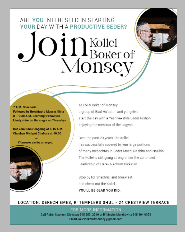
Better! The text in the green circle isn’t working so well, runs together too much. Maybe it could be in white to separate more from body text. Possibly centered. And organized better so easier to see the info-i.e. all times in bold or italics, better proximity to create subgroups, etc.
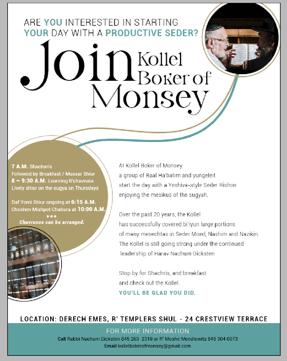
Really nice! Especially the heading!
I feel like the text in the circle is a bit close to the edge? Like it doesn’t have so much breathing space. You can add more incent spacing by pressing CTRL+B. Maybe center it as well.
Would you maybe consider trying a version flipped around? Meaning: put the top-right circle on the left, and the title on the right ect… This way the straight edge of the body text could go straight along the left edge of the paper, and you can then have the text wrap around the curved edges of the circles (which would then be on the right side of the page).
Do you understand what I am trying to say?