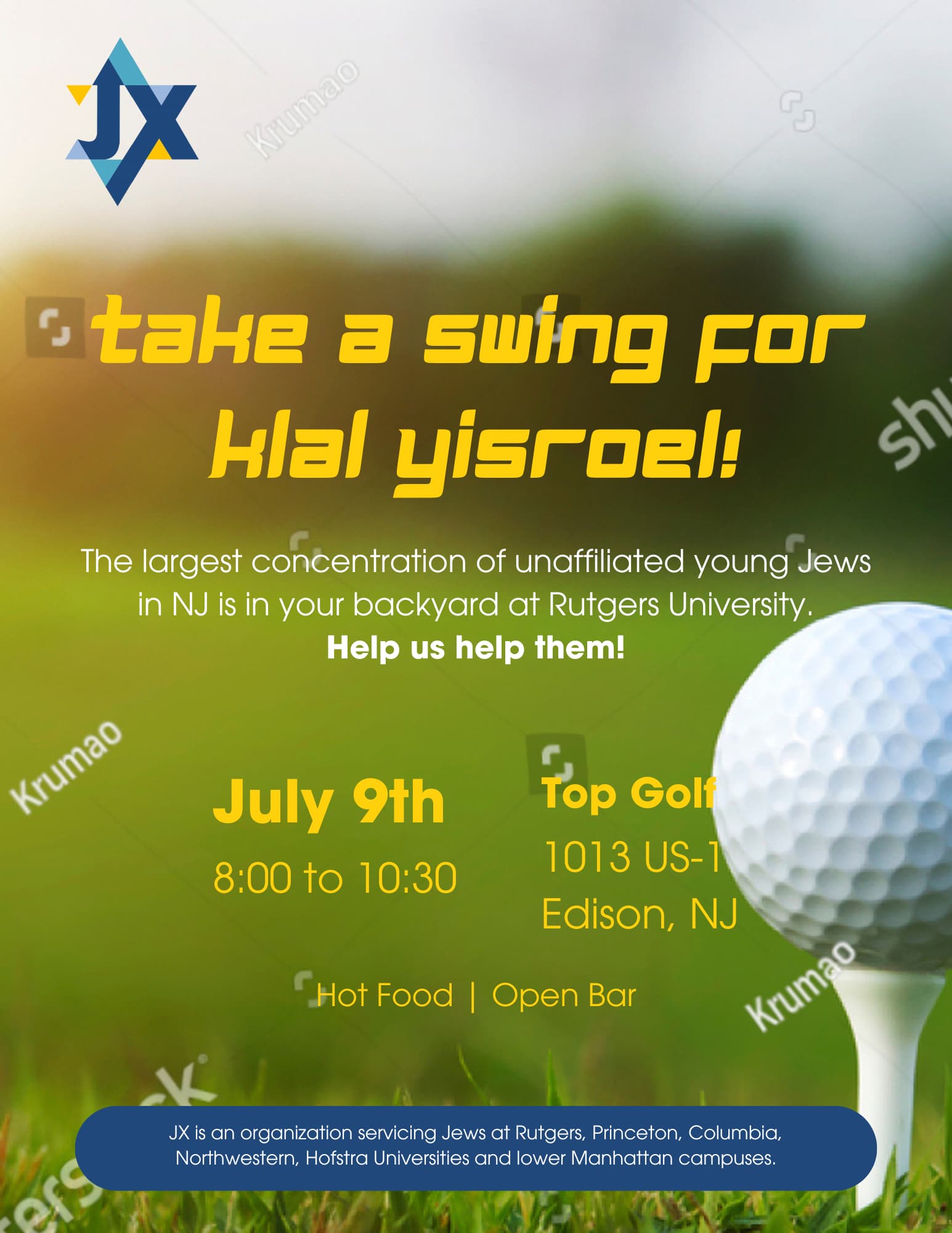
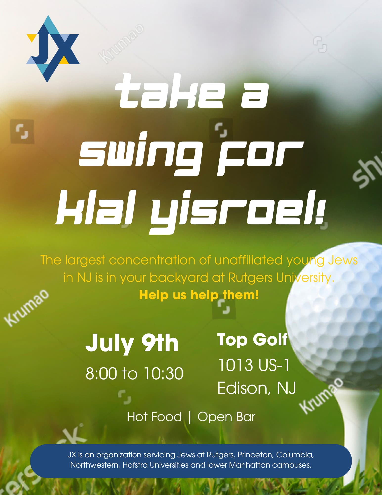
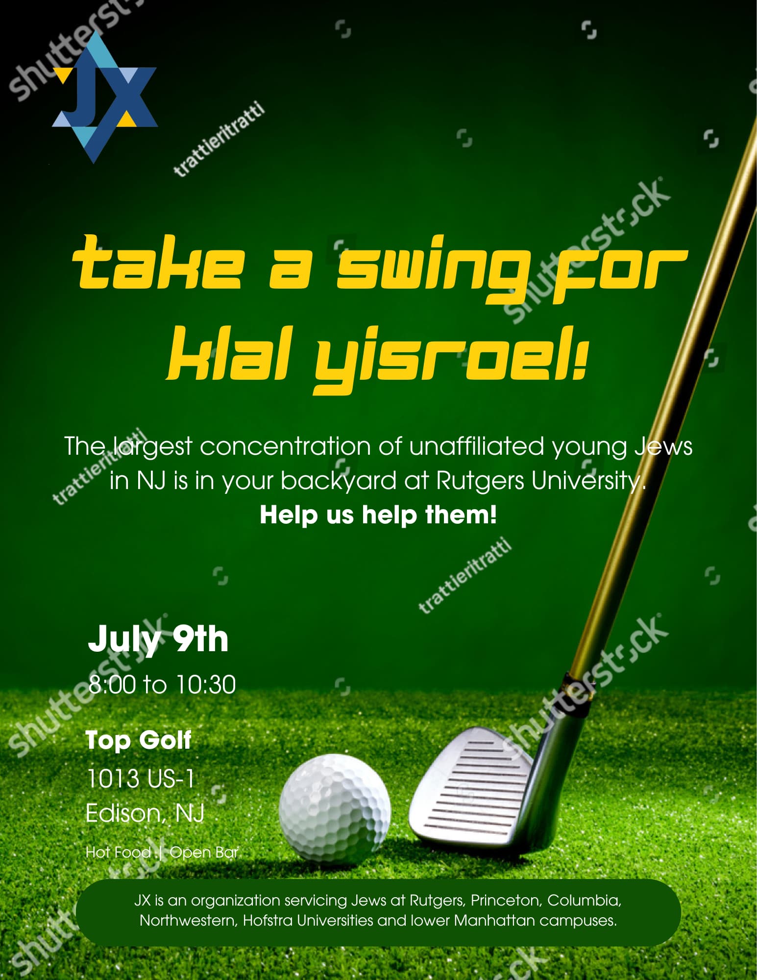
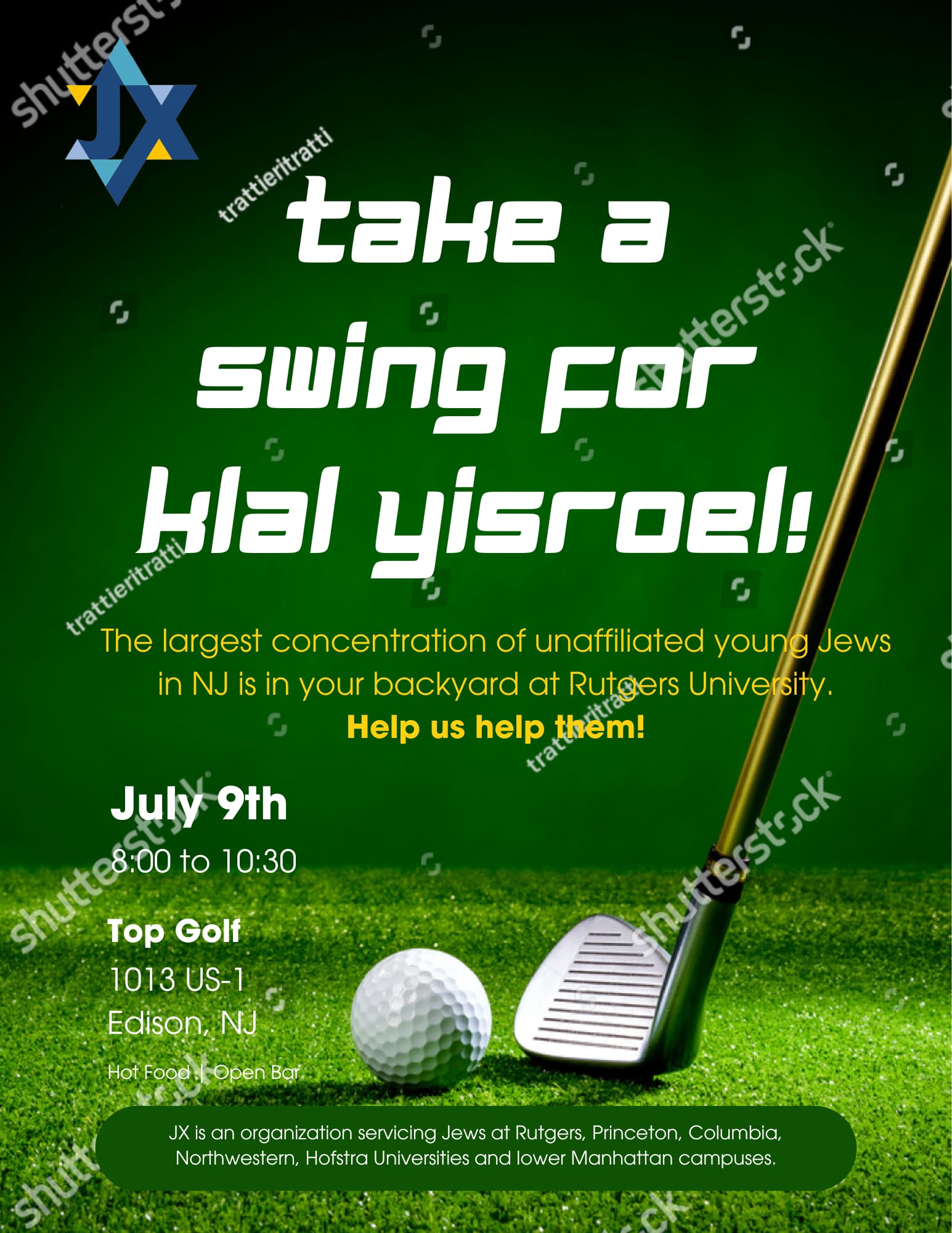
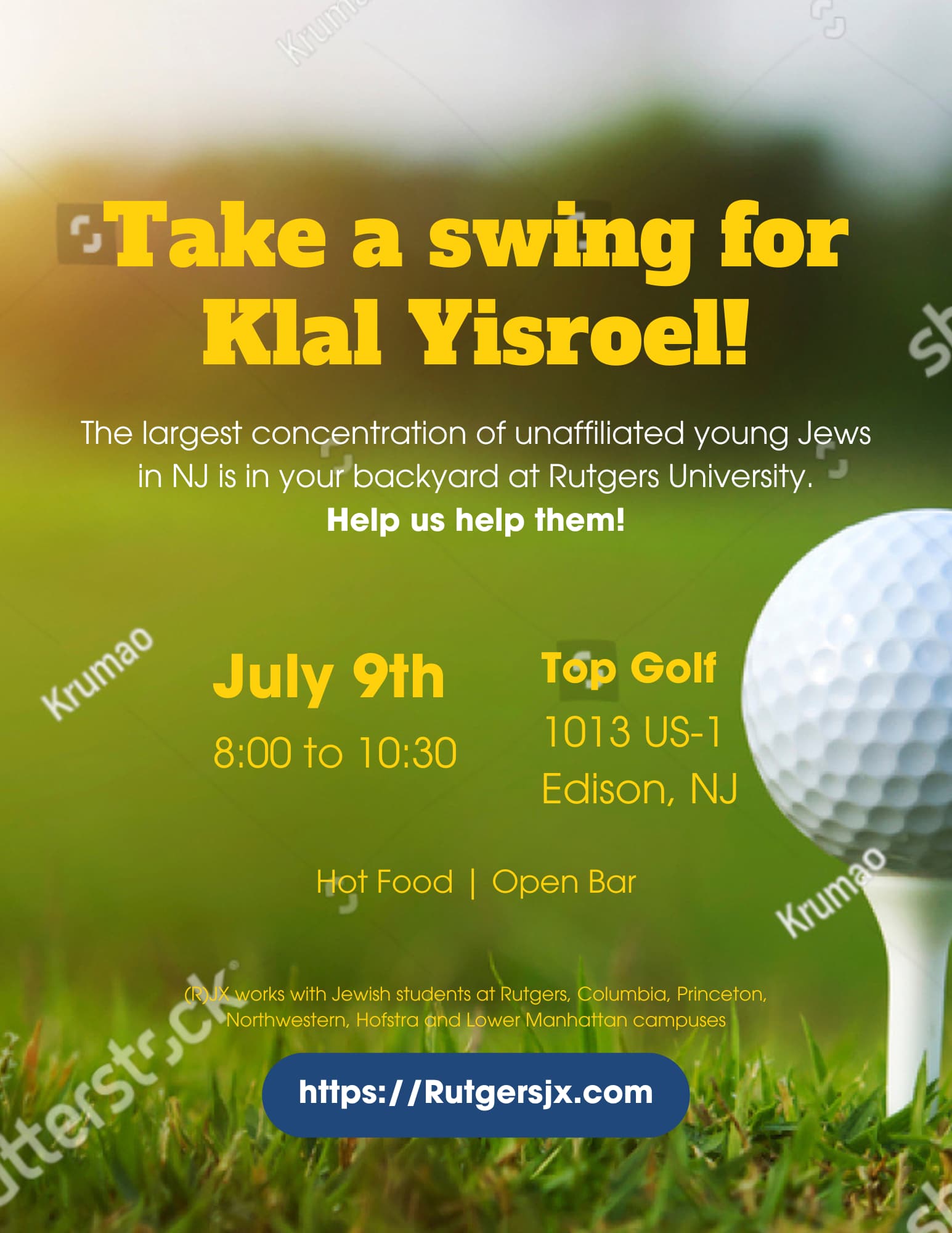
Hi!
I’m designing this flyer for a kiruv organization. How does this look as a rough draft to send to the client?

Hi!
I’m designing this flyer for a kiruv organization. How does this look as a rough draft to send to the client?
I like the 3rd one best… (like date & top golf on left… otherwise too close to the ball…)
I think the bottom text needs a diff color under it possibly… the dark green is very close to background color… unless you don’t want that part to be super noticeable?
Also, I don’t really like the font of your headline- take a swing… not sure which font to suggest…
B’H the flyer came out nicely!
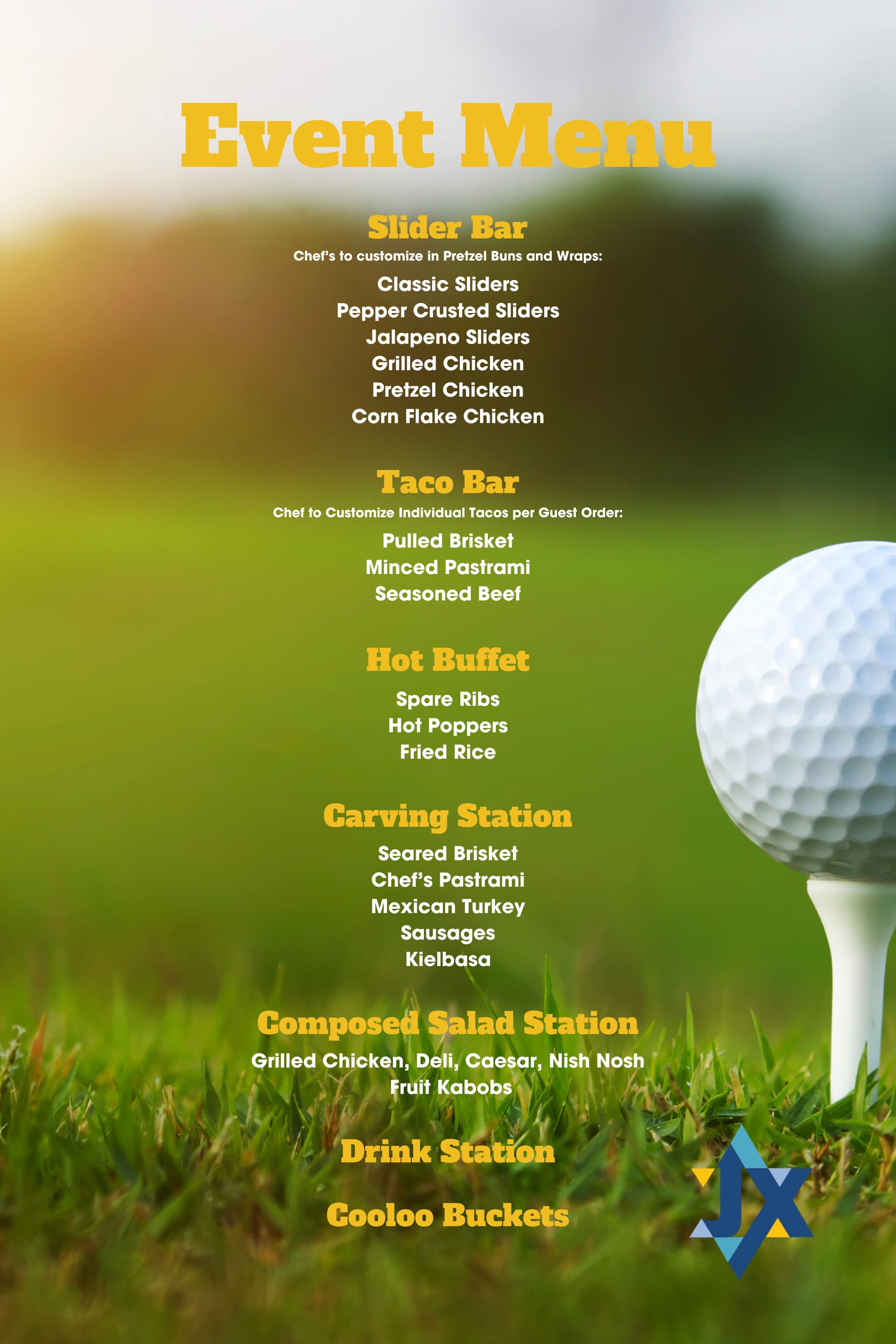
They asked me to design a matching menu. This is what I have so far but I’m not liking how it’s coming out. Any suggestions on how to make it better?
They want it to be on a 24x36in poster.
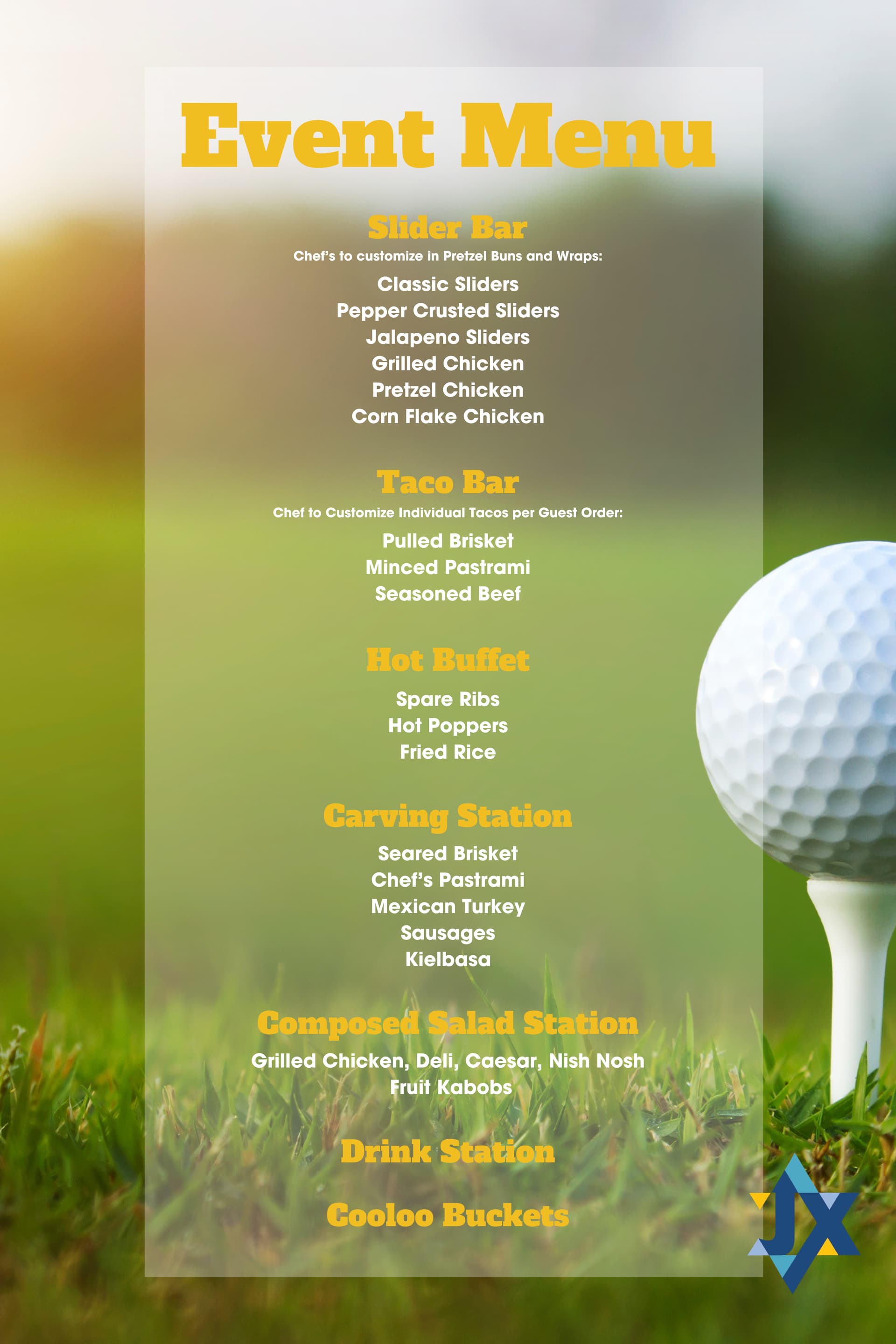
I would frame the menu on partly opaque background.
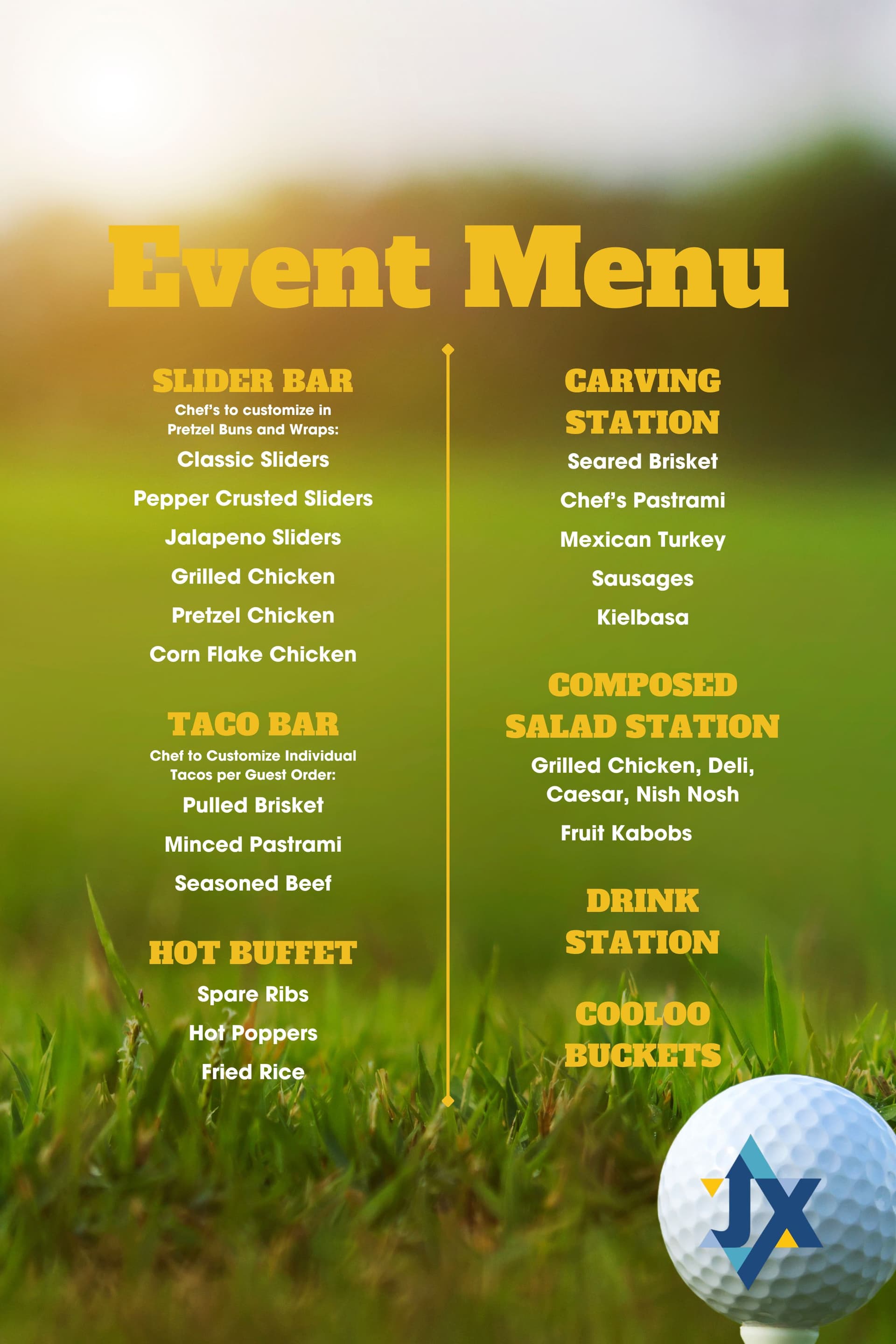
Try the third one on the opaque background.
Maybe have the ball and logo come in front of the background