Anyone have a good font for the word discover?
I want it to be a really good font with more going on so it can almost be like the logo to the shabbaton.

And Ill take ideas on how to give it an oomph its missing.
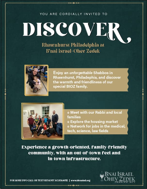
I think the date needs to be. more prominent
the title should take up more space
and the date should be in bigger on it’s own line
It needs to be a bit more grand
maybe try to align the pictures a bit more
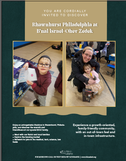
should I go with a totally diff style for this flyer because of the images? I never designed a flyer with images before.


Looking good!
Bottom text is a bit hard to read, I think it’s not such great contrast.
Also, noticed a typo in the sentence under discover, should be Zedek, not Zededek…

Much better! The “Bnai Israel- Ohev Zedek” text under Discover- I would maybe make them smaller and fit in before the R, or extend to the end of the R and lower it a bit.
This was what I sent cilent. She said its to boring, they want it to pop more. Its not modern enough.
I told her to let me know what she wants as the focus, pictures or text.
Any bright ideas on how to change this to pop more?
So she said they want the pictures to be focus, and changed up the text.
Any suggestions on this one?
maybe change the color of the beige/gold bar… its very similar to the borders around the pictures…