Hi,
I made this choice of 2 flyers for a cooking demo at a community fair.
I would love feedback if anyone can respond in the next 2 hours- it’s a rush job.
Thanks so much!
Hi,
I made this choice of 2 flyers for a cooking demo at a community fair.
I would love feedback if anyone can respond in the next 2 hours- it’s a rush job.
Thanks so much!
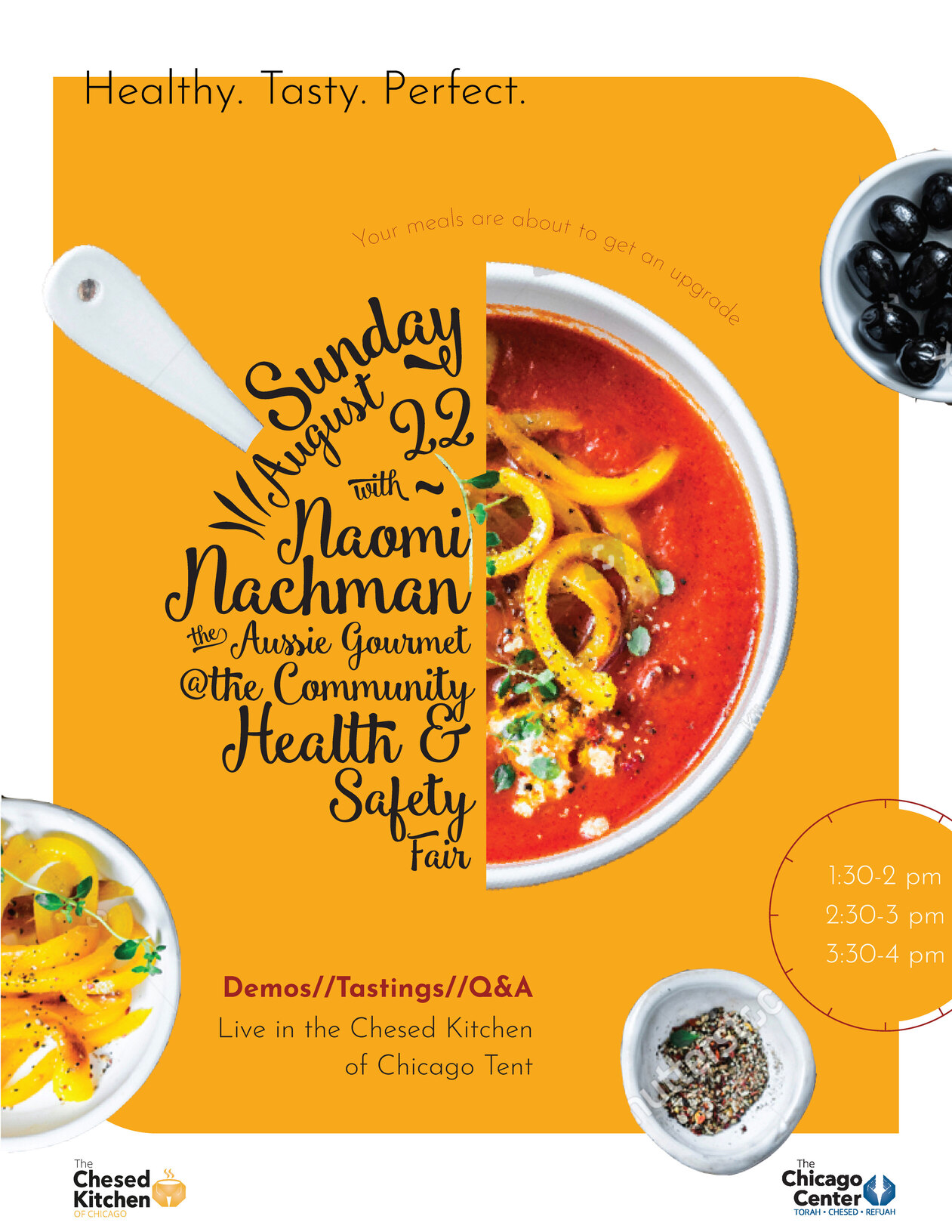
The 2nd one is cool but hard to read the important information!
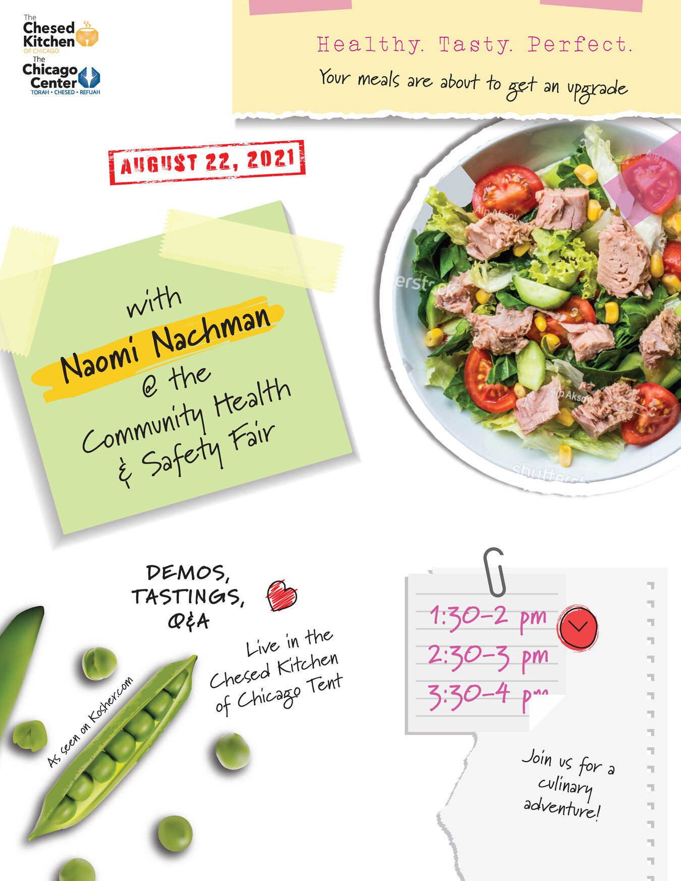
the first one is also great but the info is dotted everywhere should the times not be near the date?
i love the second one. But the font of the main info is not so clear
get rid of the three lines before august and get the date more clear. also make the times more bold.
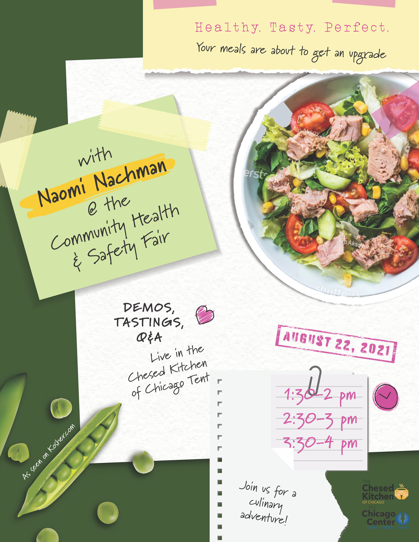
i really like this flyer! it has so much character!
I really like the second one - has a stronger focal point. I also agree about the text being too hard to read. I happen to like the light and healthy feel of the first one also but you would need to give it hierachy by creating a stronger focal area and showing the important information more clearly.
Sorry - my other response came in the same time you were posting your revised ad. I think you should make the “with” before the words Naomi Nachman the same size as the other text that says “Aussie Gourmet…” and take away all the lines before and after “with”
Maybe also make the date in white so it pops out like the name…
Good Luck!
Thanks so much everyone for your help!
Here are some updates.
Anything I can do to give the first more of a focal point?
Is the info on the second easy enough to read?
Thanks a million!!!
I’m a bit late in the game but I love the 2nd one! I didn’t have a problem reading the text… Great job!
The orange one is good now. I just can’t see the small line under “demos, testing, Q & A” - make it slightly bigger or bolder…
For the second ad, I like it much better that you added the green background. I think the way you can make a stronger focal area is by taking out the paper “join us for a…” move down the time and date, and info about Demo’s… then enlarge the light green sticky note and salad bowl and add the words “Join us for a culinary experience” on top of the word “with”
Maybe tilt the yellow box on top a drop to the right…
They both really came out amazing!
Thanks both of you for the encouraging words 
Nothing like some positive feedback when you’re starting out!
Thanks @Breindy-S for the tips on how to make a strong focal area-
I couldn’t figure out a way of doing that.
Good ideas!
Now we’ll see which one client chooses…
Thanks again everyone for your amazing help!