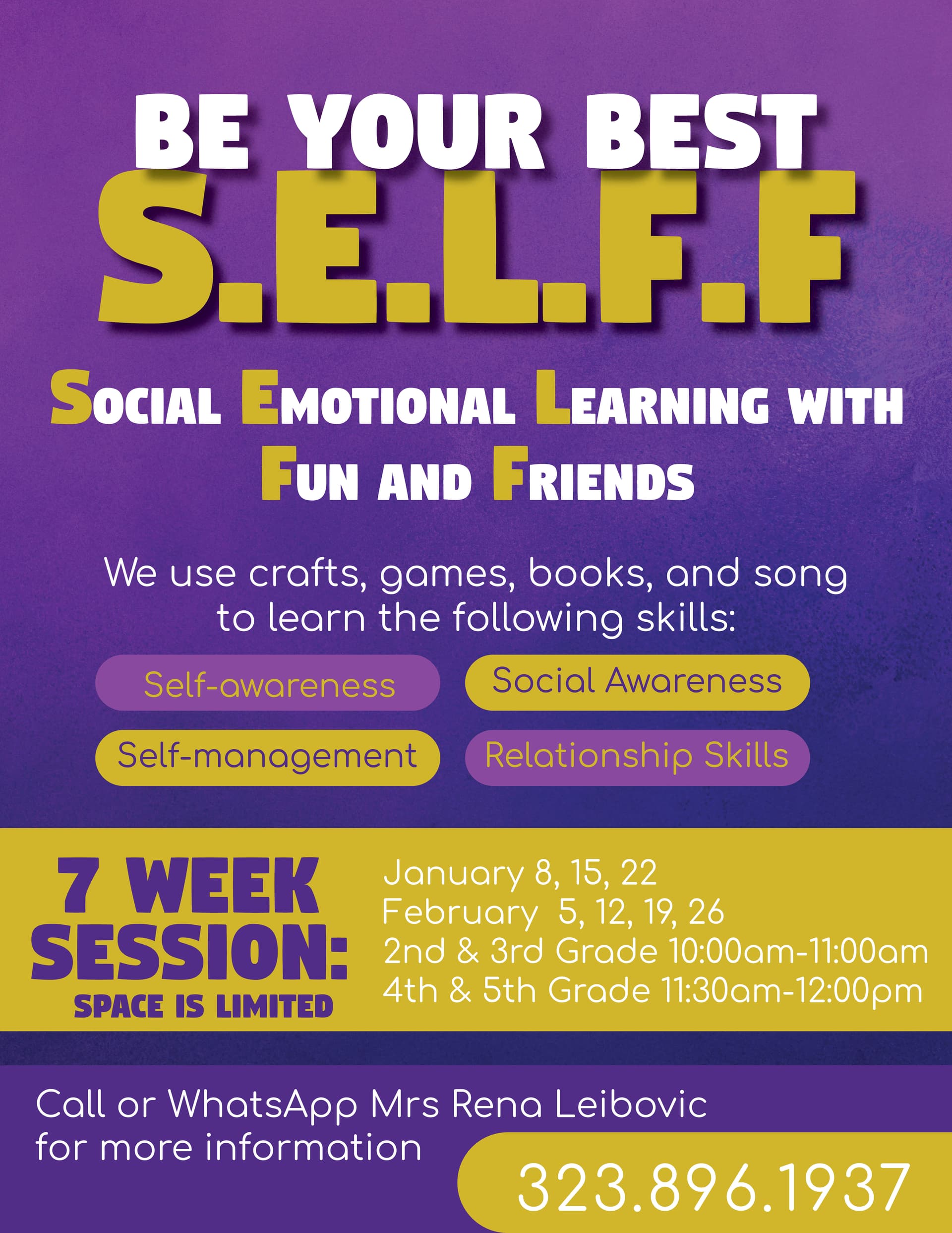
Not sure if I like how the plain white font looks. Any advice?
Nice. Just a few things:
Maybe work on the hierarchy. There is a lot going on.
Try to think about which info is the most important to catch the readers eye, and make that stand out the most. And so on…
I don’t think that the small text has to be so big either. Especially the dates.
Is there an extra space before “January”? Also, I would add more leading in between the dates.
You can make the “nd” in 2nd a subscript (and the others too).
Also, keep in mind the margins around the edge- you don’t want to be too close. But I think shrinking most of the text will help with that.
The secondary font looks a bit too youthful- I assume this is geared for teachers/ parents.
I think I said enough! can’t wait to see what you do:)
yes its hard to read the white small font on the yellow… i like your color scheme and the heading font
i wasnt sure if its geared for parents or teachers… seems its speaking to the children themselves…
I like it over all, just have 2 changes in mind.
- white text is hard to read on yellow.
- Can you bring in some image? (maybe near yellow bar, “7 week session”)
Otherwise I like the hierarchy, maybe just replace the shapes behind “Self awareness”…
The rest I really like and think you should leave as is.
Hatzlacha!
Looks good, I think the strong font looks good. Hierarchy could be improved…it is quite busy and you don’t have a very strong, clear and dramatic focal point and secondary focal point. If you want the top title to be the focus, make it much more dramatic than the rest through size, contrast, brightness, style, etc. and tone back everything else through size etc. The secondary focal point might be the yellow strip with the text in it, so that should be the next thing we see using bits of color and font similarities to tie the primary and secodary focal points together. Then everything else should be less important than those elements. Proximity could also be tightened and improved. When you squint at it, how many groups of info do you see? Create strong groups with visual separations, or stops, between, rather than having everything run together. For example, the subhead on top could be closer in with the title to create one group. This is important because of all the info here.Any way an image could be worked in, maybe something grouped with the title or with the yellow strip (ie coming out from behind) NOt sure if that makes sense here, but otherwise you can also look at inspiration flyers that are only type to see how you can enhance visual interest with just type…things that are too type heavy are intimidating to viewers!
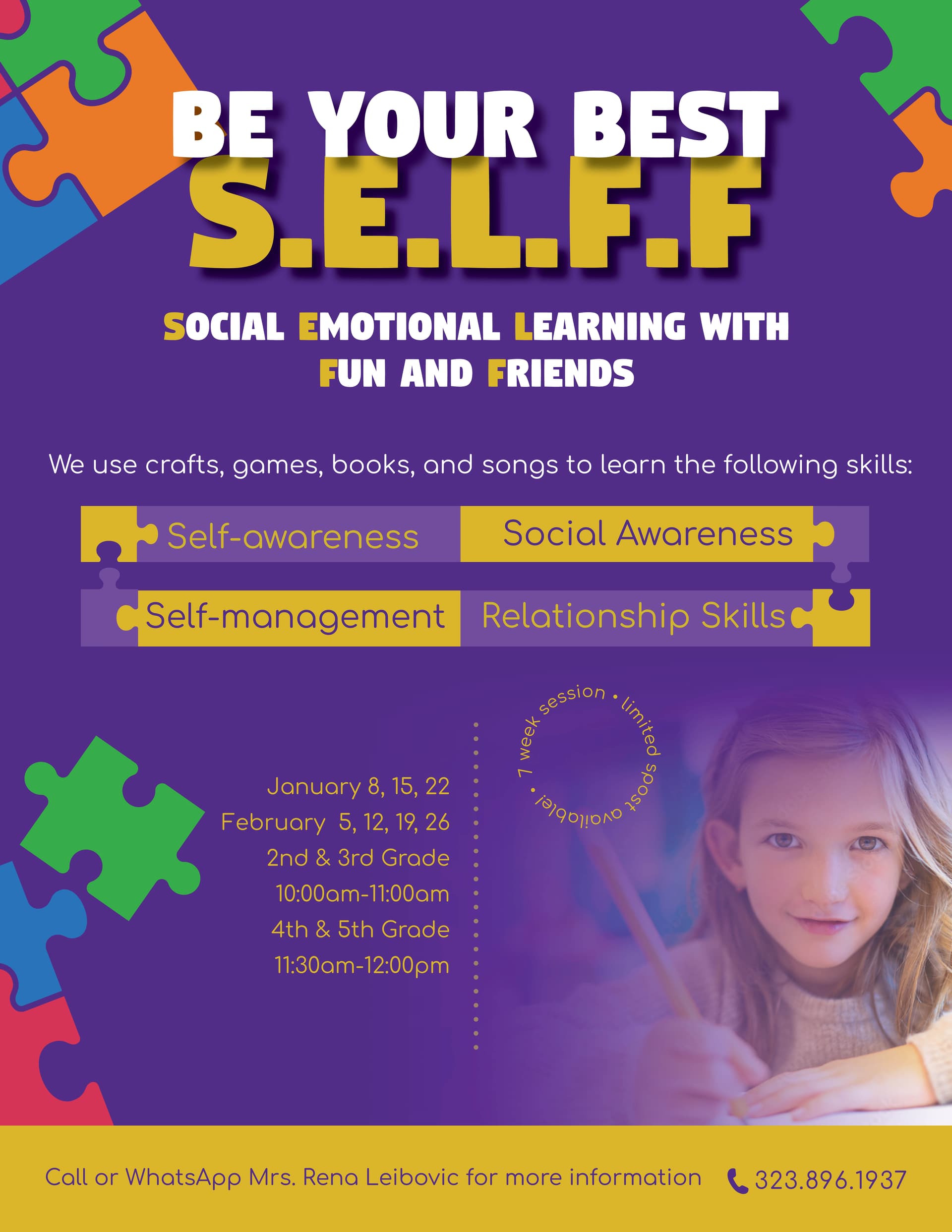
wow!
i love how you incorporated the puzzle pieces!
much better now:)
I’m just curious about the words in the circle. Is it in that specific spot for a reason?
No it’s not there for a reason. Think I should move it over?
Looks amazing!!
I think just work on dates and timings to organise it a little more. Maybe bold some things and add spacing as it’s not so clear the way it is now.

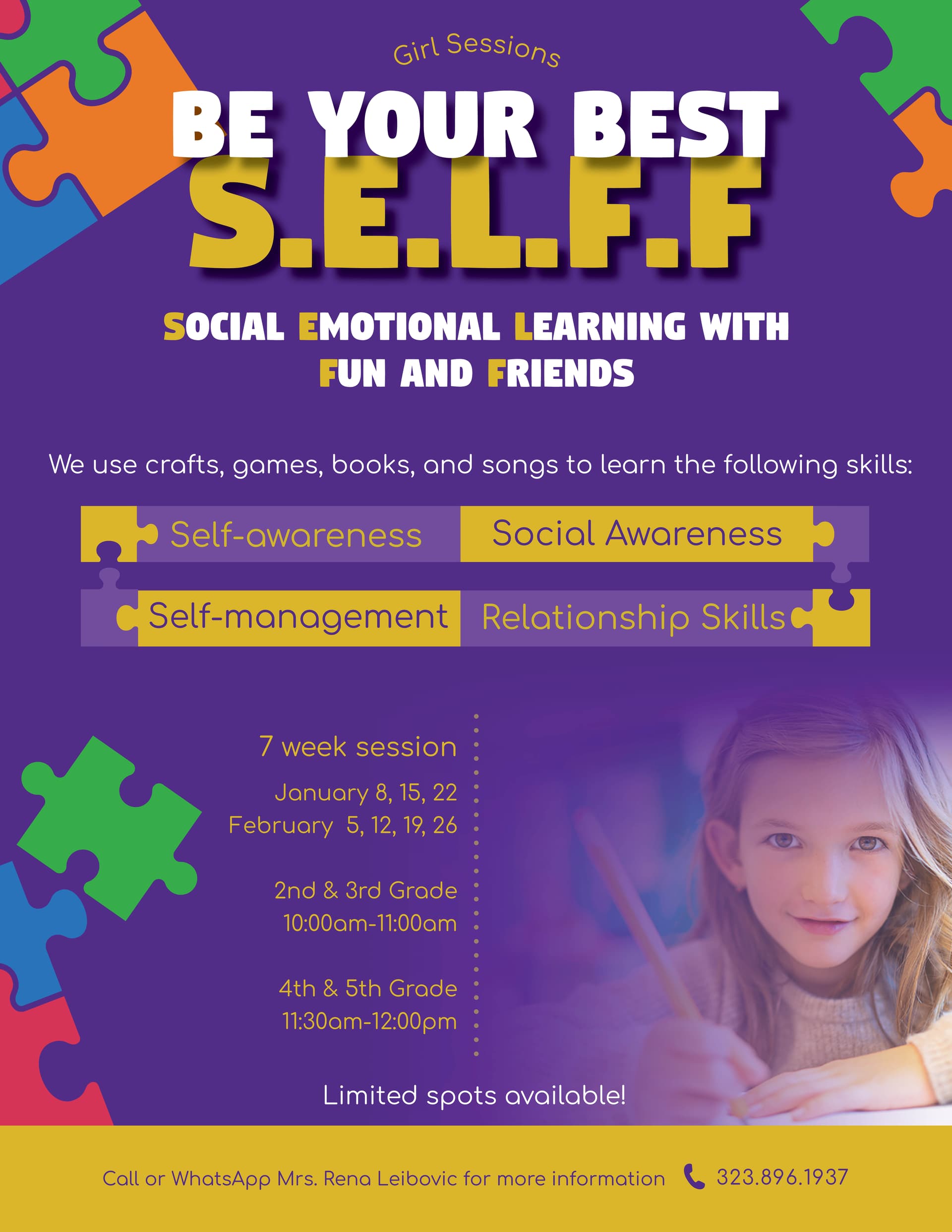
i like the second one better
I like the second one better also
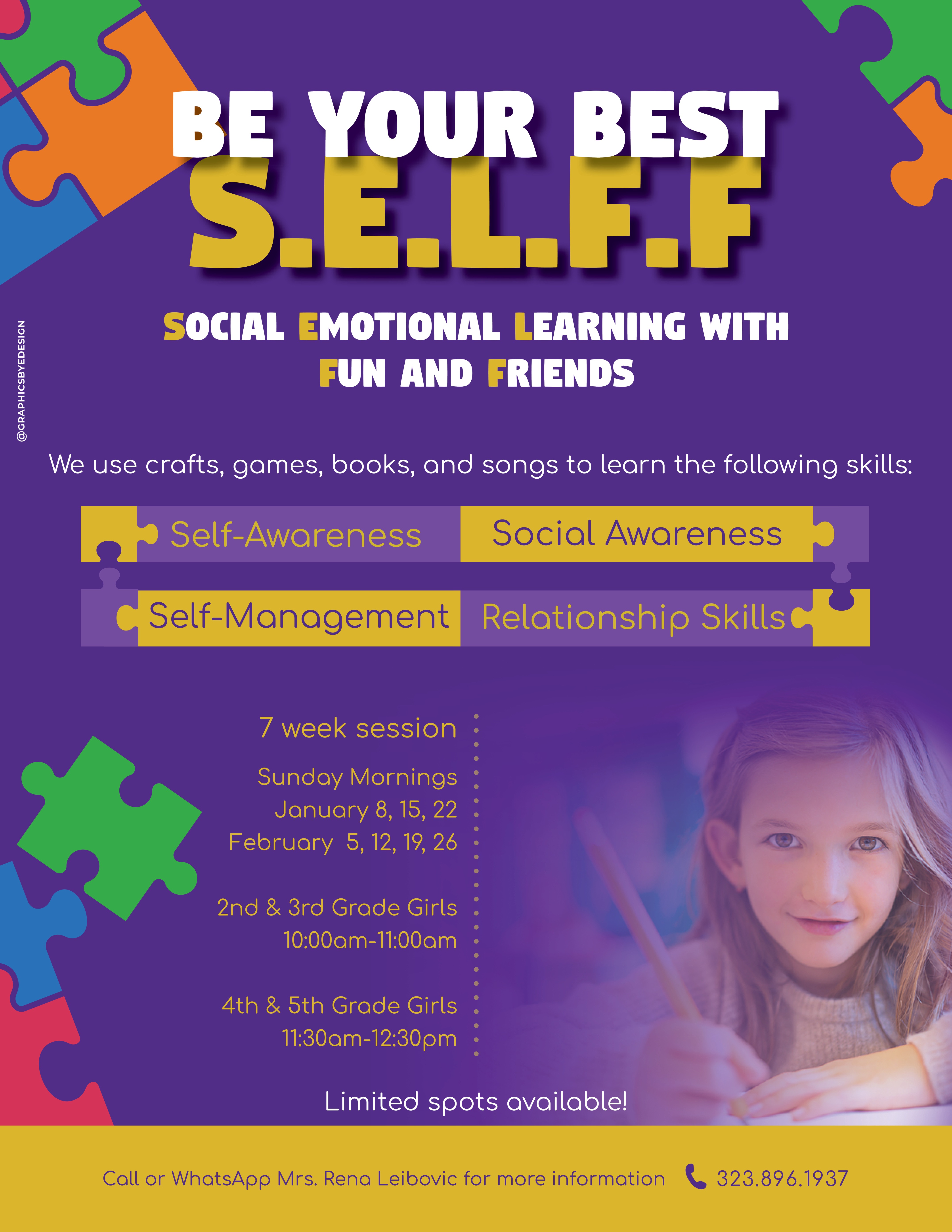
Beautiful!!
Nice! I love how you organized the info! Very cool to see the whole process 
It looks great now!
Hi! My client wants to add more information to this flyer but in a way that shows more information is being added. Hows this? Any other ways to add additional info but not change the whole flyer. to purposely show theres a change etc… any inspo?
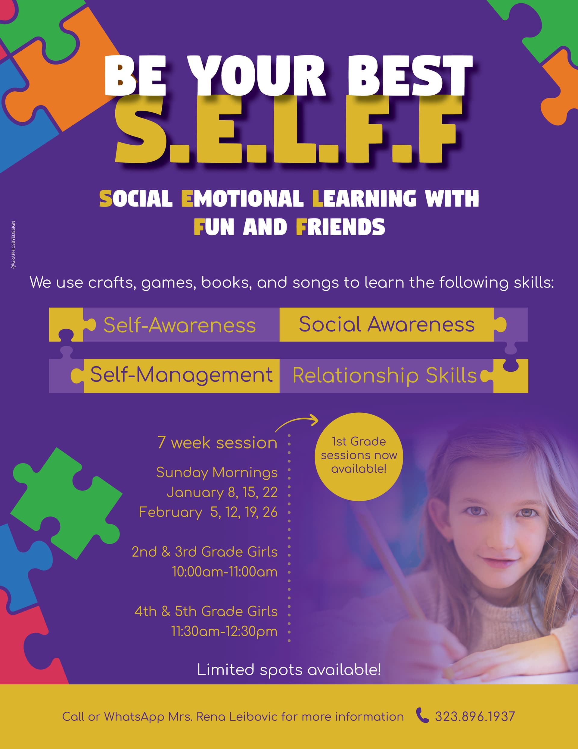
What’s added? Just the circle with the info about 1st grade? Maybe you can make it stand out a bit more cuz it’s still blending in so well that I’m not sure people will notice.