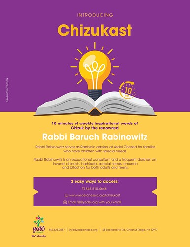
Hi, I had an organization reach out to me for a flyer. The flyer is for a new program they are having which is basically 10 minutes of weekly inspiration over the phone etc…
Im having a hard time looking for ideas on how to layout this kind of flyer. I was given the text but I would love some ideas on how to display the text.
I was thinking I can use a clock, light bulb or maybe some books to get the idea of the 10 min inspiration but feel free to share your ideas!
or if you have any flyers with a similar idea i would love to see!
Thanks!
looking good! the logo and details at the bottom for some reason looks a bit wrong maybe play around with that, otherwise rly rly nice!
maybe just put the logo centered and the deatils underneath?
Do a test print with the yellow, some times it prints very “dirty” looking
otherwise it looks great!
The info in the purple may look sharper with white
wow! so sharp!
wow its amazing!
