Hi,
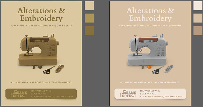
I designed this logo and flyer for my sister’s seamstress & embroidery business.
Looking for some critique and opinions.
Is it clear enough?
Does it catch the eye?
Which color theme is better?
Thanks!
1 Like
I like the second one (on the right) better. The name is so catchy and creative!
1 Like
Really nice and clean! I also like the one on the right better. But i would maybe do a darker brown (like from the sewing machine) for the main text because the light text doesnt show up so well on the light background.
Thanks!
We landed up going with the right flyer and keeping it as is.
She felt that the brown text starting taking over the whole flyer and that it made it too busy. People won’t know where to look first!
wow! so nice! love it!

