I am in middle of making this for a Yeshiva Fundraising Campaign.
They want to hang this sign around the Yeshiva. Navy and Gold is the Campaign colors…
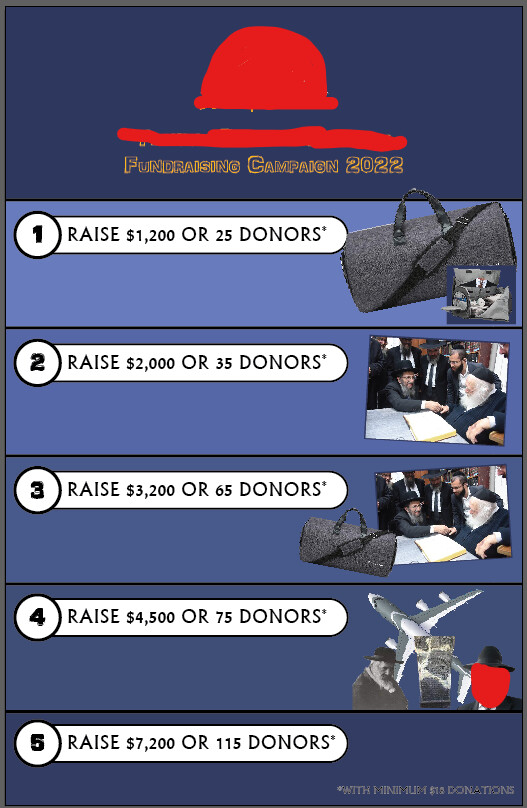
I am having a really hard time placing all the pictures (Especially on # 4) and making it look more exciting! I feel like it looks super plain…
Any critique? Need it done ASAP…
Is this the font they specifically wanted you to use? I feel like they want an elegant feel but this font isn’t bringing that out. I especially don’t love that the numbers are smaller than the letters.
Maybe also add drop shadows to the images of the duffel bag and airplane to add depth.
can you use the official campaign graphics in your flyer say at the top header area to make it come more alive?
you can add some gold to the diff sections - either to the border/numbers or image frames…
Thanks for the feedback! @chanamiriam added the dropshadow and love what it adds! Thanks!
The campaign doesn’t really have specific graphics… or none that they gave me…
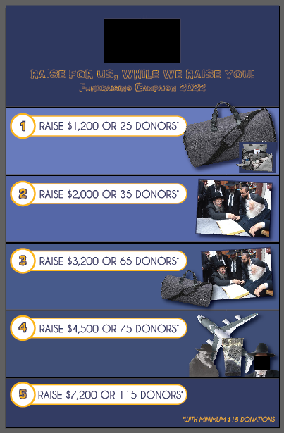
Here is with a few coloring and picture edits I made:
Also, can you help me with the slogan? They want something like that, it’s just not sounding right.
looking more alive… i’m also not sure about the font of ‘raise for us…’ not so clear as outlines…
and yes i agree ‘we raise you’ doesnt sound right. what are the prizes? i dont think the photos alone are clear enough - it should say the prize too in the space under the 5 headings…
it’s not your job to come up with the copy!! ppl pay hundreds of $$$ for persuasive copy!! you can come up with a suggestion as a chessed but it cant be your responsibility! i would try and get them to find someone in their yeshiva good with words to do the text…
oh i thought this was an official crowdfunder type of campaign where they give graphics and even help with the copy…and you’re just doing the ‘in-house’ marketing to the yeshiva…
The drop shadow did add a lot! Can you try to incorporate the accent color in the prizes maybe? Or as a border, a shape etc? It’s still looking a little dark.
Also I’m wondering if you should use a very legible script or/or serif font for the main title. That might look better.
About the copy, for sure ask them if they can come up with something and if they can’t, I would just do something more generic like Yeshiva ABC Annual Fundraising Campaign. If they have a logo, that would look nice, and if they give you a slogan or if they have a yeshiva slogan you can put that.
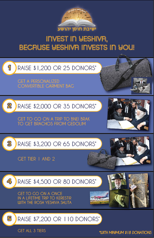
Here is the final flyer for now unless they want any changes…
Or if I decide to make any changes until tomorrow night… So let me know if you notice anything or have any more critique!
Thanks for all your advice and help!!!