Hi,
If anyone has any critique on this flyer, I would greatly appreciate it.
I specifically want to know how you find your eyes traveling through the page. If this needs improving, I would love some pointers.
Thanks!
Michal
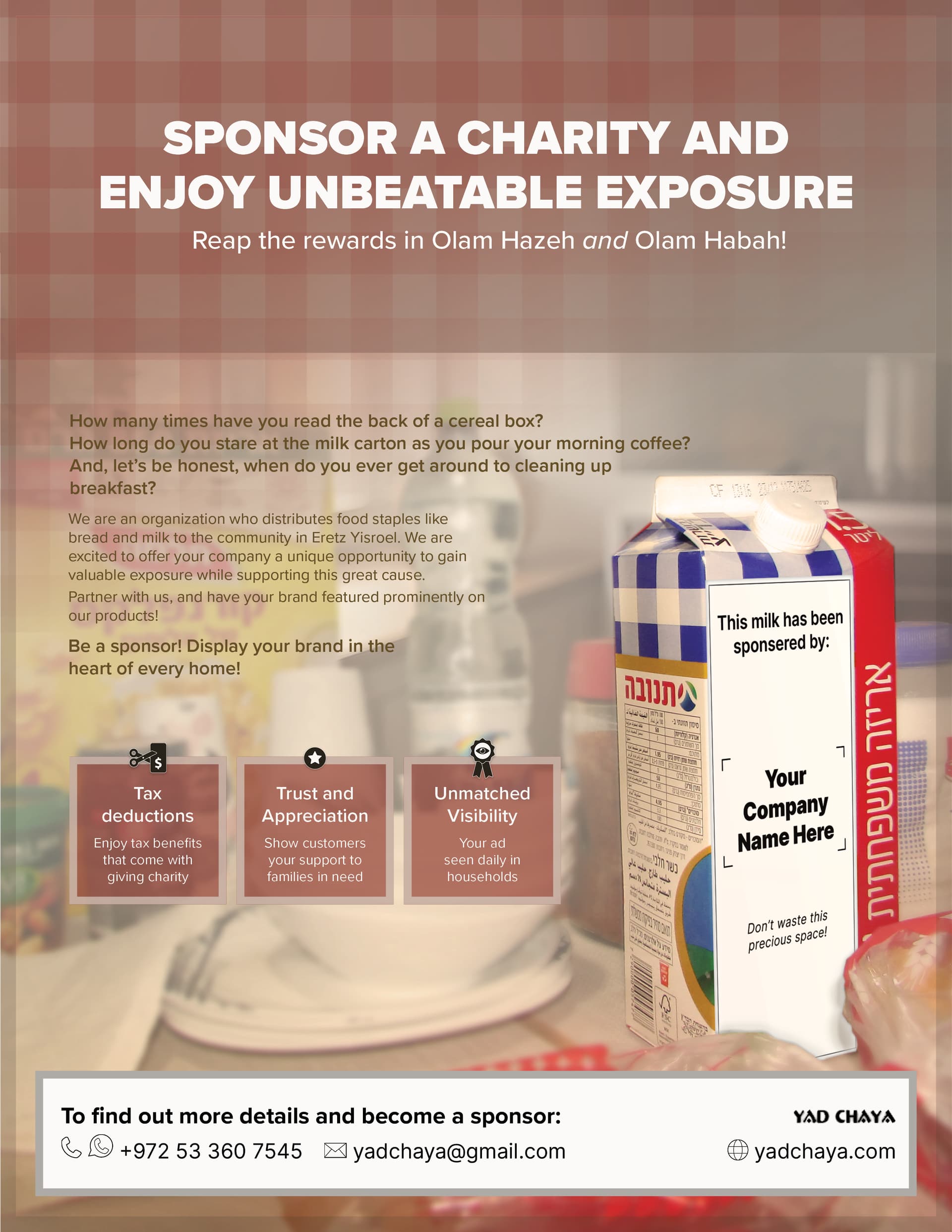
My eyes went to the milk, the title and tehn the 3 boxes…
It looks good, but I think the white layer on the milk, looks like a paper was glued on, basically not perfectly natural…
Thanks Chani! Your feedback is really helpful!
I am only seeing the milk, I am missing a hiarchy, it is hard because its a lot of text, but try to balance it out better. Work with background boxes, color and font.
Thank you Schlomith!
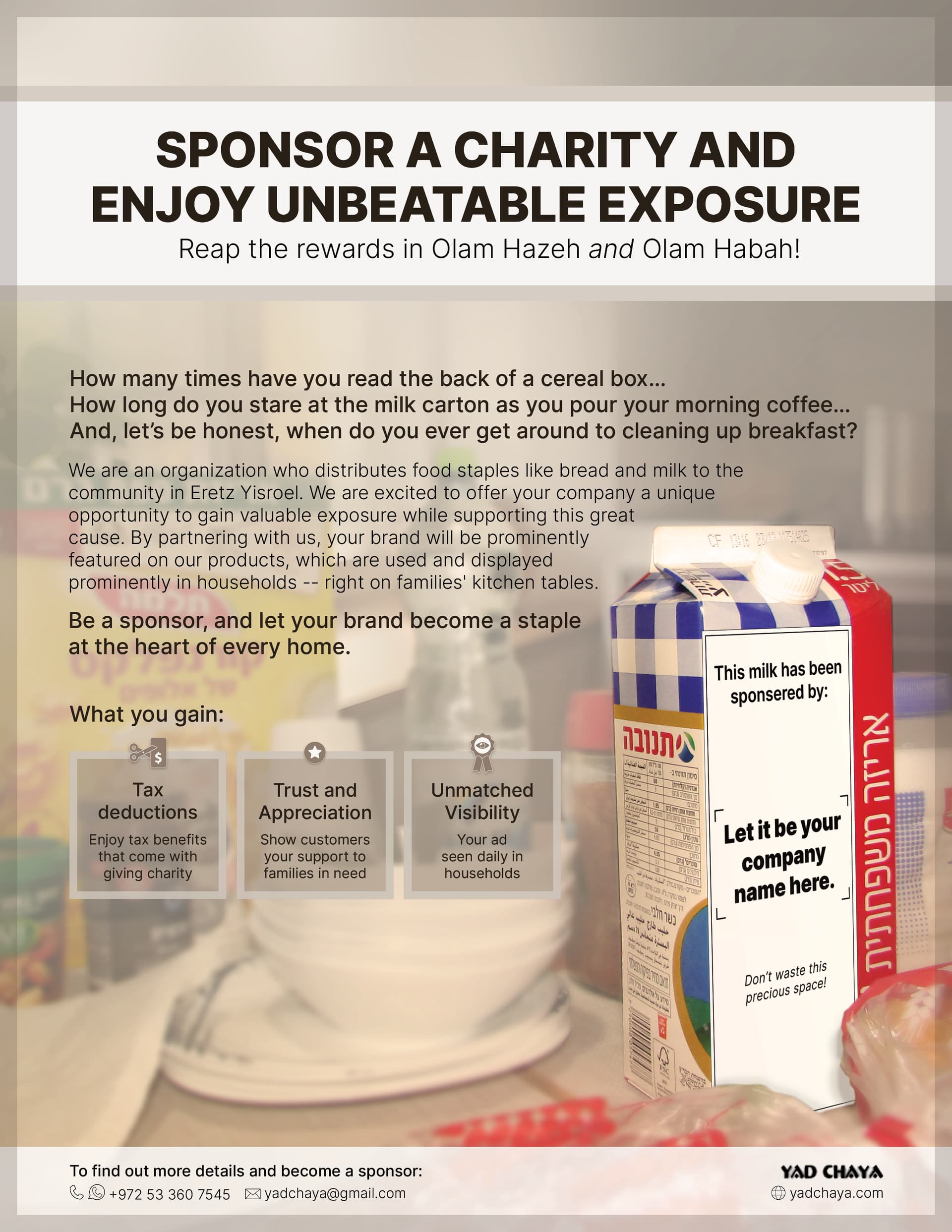
What do you think of it now?
Do your eyes still take you from the milk to the title to everything else, Chani? And Schlomith, do your eyes now take you in that direction?
I see the milk and title about the same time,
the middle text is as bit much
can you try to make the text smaller and maybe tighten the leading based on what it looks like when it’s smaller?
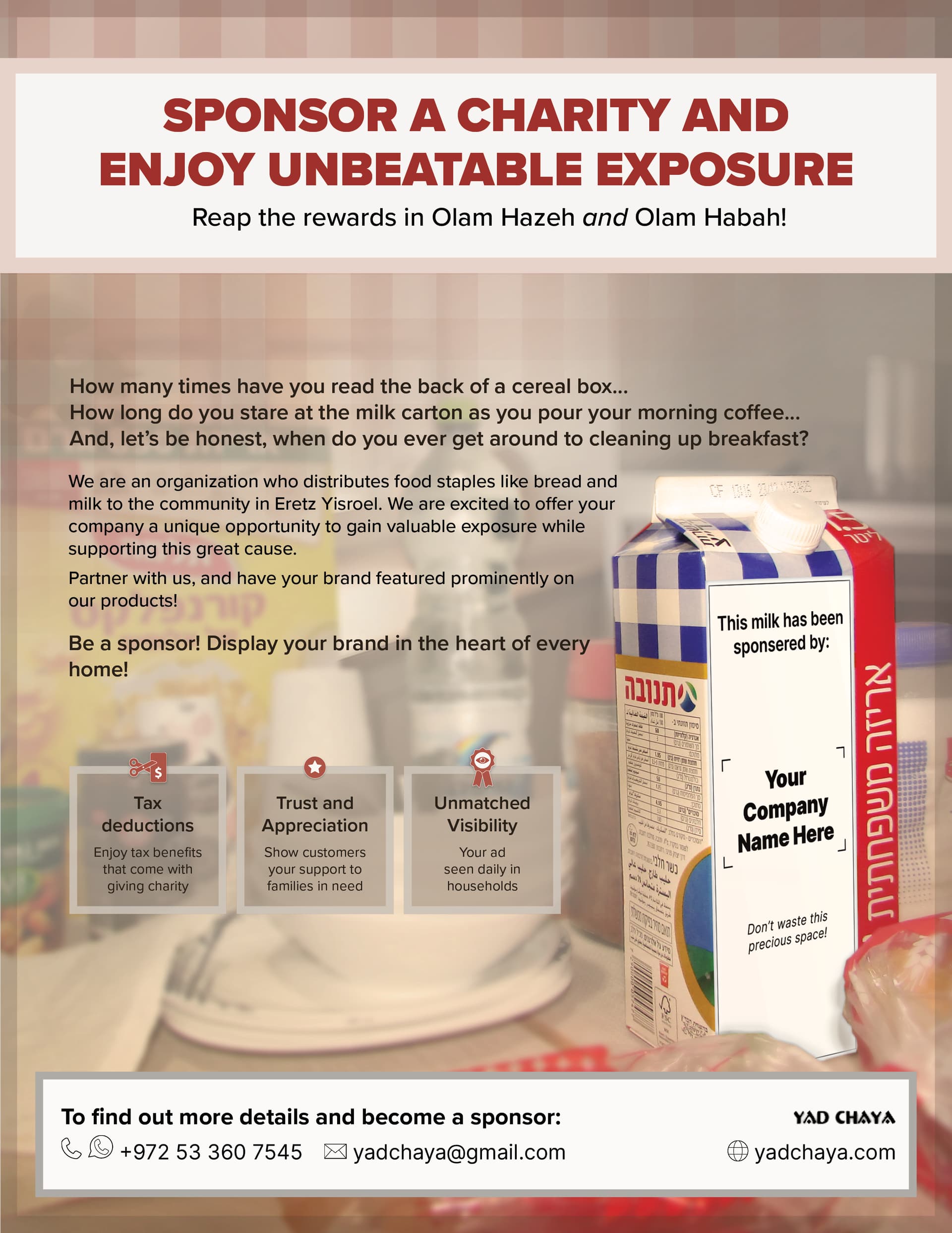
Its very boxed off. Everything is in boxes. Can you change that as well as the coloring is muted and a little drab.
Maybe get rid of the top box and just put the copy on the background in a nice font that will be seen in that same color.
Also you can switch the 3 little boxes to be the maroon color and make the text white in it for some more pop in color.
cool concept
I agree about the coloring - I think it would look better with brighter coloring and more contrast
Thank you everyone!
Here is a revised version: at the same time as making the title less “boxy,” it became more secondary to the milk, which is what I want. In terms of the muted colors, I want that look, as this is meant to give off cozy breakfast in the kitchen vibes. And, it lets the milk bottle stand out more. The body text is now smaller, and a less contrasted color so that it doesn’t look like too much.
I really appreciate all the critique.
Does anyone have any other thoughts?
Thanks!