Hi,
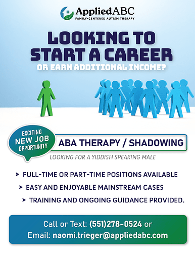
I am looking for feedback on this flyer.
I will be using the same design to make this flyer/ad into a yiddish version as well.
Thanks in advance!
Its very nice, I would just align the triangle bullet points, make all the text a tiny bit smaller and move the logo down a drop…
really nice! I would make the whole middle section slightly smaller so you’ll have a bit more of a hierarchy and focus
Thanks @miriamhalter and @Breindy-S for your input. I will make adjustments and show it to my team.
It looks good, I’m just not sure exactly what the pic has to do with looking for a career or this particular job…
