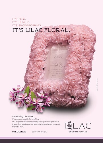
Need help with this ad ASAP. It needs to go in later today.
I feel like it is not popping enough - what can I do to spruce it up? TIA!
I am still working on the bottom text - it’s raw right now.
Can anyone help me with this???
That picture frame is stunning!
Maybe move the text up and ‘behind’ the picture so that the image is in front.
The shadow beneath it is a bit intense.
I wonder what it would look like with some sort of pink filling up the bottom part of the ad- like starting from the purple flowers till the bottom.
Is there any way you can lighten up the middle of the frame?
Maybe put the logo on the left and the rest of text on right to balance it out.
I would only have 2 colors for the text / lines at the bottom of ad.
Can you try put the flowers on the right hand side of the frame?
What about putting its new… across the top with increased tracking between the letters.
and then the title centered underneath.
Yeah, so she makes these gorgeous custom floral stuff.
I worked on the shadow already, @al1 what do you mean by pink filling up the bottom?
@Tali I need to change the invitation.
Move the text up more and bigger. Otherwise its really good
Got an extension till tomorrow… So I can now work on it in a bit more relaxed fashion!
Working on it now, will post the edits soon…
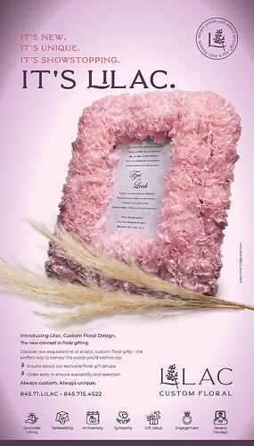
Here is the final for now - unless anyone has other critique!
My client printed it out on a color printer and said the gradient printed as 3 ovals of color instead of a smooth gradient. Has anyone ever had something like that, and how can I ensure that it shouldn’t print that way in the magazine??? TIA
Looks really nice! You can try to make a brushed background in photoshop which gives off a smoother look than a gradient background. Darker strokes in the corners and lighter in the center. The screenshot attached is very subtle but it’s for the idea. image|353x500
I could do that… but why is my indesign gradient coming up like this - as ovals sortof?
You might need to adjust the gradient sliders. Sometimes when they are too close to each other, it doesn’t look seamless
It’s really nice! I liked the lighter pink background better…
I think it would be fine if you remove the gradient altogether.
Yeah, I liked the lighter one too! 
My client said she doesn’t like light pink and wanted the gradient cuz she felt it gave more pop.
She didn’t like solid light purple either…
I redid the gradient in Photoshop, and I hope it’ll print smoothly…
saw this in print and the gradient looked fine and the whole ad looked so nice!
Thanks!

