Hi, Can anyone tell me how I can ‘dress’ up this logo a bit?
Make it more full of life?
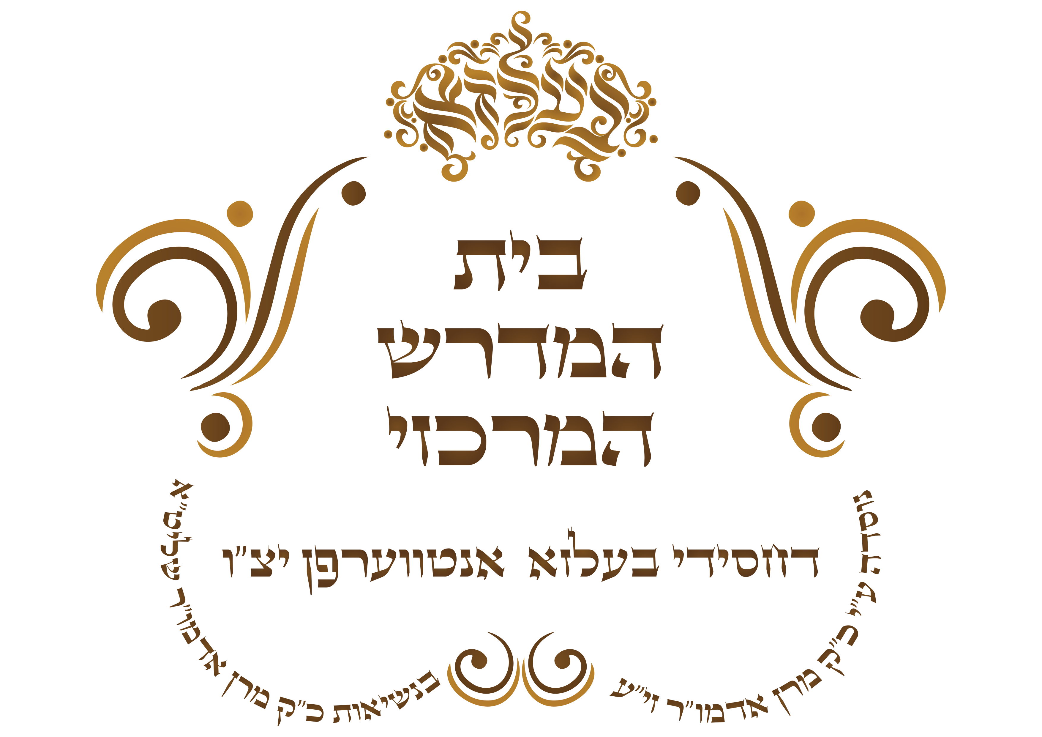
They want something rather simple, but I find that this is too empty
It looks really nice! Maybe make the word “HaMedrash” bigger, to add some more contrast
I did that but they want it the same font size
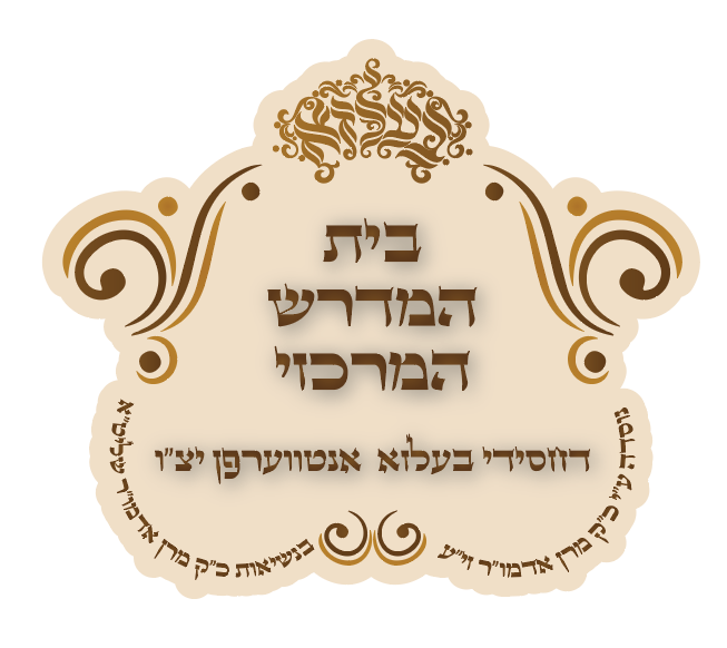
Why dont you give a full color behind and around? Making it more of a sealed emblem
Take a look at this link EN final.mp4 - Google Drive
no! the original is much better! never put a drop shadow on a logo!
I can also do it without the shadow any other idea how to ‘dress’ it up?
Make the edges of the outline smooth, not following the outline of each letter. I would draw it so it comes out smooth.
I would make a darker outline/background and lighter letters with a slight drop shadow, not a blurred dropshadow.
Elementric’s website has a few tutorials on how to make chassidish style logos. If you email me slevitin123@gmail.com I can send them to you.
i think it would look much nicer and neater if the name of the shul is bigger and the tag line underneath smaller.
was thie backround done with the pencil tool ? Just following the shape of the logo?
Is there any easier way to do that?
i just copied it and made a stroke around it and used it as the background.
Watch the tutorial that Adina uploaded
the tutorial was from Elemetric Im pretty sure
I’m stuck again with it.
They dont want it with a background because they want to be able to print it in black/white.
But they’re not happy with it as it is, its too simple they say. (they already started using it in the meantime so cant make too big changes on it).
Any ideas?
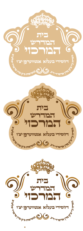
Why can’t you create a black and white version for them? It is not too simple at all. Very nice and well balanced.
Can I just tell them that this is it and finished?
up to you. i dont know your client. i find that if i give proper reason to my design and opinion and then they listen and respect it.
Maybe an outline? A pop of color?
i think it looks very nice.
Maybe ask them if they have a suggestion?
I personally would not give up on the client like that. You want them to be happy. But then again, that could just be a personality thing.
Unless they are being unreasonable. Then you need boundaries.
Try making the middle words “Beis Medrash HaMercazi” bigger to fill up that space more
Maybe also try adding a swirl or something to the empty spaces on the bottom
tnx for the suggestions!