Hi!
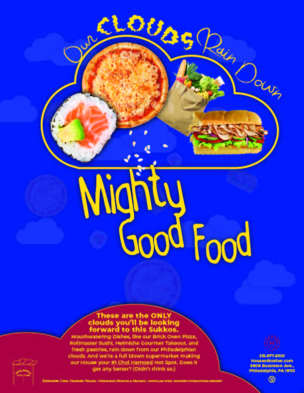
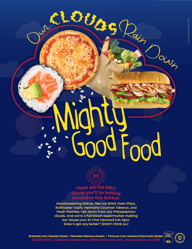
Any suggestions/or input on this sukkos ad? The clouds are a reference to Sukkos.
Not sure if this looks too childish and not sure the best way to include the info on the bottom without it looking to messy.
Hi!
Any suggestions/or input on this sukkos ad? The clouds are a reference to Sukkos.
Not sure if this looks too childish and not sure the best way to include the info on the bottom without it looking to messy.
we cant see the ad
Sorry, here are the ads. One has red on the bottom, the other blue. Red and blue are the branding colors so not sure how much I can deviate from that.
Is the blue very bright or is it my monitor?
I don’t think it looks too childish. I happen to like it - it’s very different looking, very creative! I think the red on the bottom is better - gives it more contrast though the words inside the cloud are too small. I also think you can make the focal area a drop bigger and then maybe take the words out of the cloud and enlarge it…
Also, about deviating from the brand colors - I think you can use other colors to match the ad but it’s a good idea to try to stick to the brand colors - remember you can always use tints, tones, and shades of those colors…
Its the way it downloaded as a JPEG- looks different than it will actually print
Do you mean that the contact info is too small?
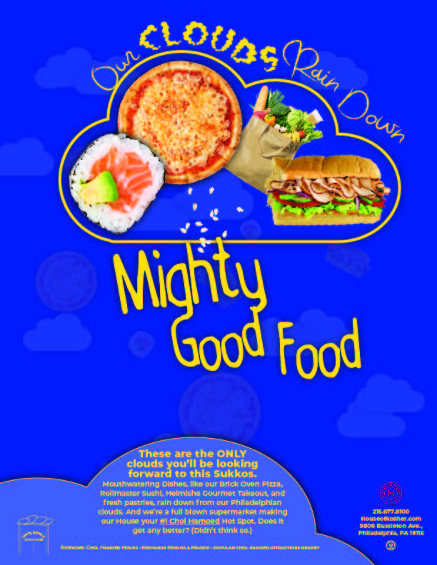
All the info on the bottom looks a drop too small to me… I had to enlarge the ad to read it… what size is it?
was 7 pt now just enlarge to 8 - the other info is 14 and 10 pt (the paragraph)
yeah 7 is tiny unless the info isn’t that important…
If you can, can you try to make the text 10.5 or 11 - that’s also a drop too small. 14 is great.
Very eye-catching and memorable concept and design!!
Wondering how many fonts are in use here.
Is the font in small caps at the bottom the same as the text above it?
Also for the focal area, maybe choose 2 fonts instead of 3…
You might want to right-align the contact info and give it enough of a margin on the page there.
I think the logo can still be enlarged more, maybe also place it under the contact info?
Really sharp and creative design!!!
Good luck  !!
!!
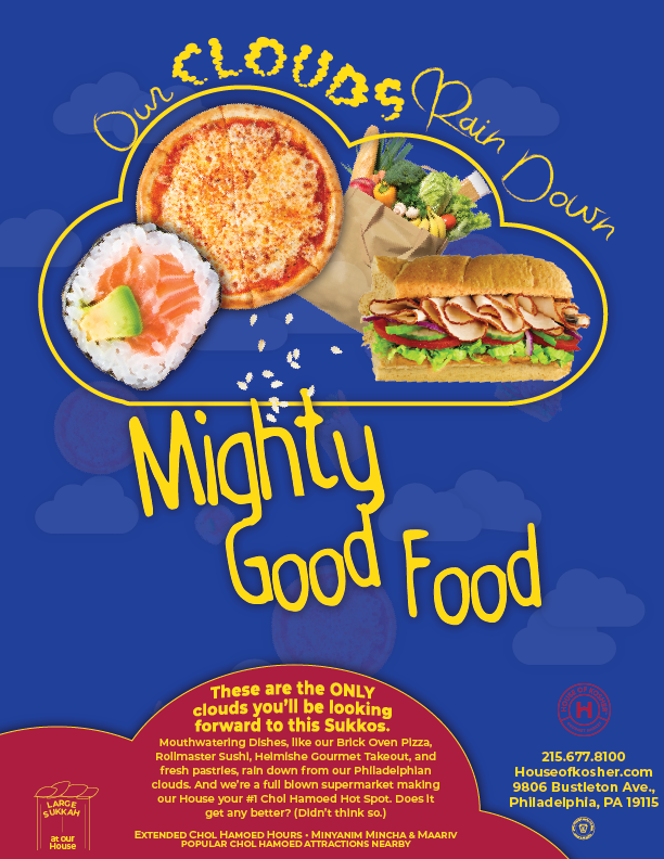
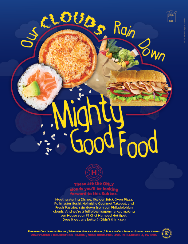
Thinking of this- simplified the bottom. How many fonts total can there be? Can there be more by the focal point since it is more like display text?
Much better! so much sharper!
I like that you included the words into the cloud, added more “rain”, and enlarged the food items…
I think you can get away with more fonts because it is display text but you can also make another version using the “Mighty Good Food” font for the words “Our” and “Rain Down” it might make the focal area even stronger…
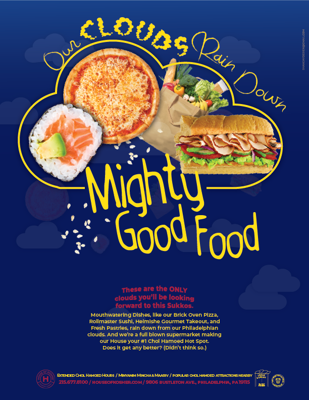
I’m also thinking maybe change the “clouds” color to the red you are using a lot on the bottom - will give it good repetition, make the word stand out more and be a good visual pathway down to the text…
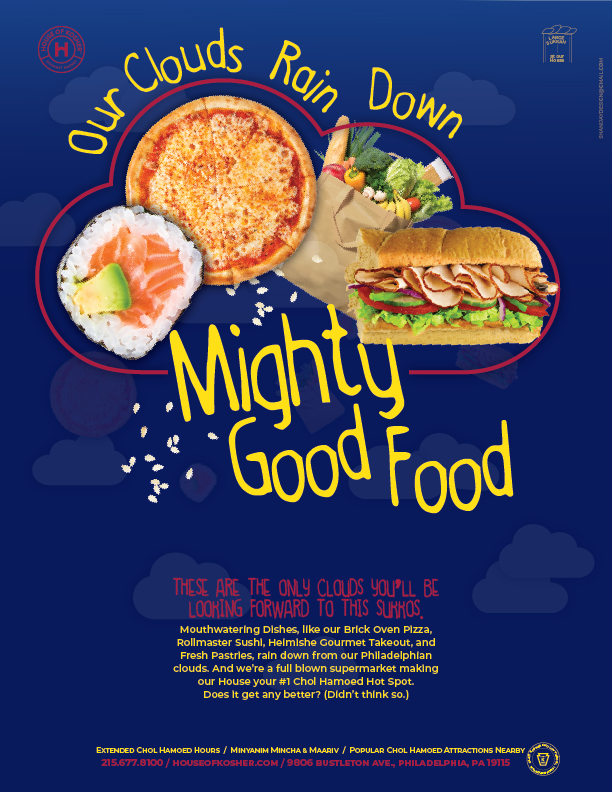
I think the bottom is better… maybe add some leading to the yellow text and spread it out a drop more to the left and right to make it more airy. I would also make the logo and icons slightly bigger…
Red cloud looks nice. I liked the logo where it was…
I felt like there was too much on the bottom… gonna try to move things around a bit- theres the kosher symbol, logo, and sukkah icon
I would try putting that cloud of text in one of the bottom corners… feel like it’s too much repetition with that main cloud…
And may just be a matter of taste, but I would take the text warp off the red text, unless that would totally take away the cloud shape…
I like the idea of putting one logo in top corner, maybe add another to other top corner?
I would make all the text in the focal point that same mighty good food font, again may be just taste:)