Hi
Any Critique?
Thanks
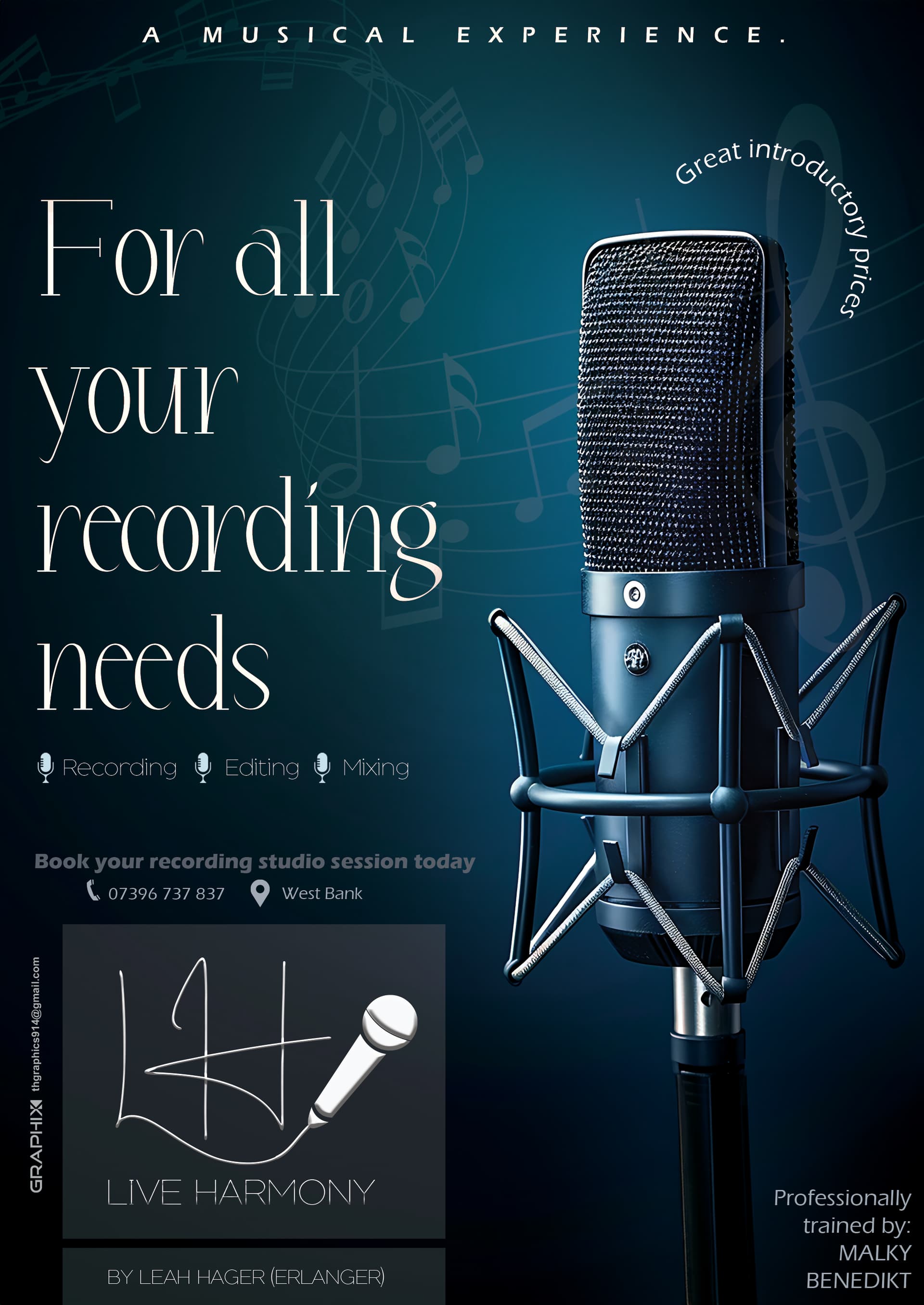
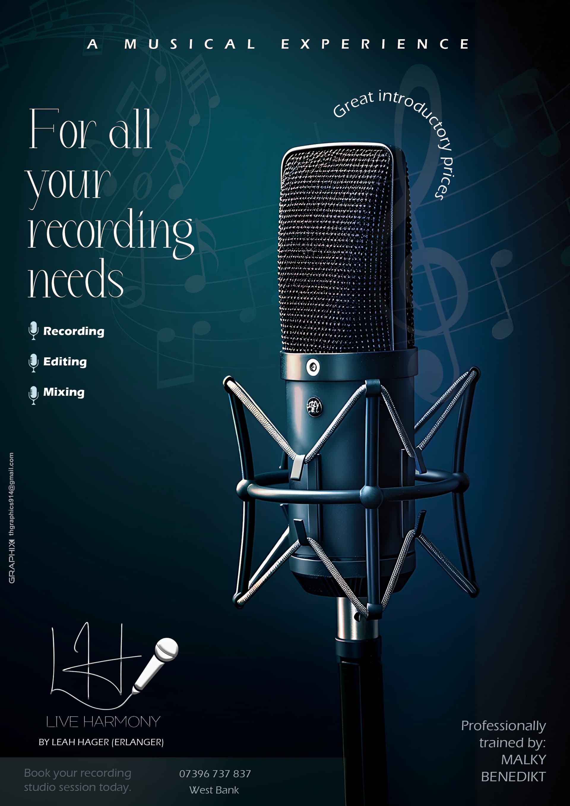
Seems very busy. I would think to make everything a nice amount smaller and see how it looks.
Looks great tho!
I’d make the leading much tighter and move headline higher. Once you make it higher and tighter, I think the mic can move inward more towards the middle.
Logo much smaller on bottom, and you need more margins for the top text and the bottom right text.
Also, I think your own logo can go quite a bit smaller…
I would put dividing lines in-between the 3 points
recording | editing | mixing
instead of the mike. The mikes are a little to much.
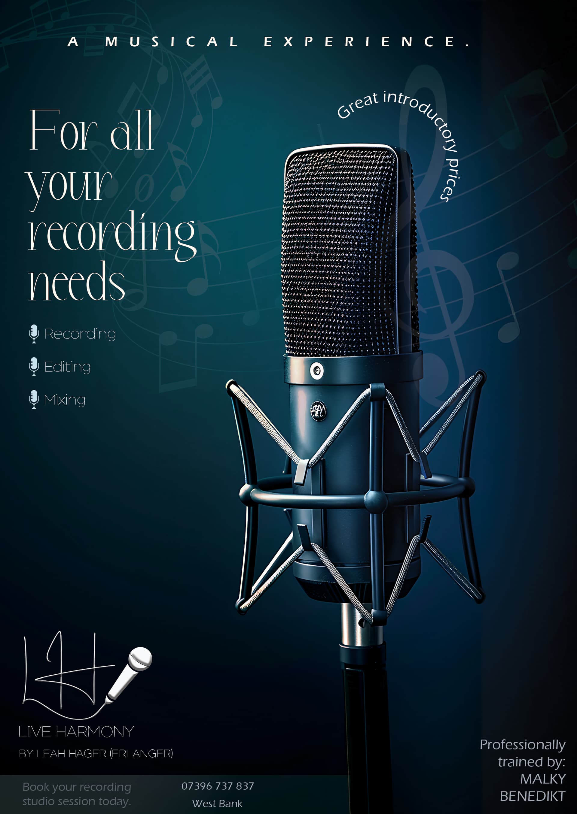
Looks nice. I think all the fonts on the left side on top and bottom are too thin and therefore hard to read
Looks really good!!
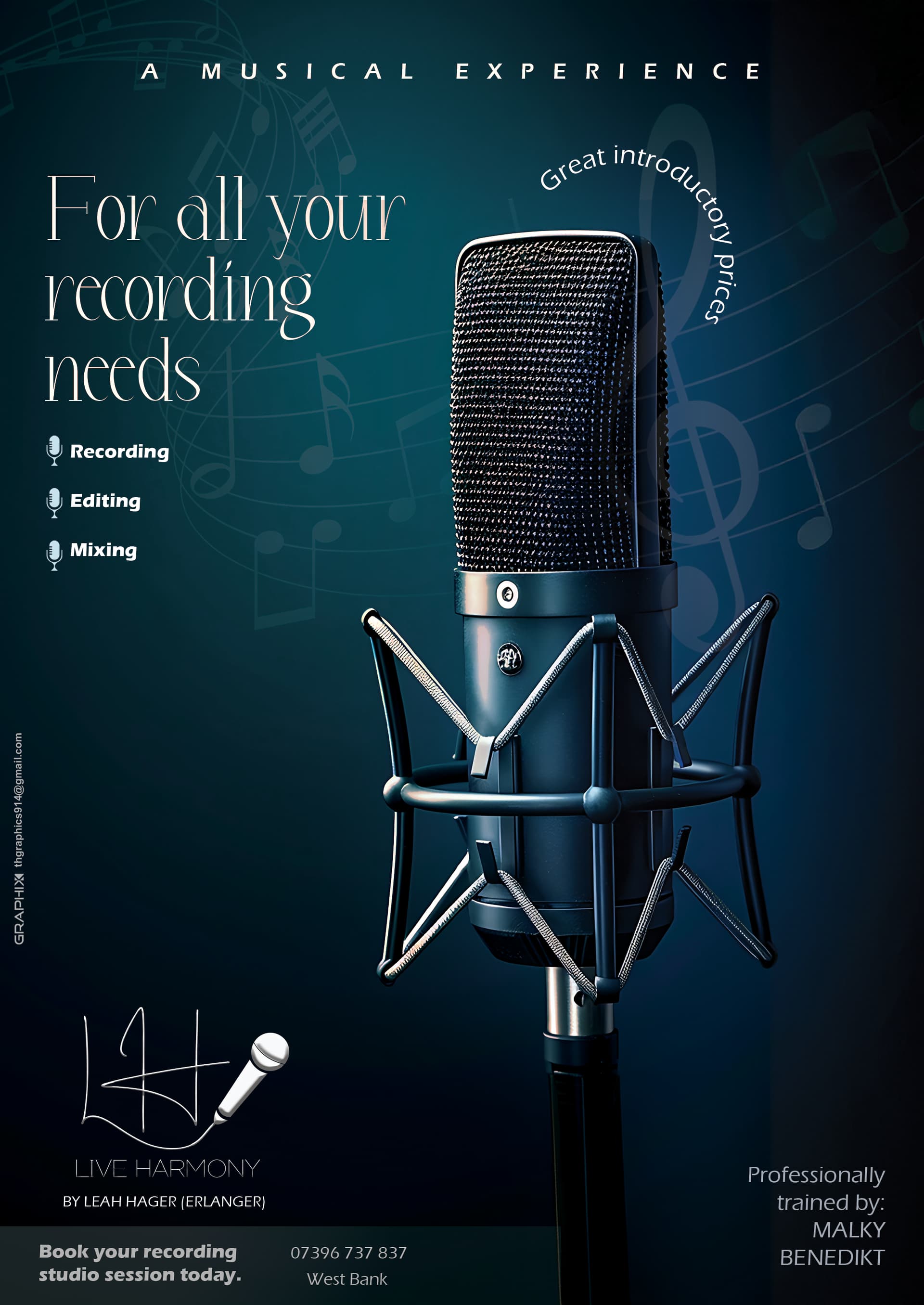
I personally liked the mic slightly off-centered.
And the words Recording-Editing-Mixing are hard to read
I also like the blue color better - but personal opinion ![]()
Wow, it’s much better!
Don’t put the mic fully centered - it’s better to the right.
Or maybe slightly angled towards the center.
Recording-Editing-Mixing is hard to read. Try going up a weight or 2.
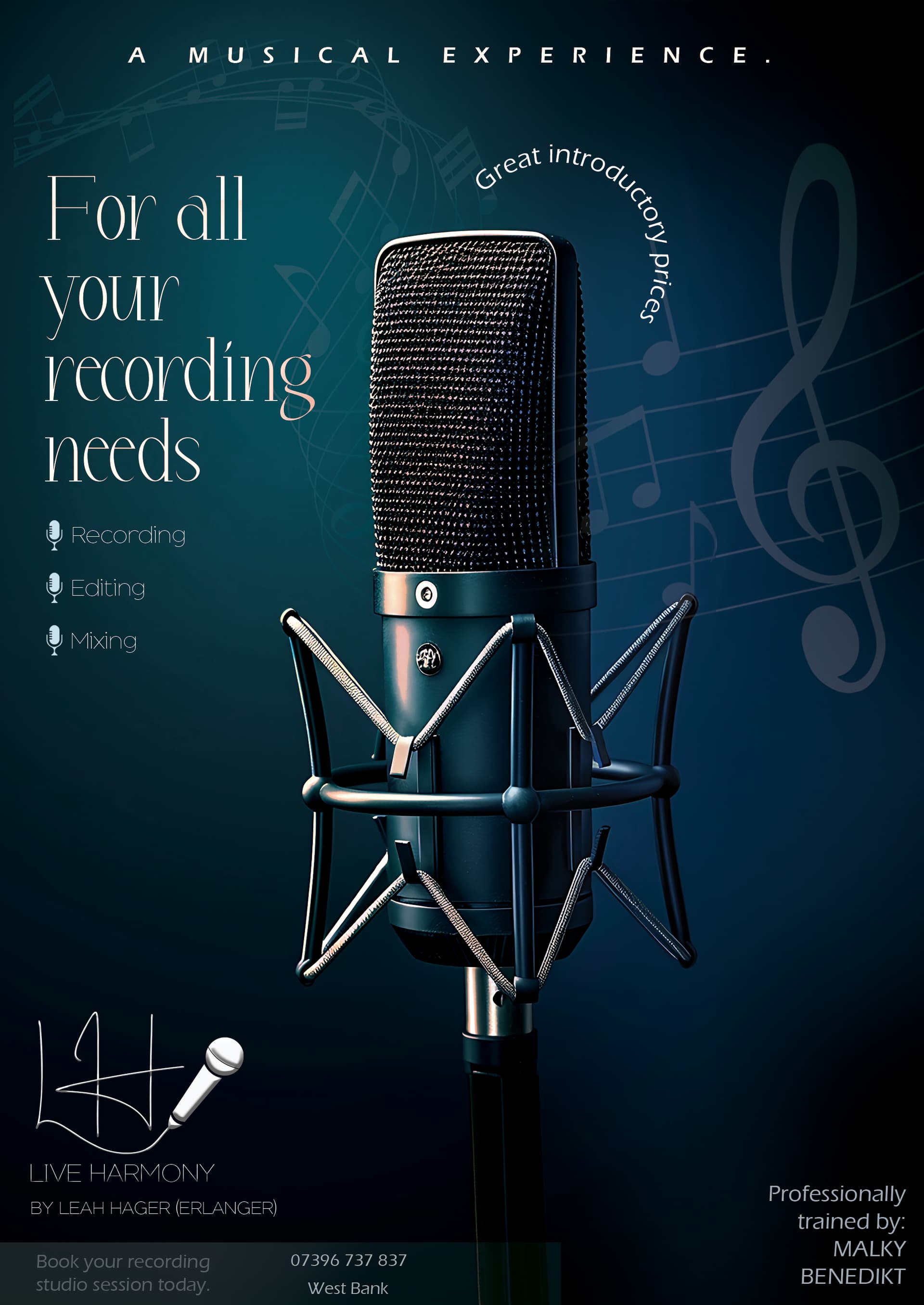
I’d say give it even more margin, especially on bottom, and I vote for the blue version.
You can put on your logo - just it needs to be really small - it shouldn’t attract too much attention to it.
I really like the overall design, however agree with @AMiller’s suggestions.
Also, I don’t see the need for the full stop after A Musical Experience. It’s just making it look off-centered.
And make sure your margins are large enough.
Still can’t see book your recording studio today unless it is just my screen…
Can the word your fit on the line before? I think it will look better…
I’d still give it even more margin, unless you have a bleed here that is not showing in the screenshot.
Agree that book your recording studio should show more.
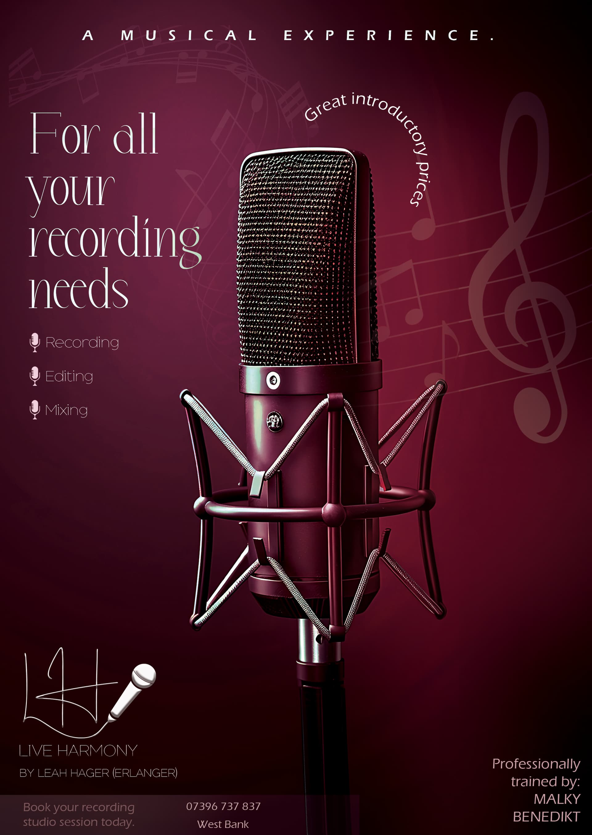
Otherwise looks great! Huge improvement from the first version!
Give it more margin, it’s all “stuck” to the edges. Font should be clearer, bit hard to read
Agree with @schlomithsassoon I’d still give more margin. Otherwise looks great!
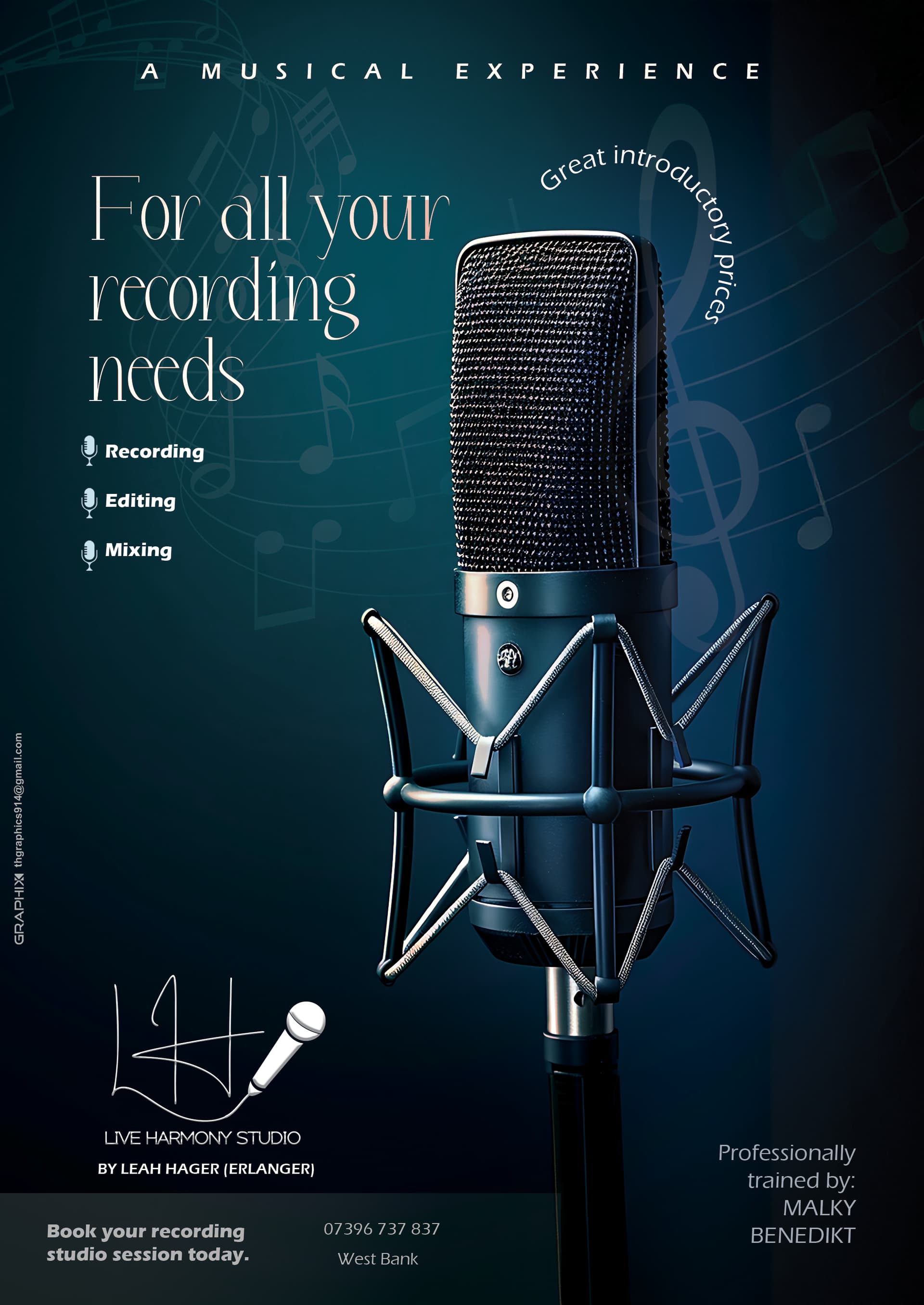
it looks so good!
Amazing! It looks great!
Minor point that I just noticed, align the book your recording studio… text with the logo and the top text.
They should all be left aligned.