This logo is for a bakery/ lunch place.
I would like to hear some feedback and some suggestions for the colorings.
Thank you!!
This logo is for a bakery/ lunch place.
I would like to hear some feedback and some suggestions for the colorings.
Thank you!!
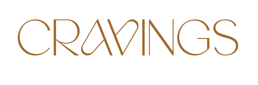
i would choose a softer font for the work craving. sans serif is good but less etchy. Not sure about the color. It looks a bit like mustard.
This one is very elegant!
What look are they going for?
something to catch the eye.
something between elegant and bold
I love the second Font and color better.
You can add the wheat thing to the C
Underneath this, you can write in sans serif - you’ll come back for more
Agreed, beautiful font! And I agree about the tagline in sans serif.
What will the physical location look like, the whole experience?
Fast-food, on-the-go / homey / higher-end / etc.?
This feels upscale.
thanks all for your help!
Think they want it to be a bakery but also a salad bar and food for on the go, and people should pop in at all hours…
First of all, what font is this? Did the A and V come like that? it’s cool!
I really like it but not sure if it’s too classy for what you’re going for
Sounds like it’s more bakery than fast food so this is perfect