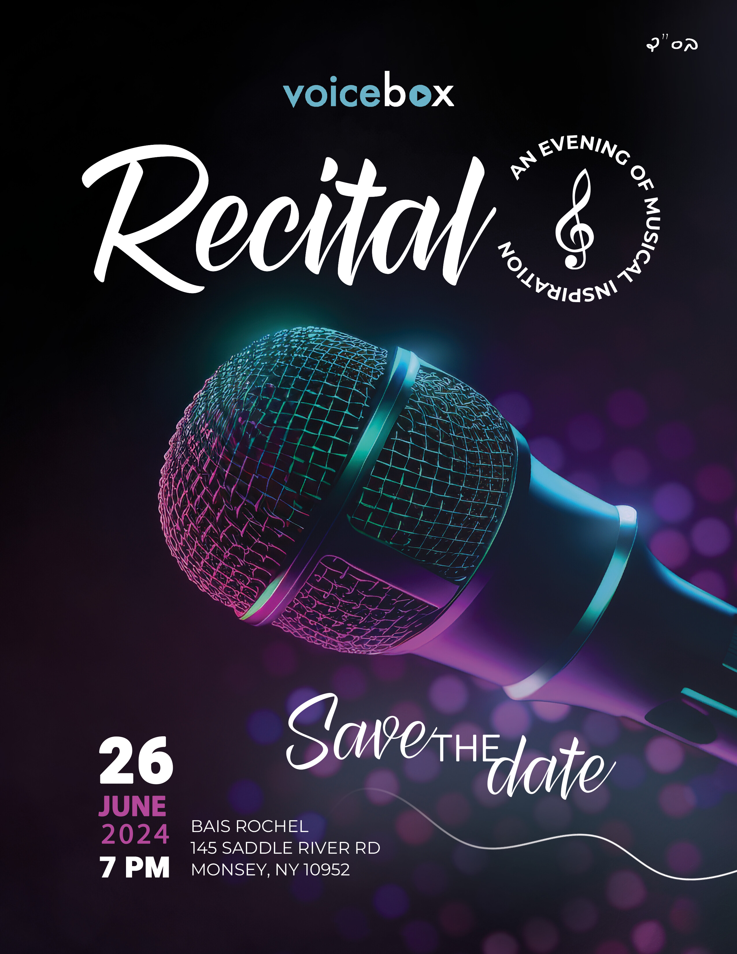
This is a flyer for a recital.
later its going to be an ad in magazines saying join us…
any critique?
1 Like
I really like it.
maybe make the June and 2024 the same bold
its really really nice!
You did a lovely job, Rivka!
wow!
@Rtv Looks amazing,
just slight changes: i think bs’d can go smaller, ‘an evening…’ should be a bit thinner, a few points smaller with more tracking. also not sure if you can do anything with the logo etc…
thank you so much everyone!
and ty for all the tips to make it better, i really appreciate it!
@hindigrinfeld i didnt make the logo, but might be able to play around with it a bit - what do you think should be changed? i was thinking it doesnt flow so well with the design…
Maybe it can be all white? i’m not sure…
Really nice!! Maybe you can move the logo closer up to the top of page so it doesn’t feel like it’s part of what’s going on. You can also shrink it down a bit.
Another thing I would recommend is making the save the date look more like a call to action and put the details about location and date right near it.
You can also put it all into a shape like a rectangular bar or some sort of banner. Look for some inspo on how school plays or similar events are laid out
thanks for clarifying. i actually tried it in white and didnt love it…
but thanks anyways 
thanks so much for the detailed critique, i really appreciate it!
Try moving Save the Date more to the left closer to the actual date…
Love it
so pretty
my only thought is it looks a bit hazy from the smoke. Maybe turn that down so it can be a bit more vibrant.
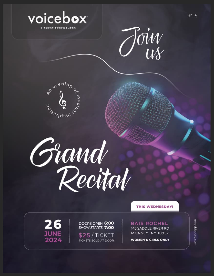
Mike seems very washed out compared to the original one you have above. Can you brighten it?
this looks awesome! the design is fantastic!! my comment is on the copy it looks a little homemade did the client just tell you what to write? It’s a shame when good design has below average copy…
really nice, maybe move smoke back so you dont loose the sharp contrast you had!
Just saw this in the monsey view, great job!
thank you everyone for all your advice and feedback
yeah me too! loved how it came out in print- it was so sharp - really caught my eye!