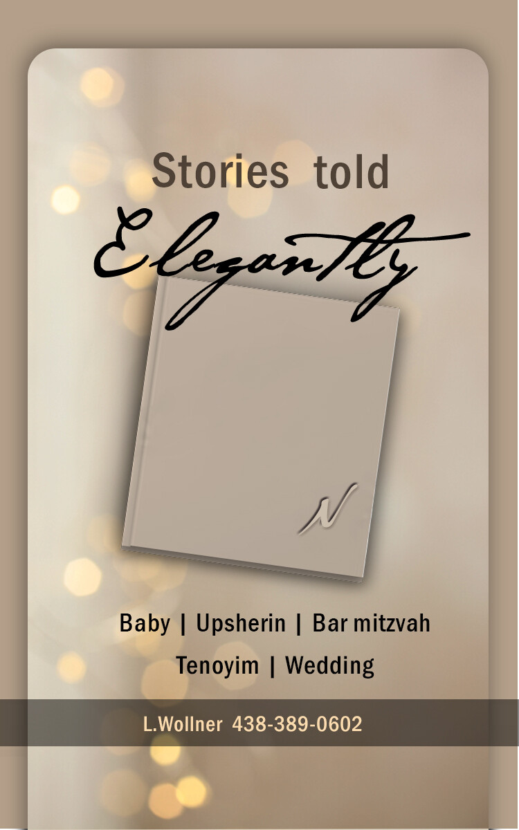
This ad is for myself . It is my first (maybe last) ad. ANY feedback appreciated. Any better suggestions for colors , layout , wordings? Thank you…
I feel like something is missing. ???
You should make it more elegant 
Try searching for elegant background in shutterstock.
Always try to download backgrounds instead of solid colors, it will make the whole ad pop more.
The colors and fonts are a drop bland.
maybe more of an abstract pen writing idea instead of a closed book… to draw the reader in more…?
Try a script style font for word elegantly. Maybe switch the background as mentioned before and or color scheme.
can you add in some photos of work you have done? Pictures speak louder than words and catch peoples eyes…
Thanks all for feedback! Whats your opinion on the colors here?Is the album the right size? Fonts are better? How can i add depth to the add without using stock backgrounds?
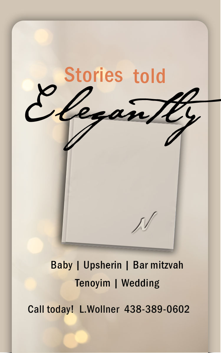
What color should I use for stories told?.I tried so many colors …cant find something that blends and is sharp enough to add color to the add.Thank you!!!
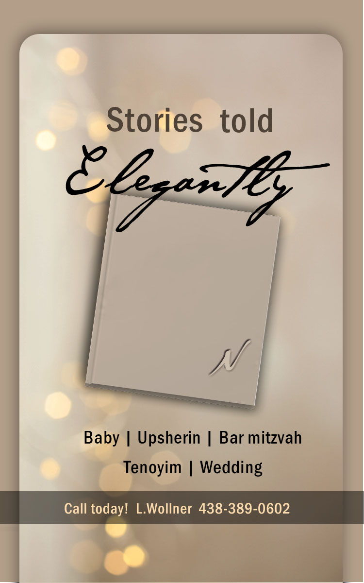
Its really getting there!!
I would do another color and that color should be incorporated in another place as well to pull all the colors together.
You can do a pinkish color and then have the N on album be pink as well or the lines between the words pink…
I’m wondering if you should add a sample of an inner page spread or replace the cover.
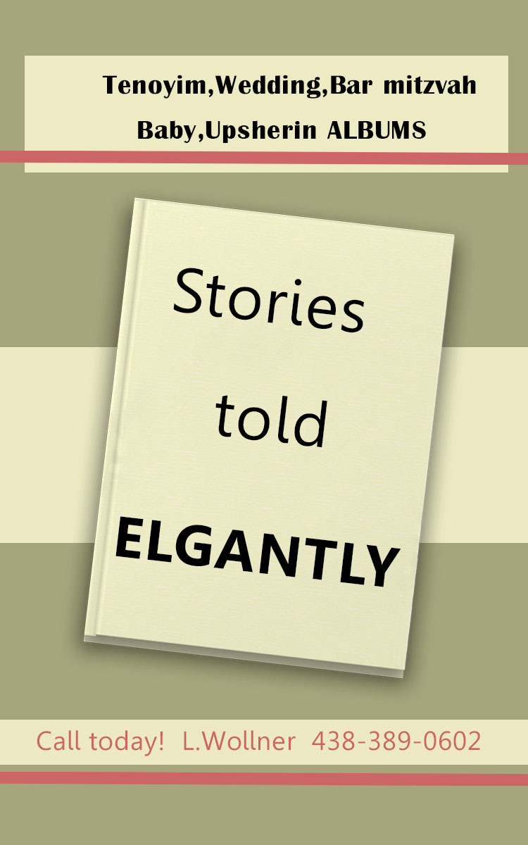
after playing around a lot this is what i came up with.
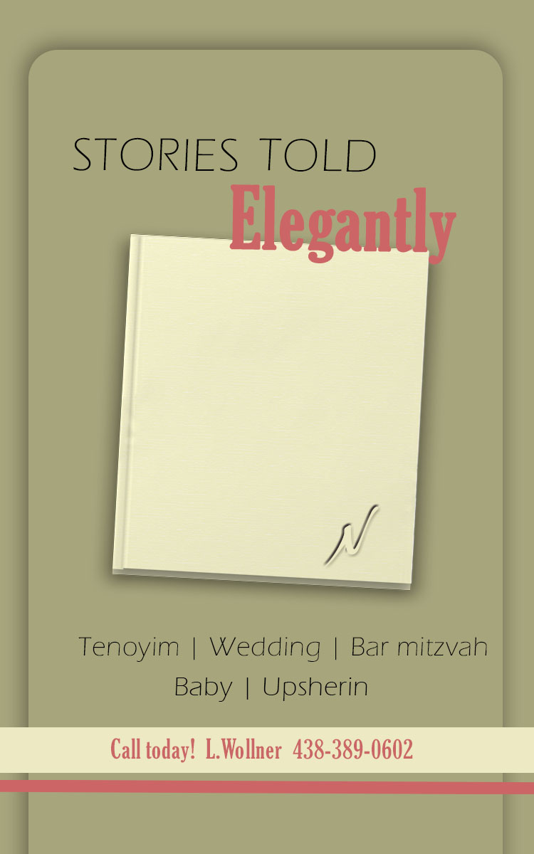
What do you think about the color of the album?
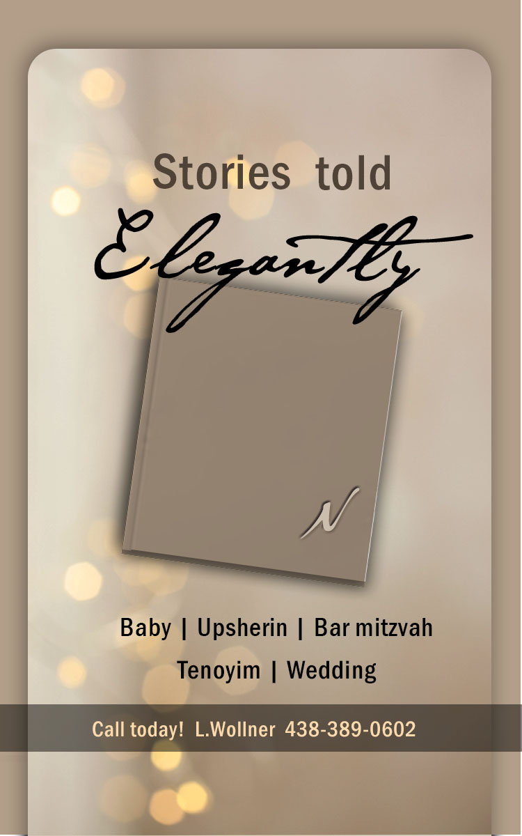
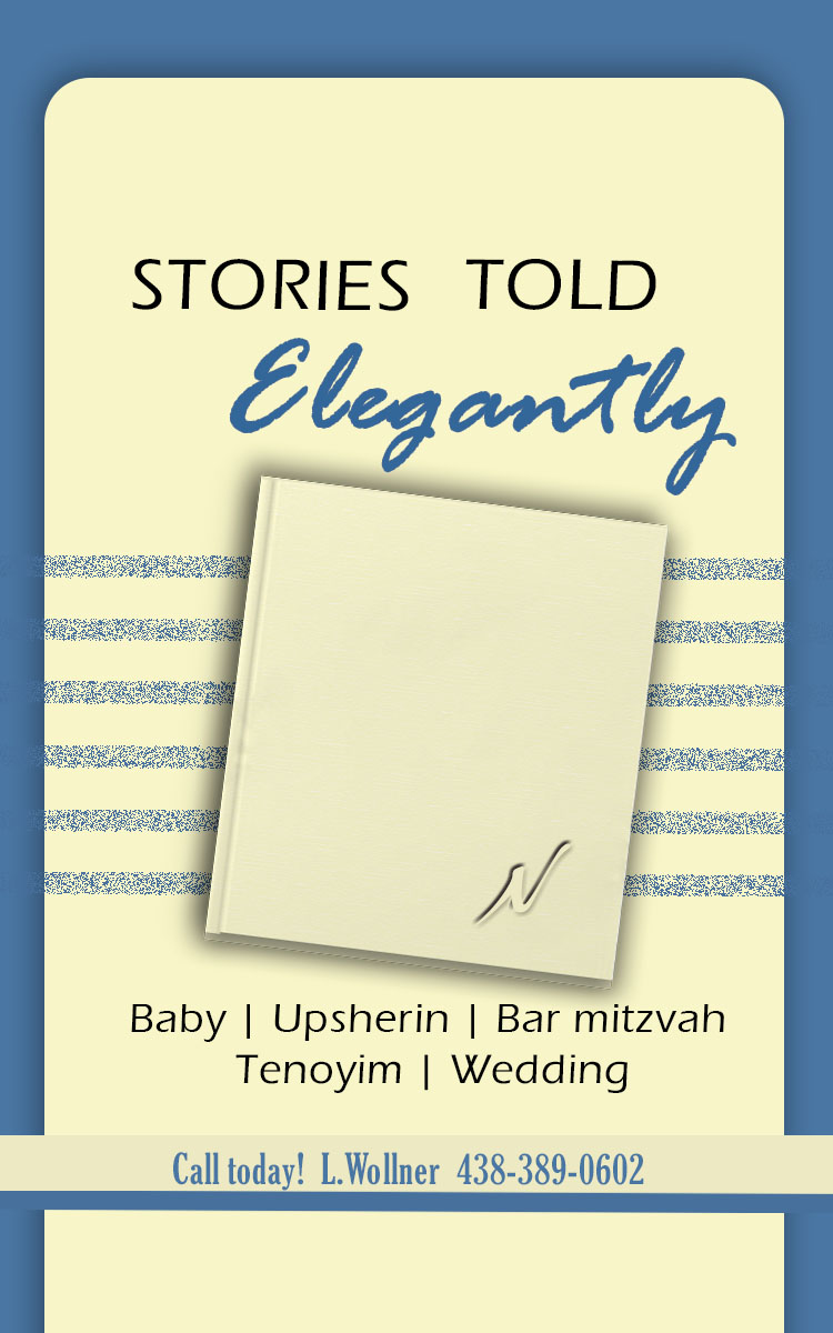
I vote for the last