I was asked to design raffle tickets for an upcoming event.
I would like to know which one is better.
The second one is the real logo (it has more white, the first one i took off some white)
I’m open for critique…
I have to send it in to print asap so if someone could tell which one to enter
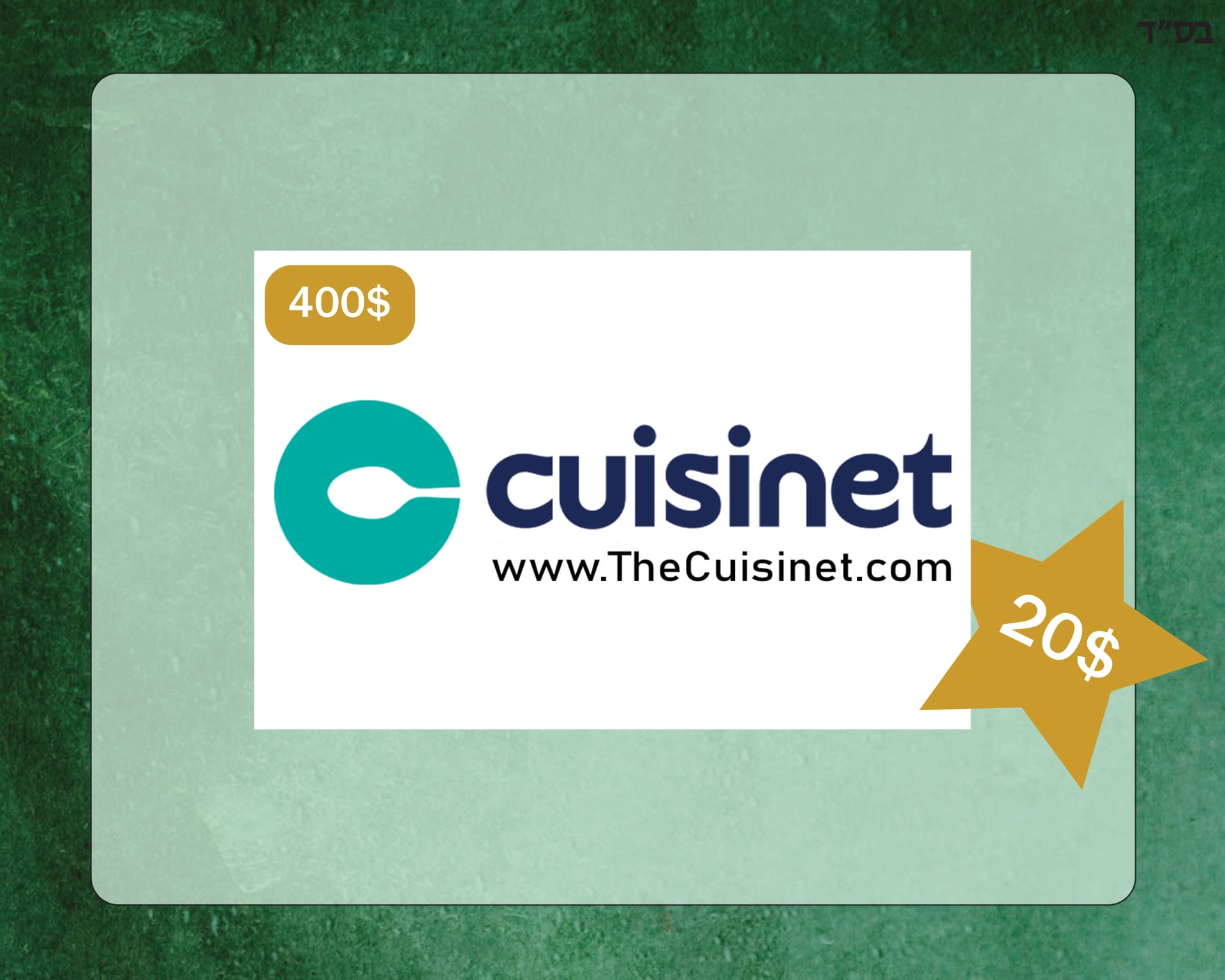
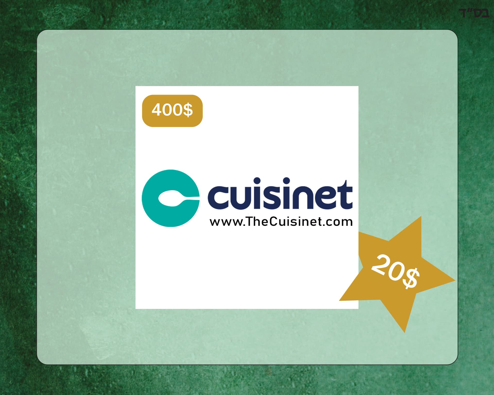
The background colors was used for the invitation so they wanted me to put all raffles on the same background


I had to send it in already but I would still like some critique for the future
Don’t know if you made the logo, but the hidden spoon is great 
From these two options, I’d vote for the first. Which one did you end up going with?
I think you did a great job.
For the future, I would have the star be in the same place on every ticket. I don’t see the need for it to be on top of the image.
I ended up using the first one.
i got the logo from the store