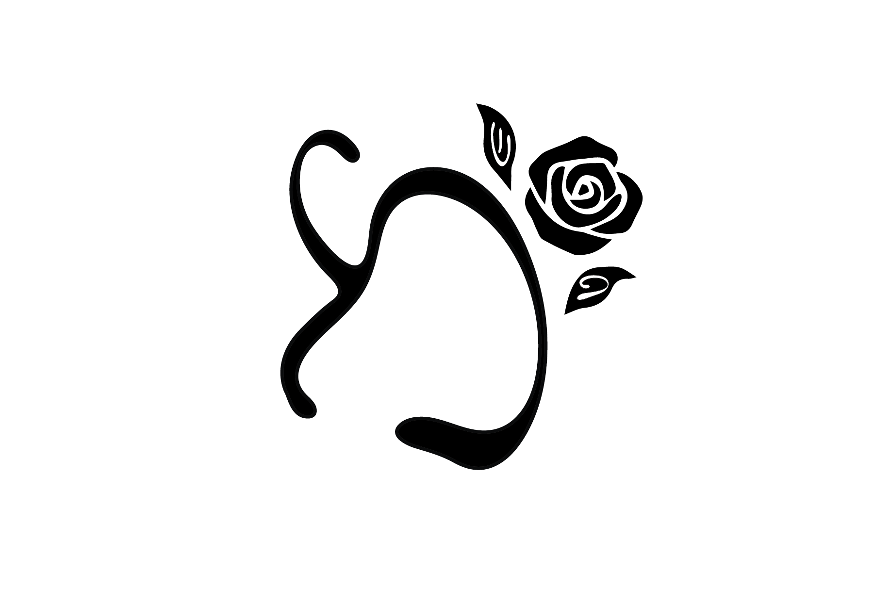
Its my first monogram so I want feedback on the general design…
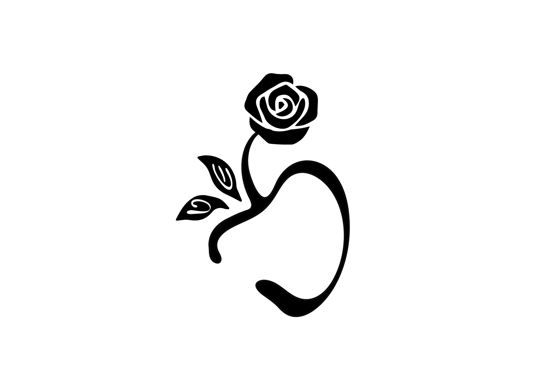
Can you see the main letter and 2 smaller letters?
Yes, I see the letters
I prefer the first one
I vote for the first one too
I like the first layout better but the 2 smaller letters are clearer and more noticeable in the 2nd( I dont love the upside down letter in the first) in general, I try to make the letters more noticeable- ie:the focus and the flower - the extra design. more the accent… also. when I look at the big letter- im seeing an apple- is it just me?
Also, instead of making the letters be neg space in the leaves, can you make the leaves just out of the letters by warping the shapes of the letters somewhat?
If it’s not clear what I mean, let me know and I can try to post a screenshot.
thanks so much for all your feedback everyone! turns out she wants an entirely different style…
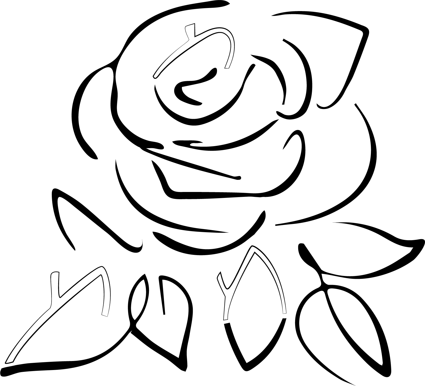
love the style of the flower. I just always feel that a monogram should be made up of the actual letters maybe with an extra line or 2 as opposed to hiding. the letters in a big image. it loses its sharpness and clarity
I know, I agree in general. But this is what the client wanted - this exact flower with the mems like this 
Curious, is the flower a design you downloaded or did you draw it?
I did an image trace and fixed it up but didnt draw from scratch
Thanks!
Nice!