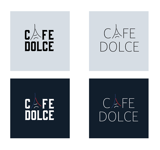
Which one is better?
Is the A/ Eiffel tower concept clear enough?
Critique?
TIA!
Top right. The thinner font gives it a certain class and sophistication. I like that.
I like the thinner font and lighter background, but also the red and blue on the eiffel tower, maybe combine it.

