Hi,
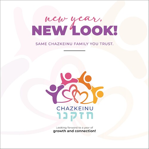
I would love feedback on this rebrand announcement post. Do you think it’s childish? (the organization services women)
Is your question on the post or on the logo design?
I’d say to stick to less colors, take out hte orange and yellow and blue and replace with tints of the pink and purple. I think that would make it more feminine…
I like the design overall, I just feel it’s too many colors…
Also, logo text I would justify it between the 2 stick figures aligned right and left… Not sure if it’s clear what I mean. Sort of to spread out the words somewhat more…
Thank you so much!
Sorry that it wasn’t clear. The question was about the post. I didn’t design the logo.
the post is perfect, its the coloring of the logo that’s making it childish. so if you didn’t design the logo then there is nothing you can do.
(you can suggest they change out some of the colors of the logo)
Yes, I agree with @chavi
The post is great if you can’t do anything about the logo…
It’s really pretty! It looks like it’s geared towards teens, but don’t they service a lot of teens? Adults also, but I think its okay
Thank you everyone! Your feedback is very helpful 
