Hi,
Made this ad, but not happy with it… not sure whats bothering me…
Think there is way to much info, but client needs it all in.
Any tips?
Thanks
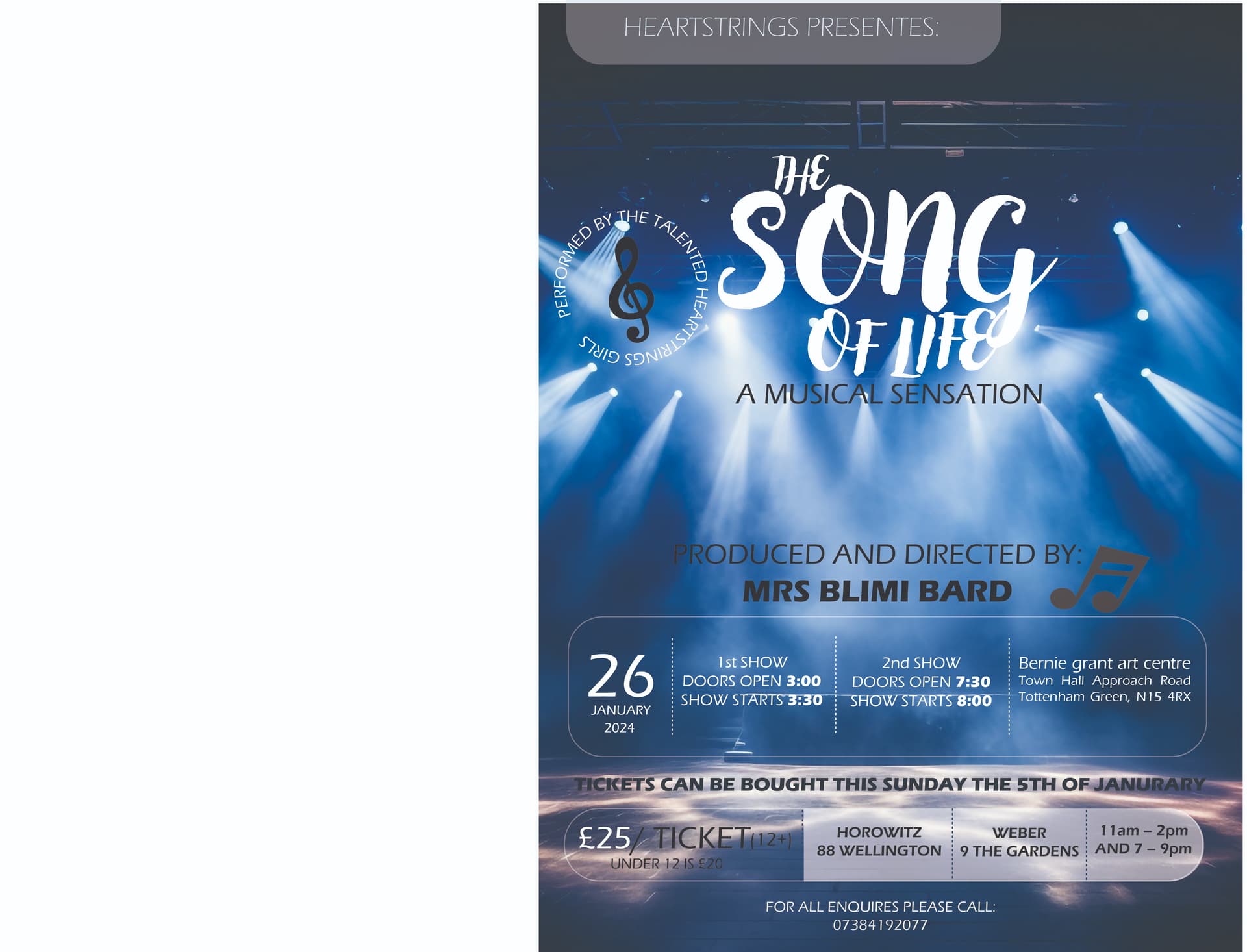
Im wondering if you can get the background to be darker and sharper so you see the white text better.
The bottom looks very squished. Can you make some of the info smaller?
Nice!
I think that the background picture is a little washed out…and also making the words blend in too much.
I would make margins smaller
smaller thing, but i would close up the gap in the circle around the music note
Its really nice!
Some small corrections I would try:
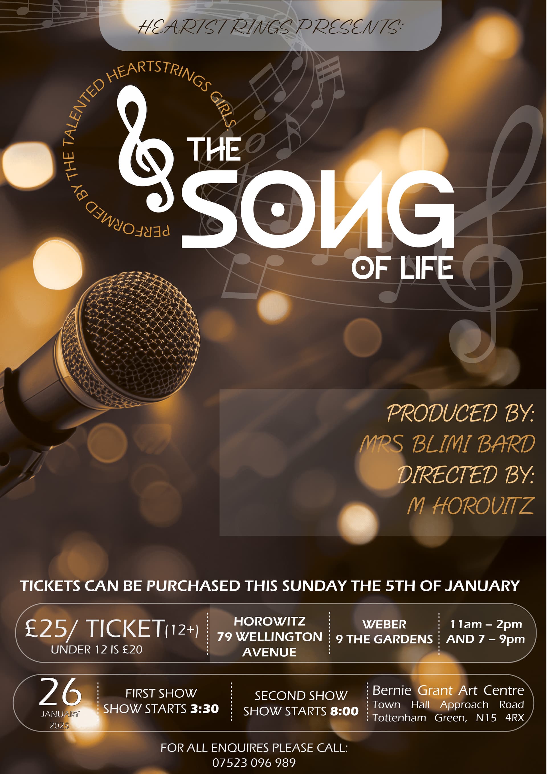
1 Fix the background behind the G of song to remove the lighter part there. That way the G won’t get lost in the background.
2 The circle ‘performed by the talented…’ can be much smaller so as not too take away focus from the title and the rest of the information
3 ‘for all inquiries’ does not look centered but it could be I am wrong about that.

I liked it better without.
Dont like the font for ‘the song of life’, but couldnt find anything…
what font would work?
looks great, you have quite a few spelling mistakes so spellcheck the whole thing!!
try switching around the mike and produced and… so the text can be left aligned. and make the circle performed by… much smaller
at the top heartstrings presents also try switching it to the other side.
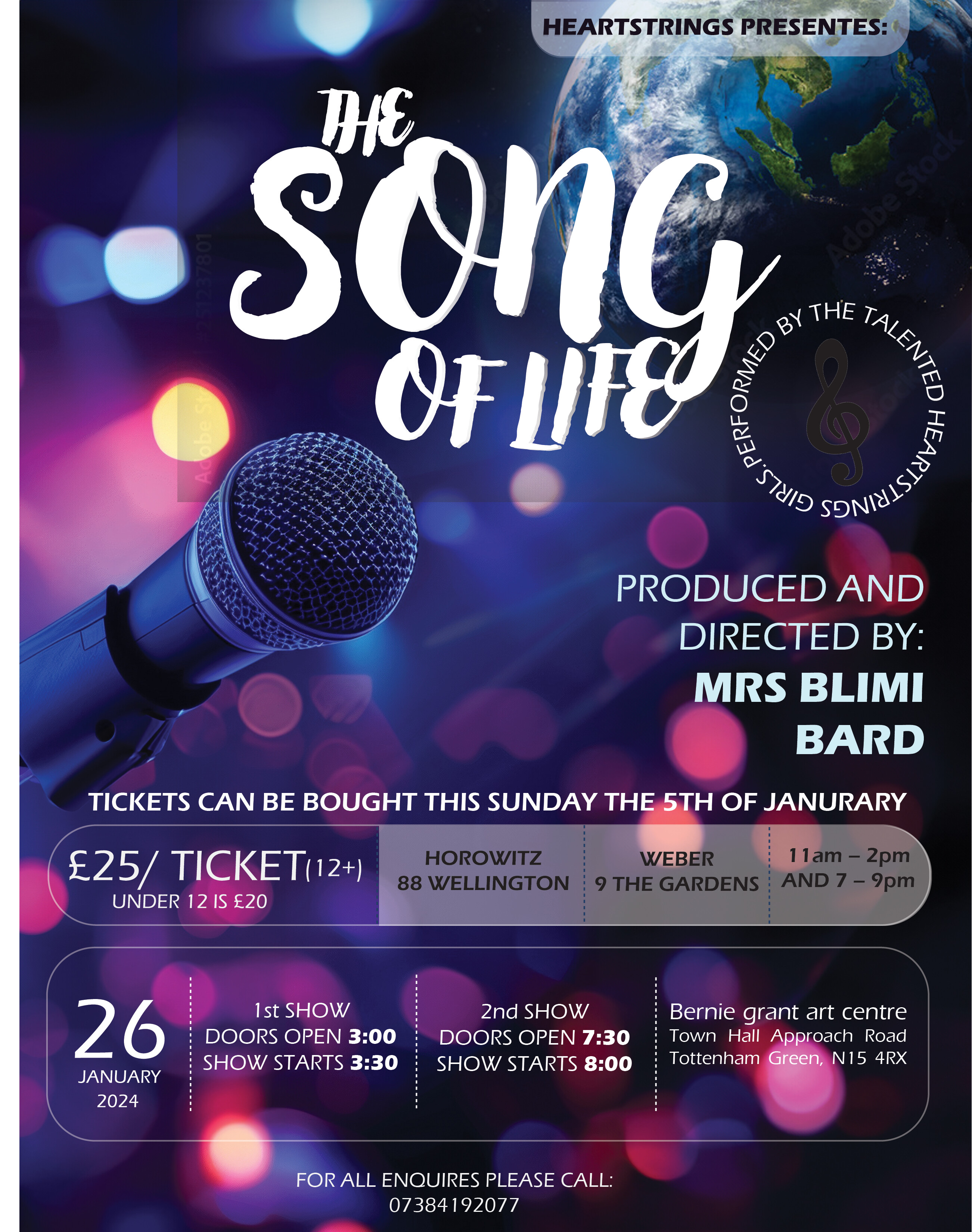
another thing remove your logo its way too big! and the globe is nice adds dimension.
maybe try to get the addresses a bit brighter too
Thanks so much!
My logo is there just as a watermark…
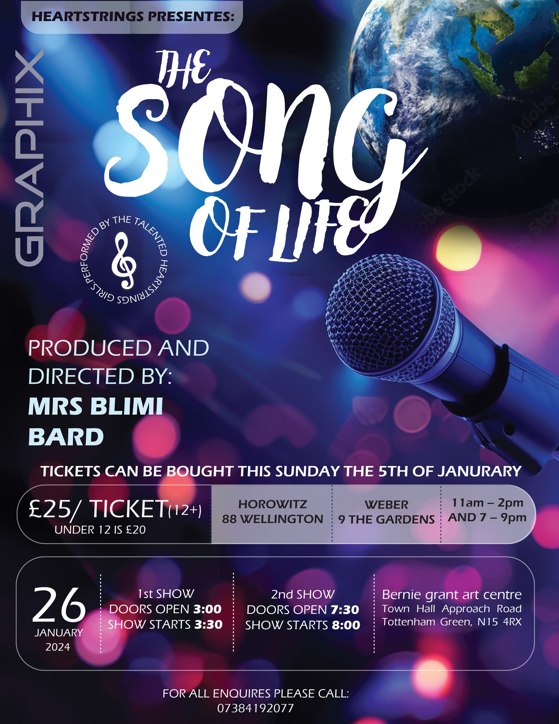
It has to be way smaller.
usually emails are in font size 6-8pt i think
@sarahgreenbergmn please clarify what needs to be smaller
I think Sarah’s referring to your logo… It’s huge, should be tiny.
I don’t think it is the best thing to use as a watermark in general since client might assume that you meant it as your signature.
Sometimes I see ads in the papers that have huge signatures which looks very unprofessional…
If something, better to watermark it with the word draft or similar…
All text on ad is taking up too much space and making it look very cluttered. Can you make the bottom rectangle smaller, there is plenty extra space above and below the text? then move down all text above that rectangle so you have more breathing room in the middle.
I’d also take out the callout, ATM it’s just making everything feel more cluttered as well.
yes, i meant your logo
She wanted black and gold… so changed the background colour.
Here is the updated version, any other changes?
Thanks
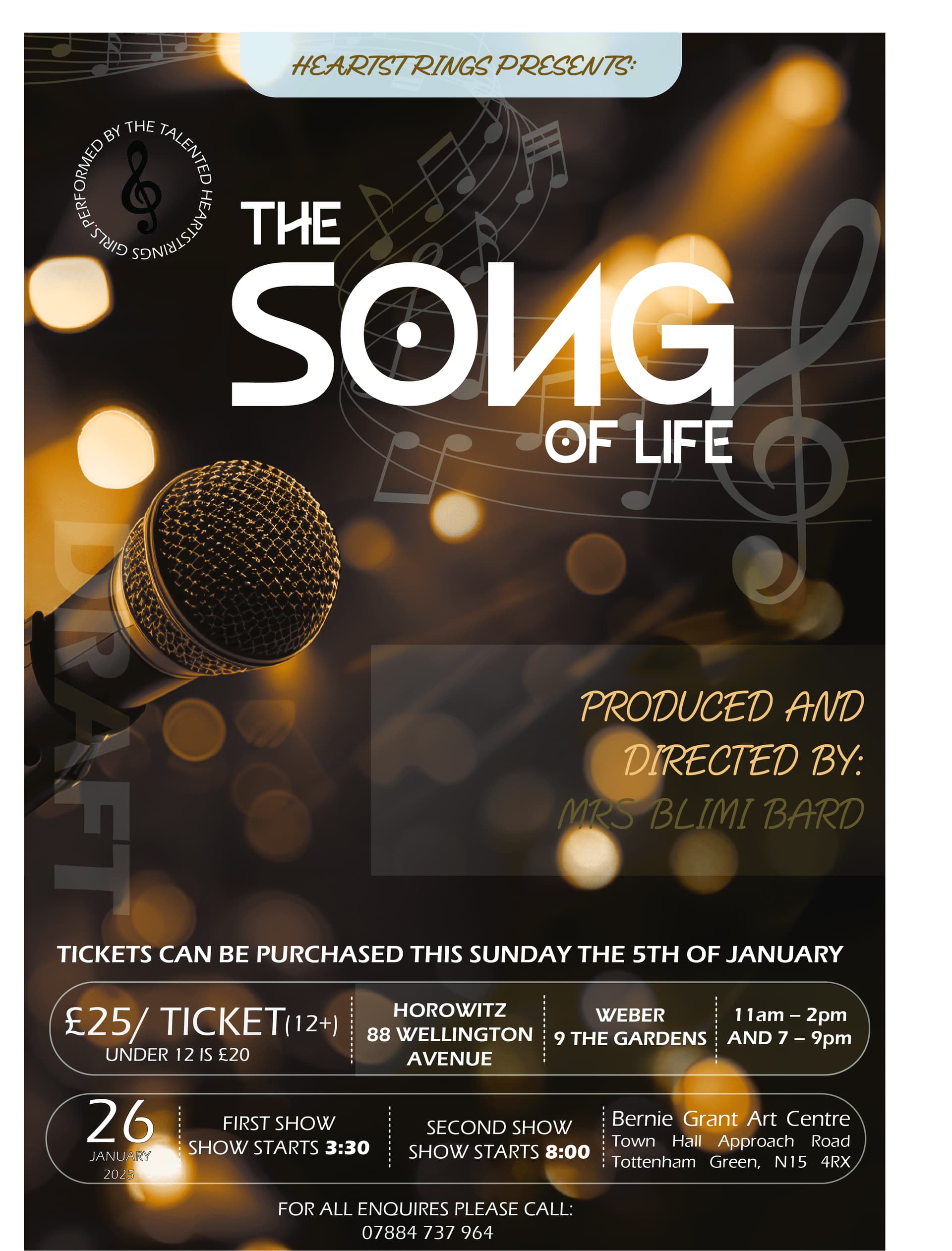
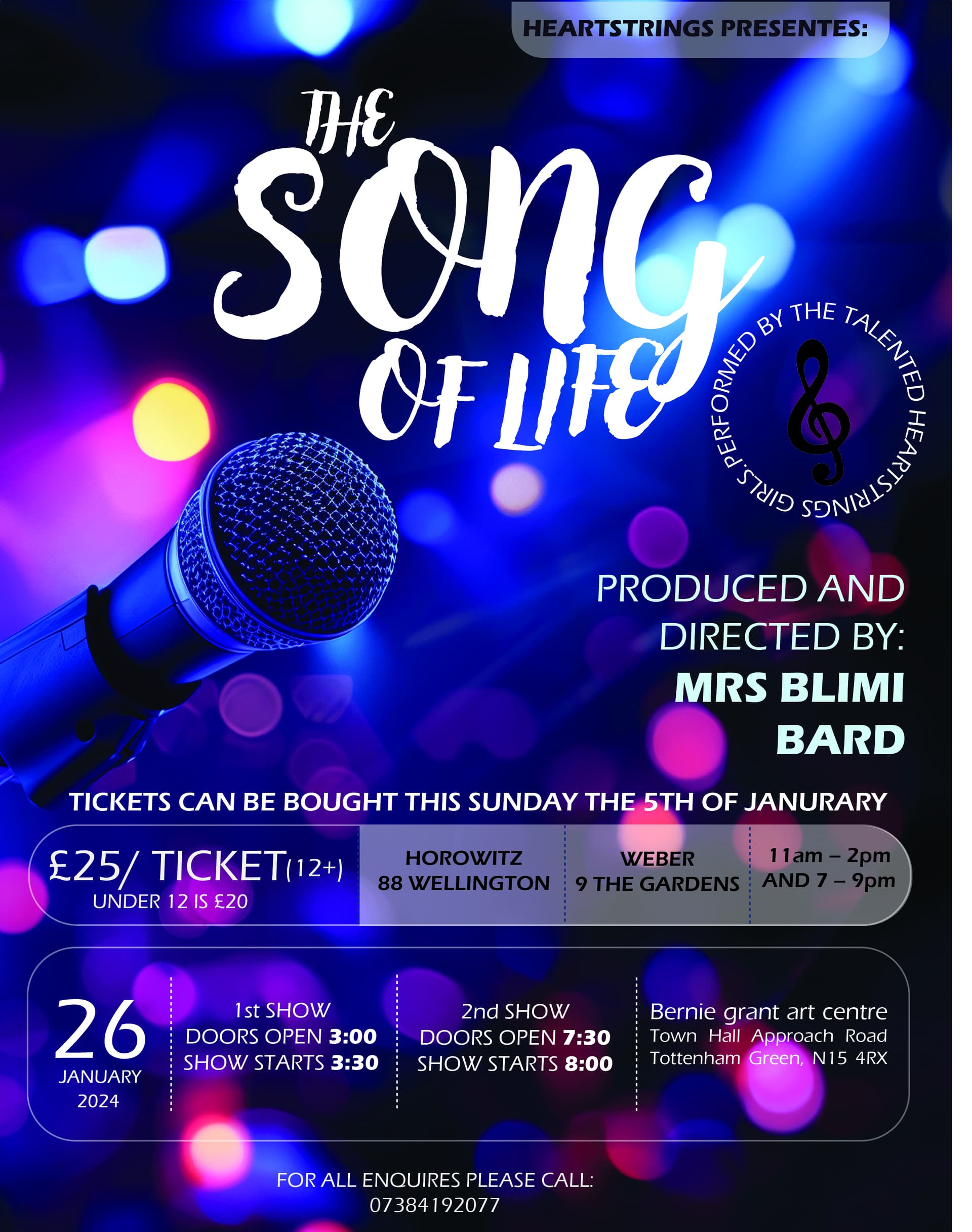
I really like it now! you can make the background box thats behind produced and directed shorter there is lots of extra space on the box.
Also the musical note in the circle icon is hard to see because its black.