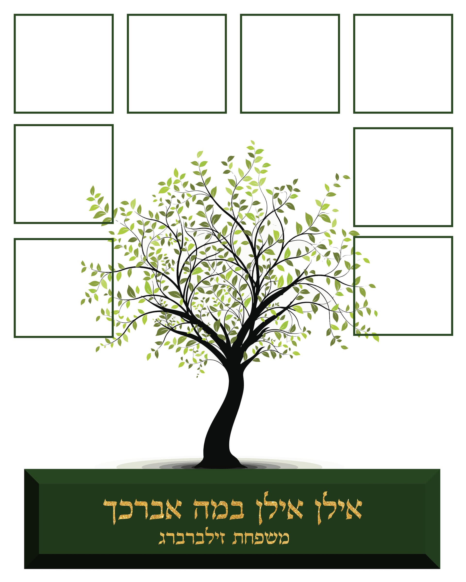
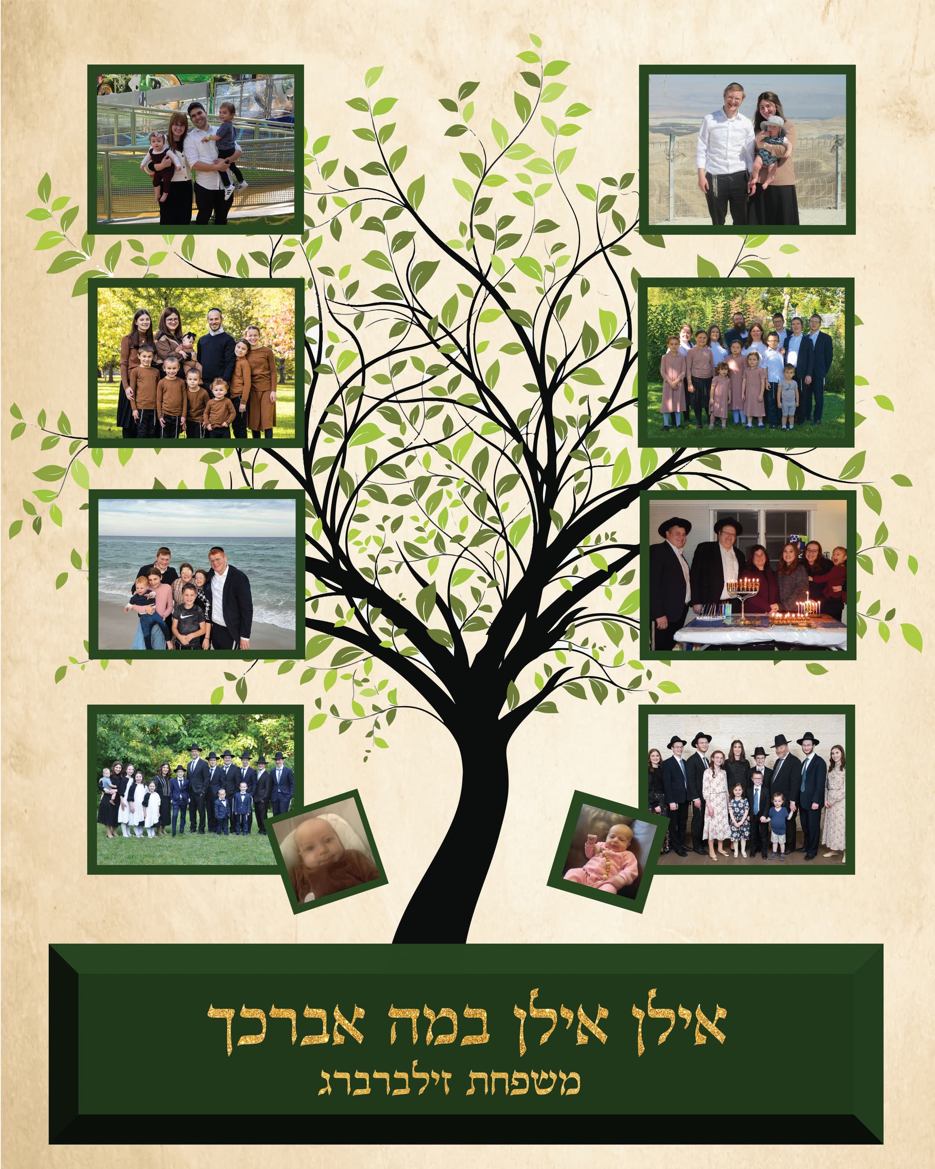
What do people think of this? it is for a grandparents anniversary and every box is going to have a family picture in it…it is going to be printed on a 16x20 canvas…my one specific question is regarding the blank space towards the bottom, between the last two frames and the box with the words- is it too much empty space, or is it fine? I am not really sure what else I could put there…also, should i change the background color or leave it pure white? I feel like plain white isnt so nice, but I am not sure what else there is to change it too…
How about just putting a light textured background, like a green and gold marble? Make sure its very light, though, so it doesnt take away from the tree.
About the empty white space, pictures are usually rectangle - either landscape or portrait, so maybe you can make 2 last frames on the right and left a little more rectangular/portrait so it ends up taking more space?
Why dont you just make all the boxes bigger so it fits nicer.
(In Indesign) you can make one box starting from where you have it until the green and then by height you can divide it by 3 - so lets say the height says 12 inches
do like this 12 in/3 and click enter - it should give you one box - then just copy it two times to get another two boxes. If what I am saying is getting confusing, maybe I can take a screen recording…let me know
regarding the background - I think you can use a nice tan rustic background…
I did something like this and used a background like:

thanks all! the problem is that the pictures are all different sizes and they won’t all fit into the same size frame, if you get what I mean…I ended up doing something like this, waiting to see if they like it! (still missing the last two pictures and the smaller pictures are babies that were born to those families after the bigger pics were taken
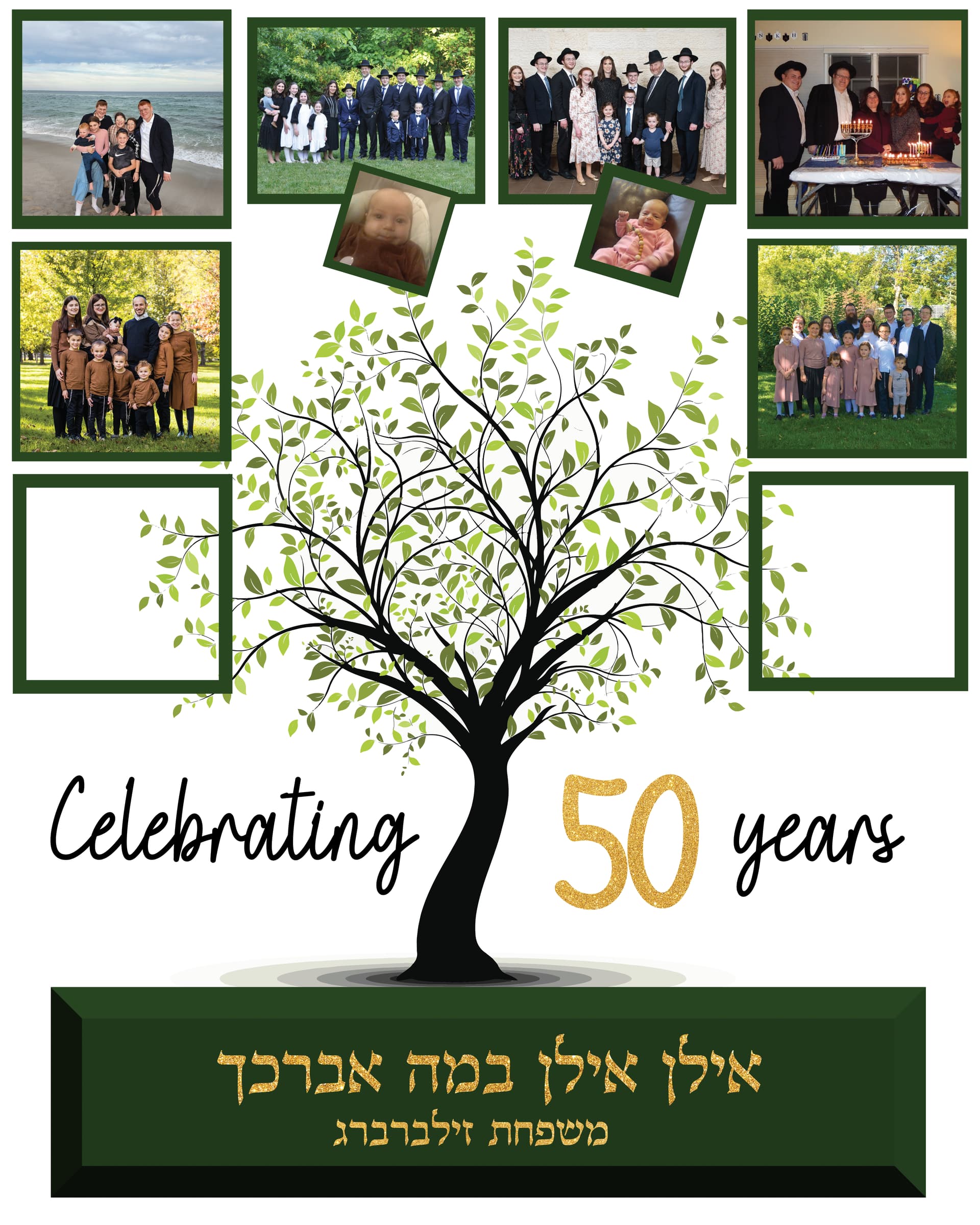
50 Years-01|400x500
going to add a tan background and see how it looks
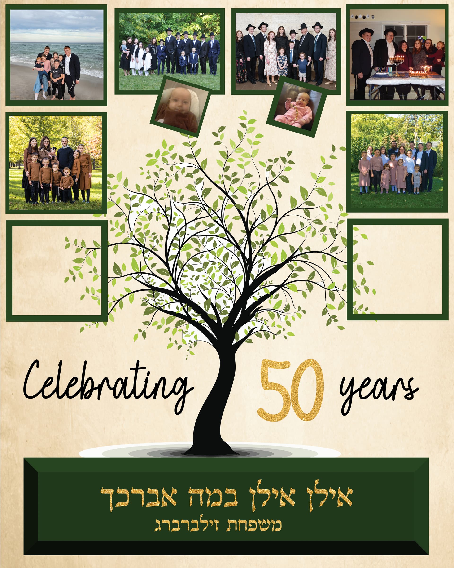
Beautiful! The tree should be above the pictures so that the leaves are not cut out on the edges rather hanging over the images
I love it! Its gorgeous! Great job 
thanks! so they don’t like the congratulations on 50 years, they want just the plain Hebrew text, so I rearranged it like this so that it isn’t too top heavy…what do people think of this?
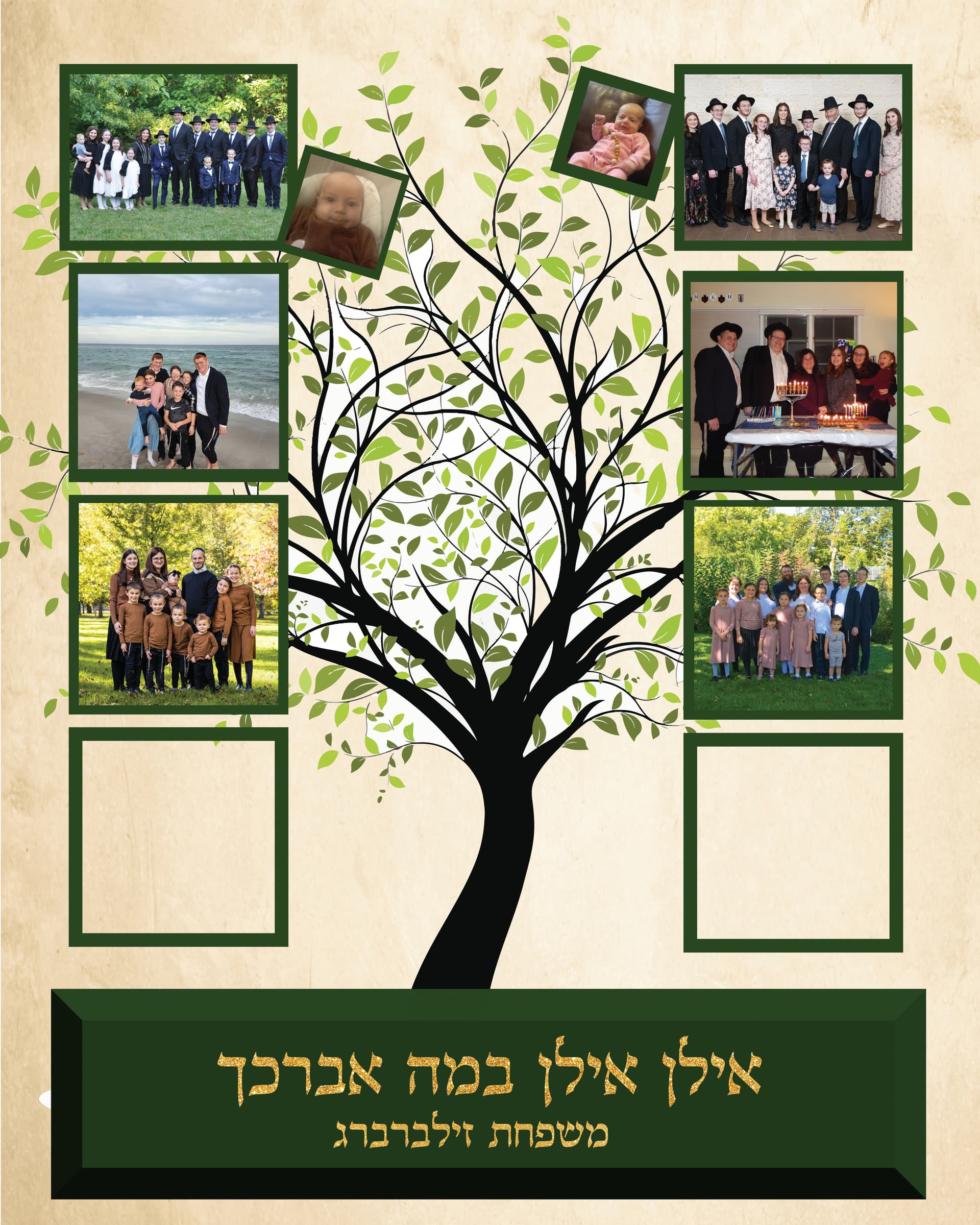
I like it best like this
Can you align the boxes perfectly? if it’s going to cut off the picture - make the picture smaller but the frame should align perfectly to the boxes underneath.
The top boxes are bothering me a drop - can you put it on the bottom in the empty space near the tree?
@Breindy-S by the top boxes, you mean the smaller ones or the bigger ones on top?
The small boxes that are on top of the trees
they have to stay attached to the pictures that they are attached to though because they are babies in those families that were born after the picture was taken…but i just moved those pictures to the bottom
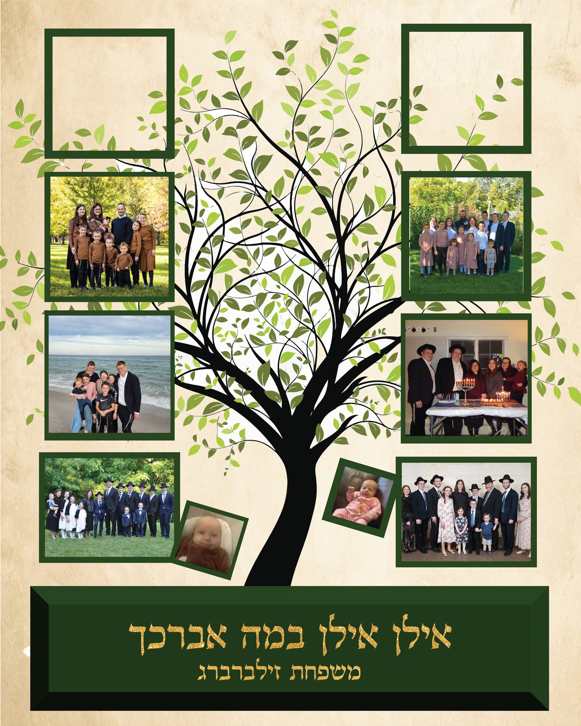
Wow! the background makes a huge difference, and i also like it better with the 2 columns of pictures rather than all around. I would just make all the boxes a little wider, its bothering me a drop that the bottom ones are wider than the rest . You can probably zoom the pictures up a little so that you get more room to widen the frame (hope you get what mean… :))
here is the (hopefully!!) final one!
@Rivkys I did make all the boxes wider and you are right, it looks much better!
Beautiful job!!
You might want to have equal margins on both sides of the page - meaning space from end on photos to edge of page…
it looks amazing!
agree about the margins spacing…