Hi!
I am working on this logo for a family Reunion… Any suggestions on how to improve?
TIA!!!
Shabbos_LOGO (2)|500x500
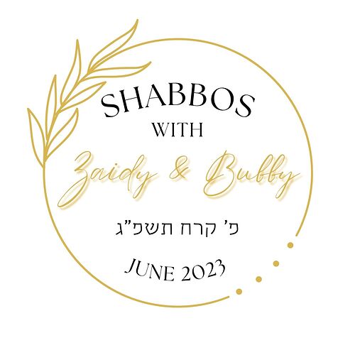
I like the top one better but the ‘Zaidy & Bubby’ is a little hard to read, between the thin script font, light gold color and the shadow
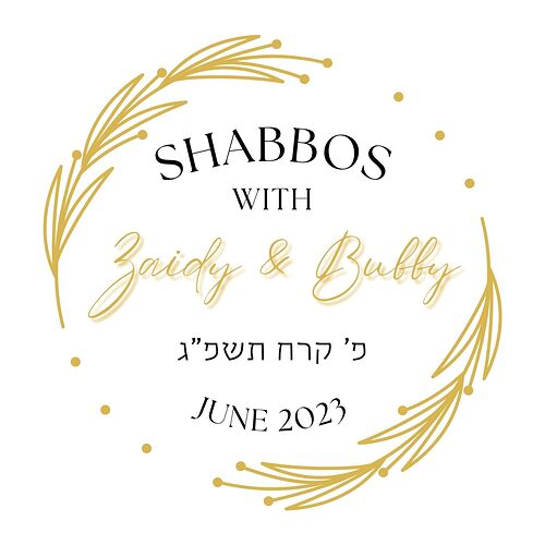
They’re both really nice. I like the second option better. I would not put a shadow on the words Zaidy and Bubby. I would recommend using a bolder script on that part instead, and using a lighter weight font for everything else. I’d suggest sticking with two rather than three fonts for easier legibility. If you can give a little more space around the inner edge of the circle, I think that would make things feel less crowded also.
For ‘Zaidy & Bubby’ try to find a script font whose weight closer matches the design of the outside circle.
I think it can also use a sans serif font for the text that’s currently black
I like first one. Would remove the 4 dots, and just have the complete gold circle. Sans serif for black text and as mentioned above a more bold Script font for the gold text. I would make all text slightly smaller to give more breathing space especially where the leaf is.
I would also try adding a single leaf which the circle should continue from there…
I like the dots on the second one, it has a note of fun.

