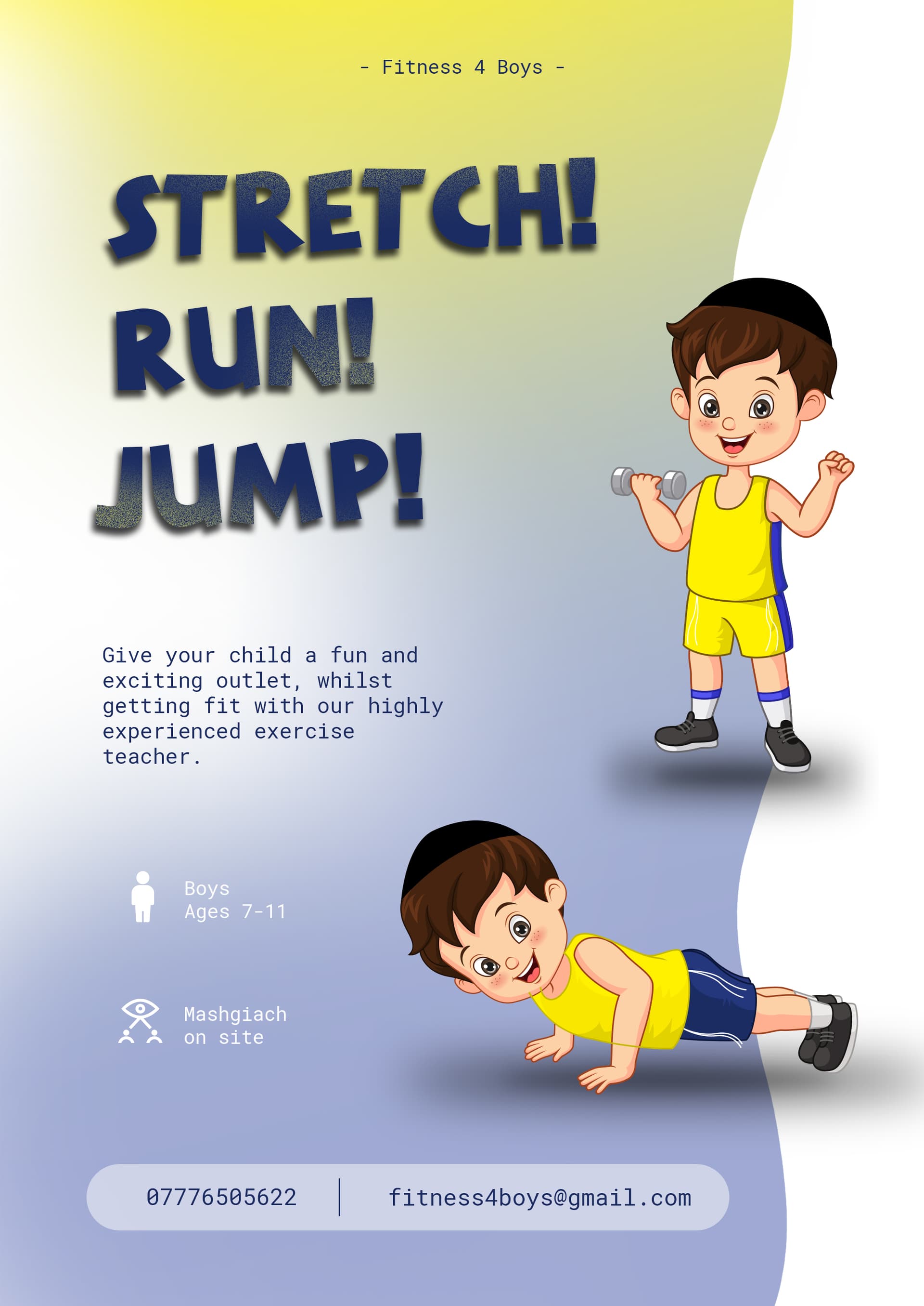
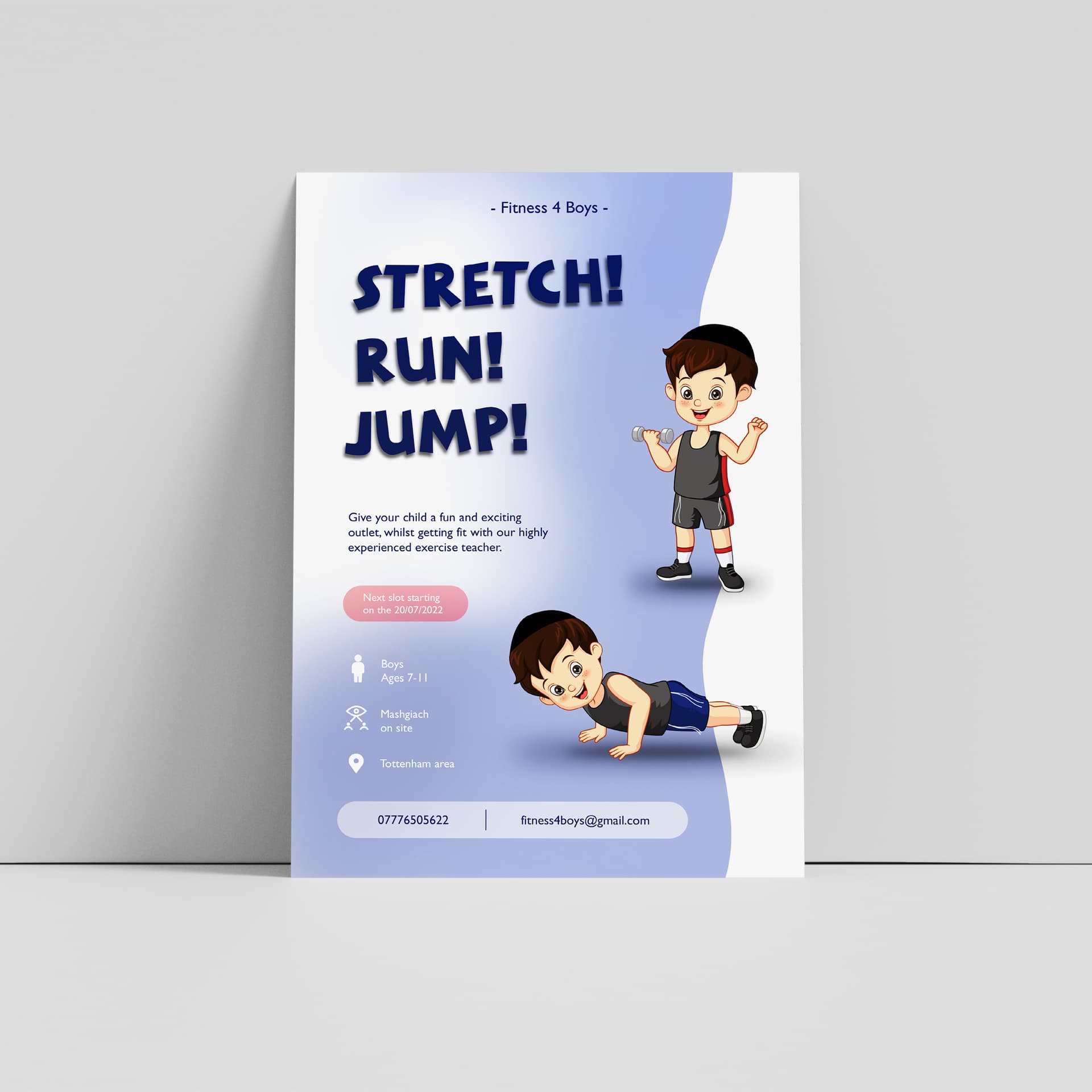
Hi, In middle of making this ad for a client!
All feedback would be appreciated please! for the copy too as did that as well…
Hi, In middle of making this ad for a client!
All feedback would be appreciated please! for the copy too as did that as well…
Really cute! I love the illustration! I know little boys can wear sleeveless, but could you add short sleeves - I think it will look more refined (and more people will be able to relate to that kind of image)
The top -Fitness 4 Boys - should be made larger - is there a logo that you could put on the top instead of those words?
I don’t love the yellow in the words (stretch, run, jump) - it would look sharper if it is a solid color - you could also maybe add more interest to the words by stretching the word stretch - make run - italic, and jump - have the letters one up one down… not sure if I am being clear enough…
Align the icons with the paragraph of text. The copy is good.
This is so cute! Not a fan of the “typewriter” font for this. Doesn’t have the right feel. Maybe change up the sizing of all the small text so they’re no all the same size.
don’t love the typewriter font either…
Just curious what do they mean by ‘mashgiach on site’?
overall it’s really adorable and fits the audience (pun not intended!), i like the overall layout. i also agree with the feedback above about the fonts… esp the fitness 4 boys i feel it should be more of a logo
Thanks everyone for your help! I also think a logo would be better but the company doesn’t have a logo so not exactly gonna make one for them for free!
@Breindy-S i also think short sleeves might be better but will be a lot of work so leaving it like this for now and if the client wants it will do it…
@shevy mashgiach means there will be jewish supervision as the teacher isnt jewish…
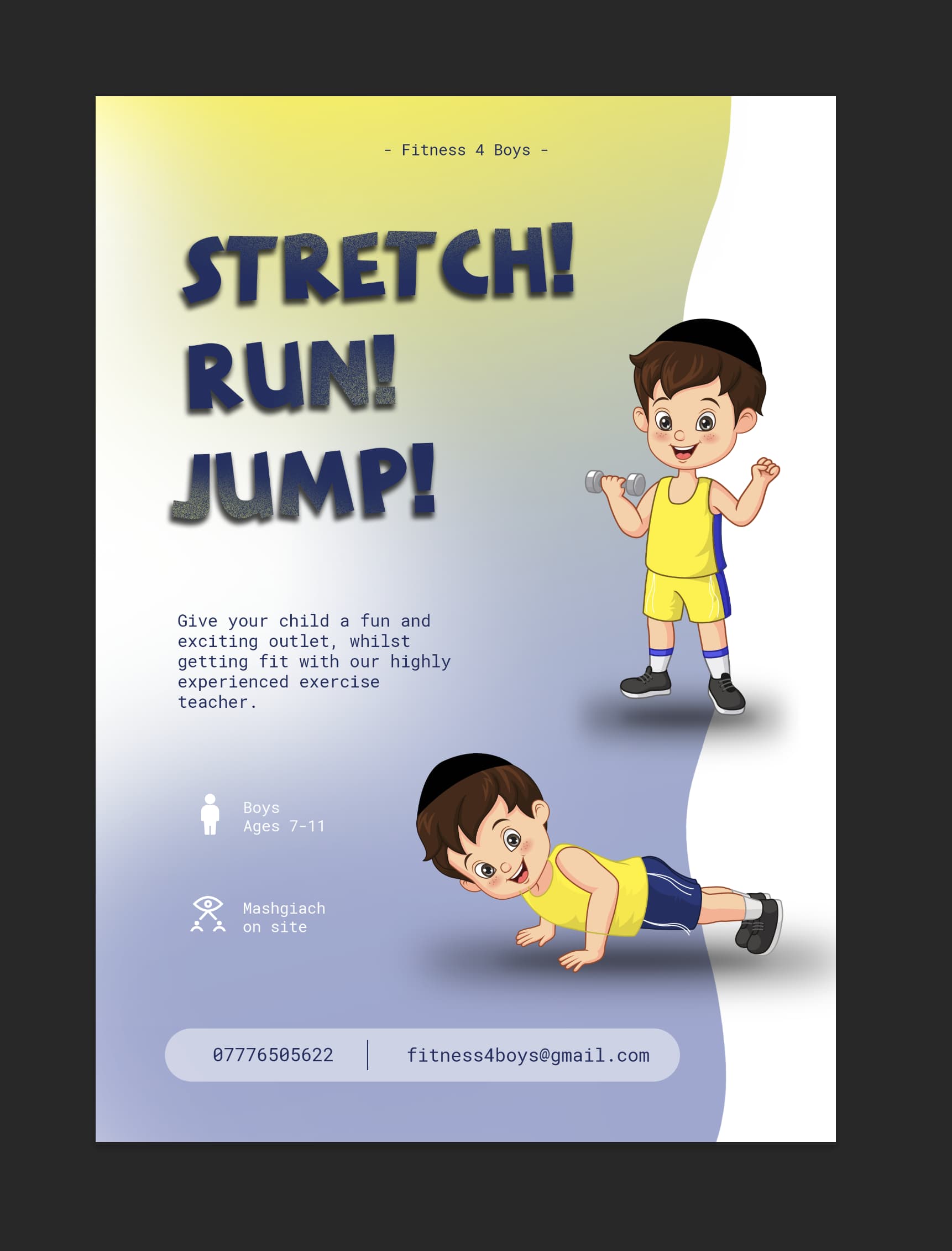
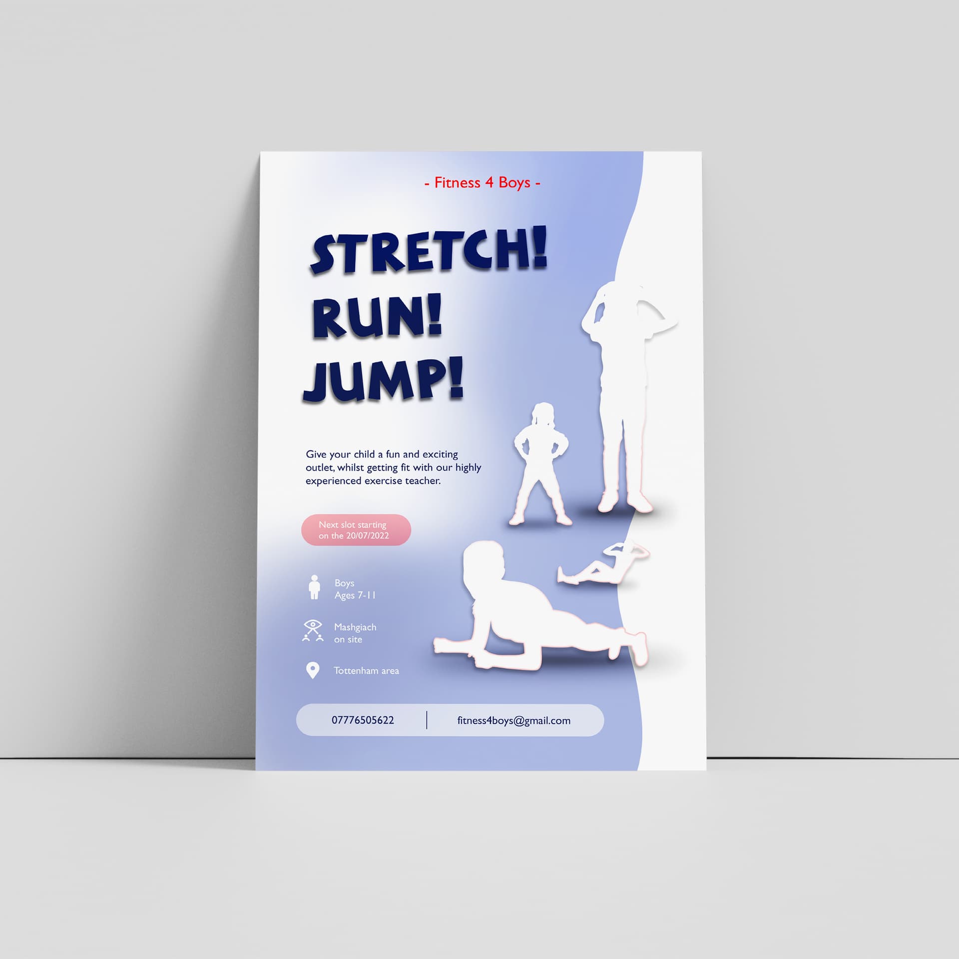
Here is the updated version… any further critique before i send it to the client??
Its really really really cute!!! where did you get that boy image from?
Thanks! its from vecteezy and i edited it a bit. the client just came back saying that they think its too immature for the age range but im not sure i agree… they think its more for 5 year olds when the ages is 7-11.
What do you guys think?
I think its perfectly age apro, whats putting them off the boy? Does he look too little?
Also, the ad has to catch the audience’s eye. This looks fun and cute.
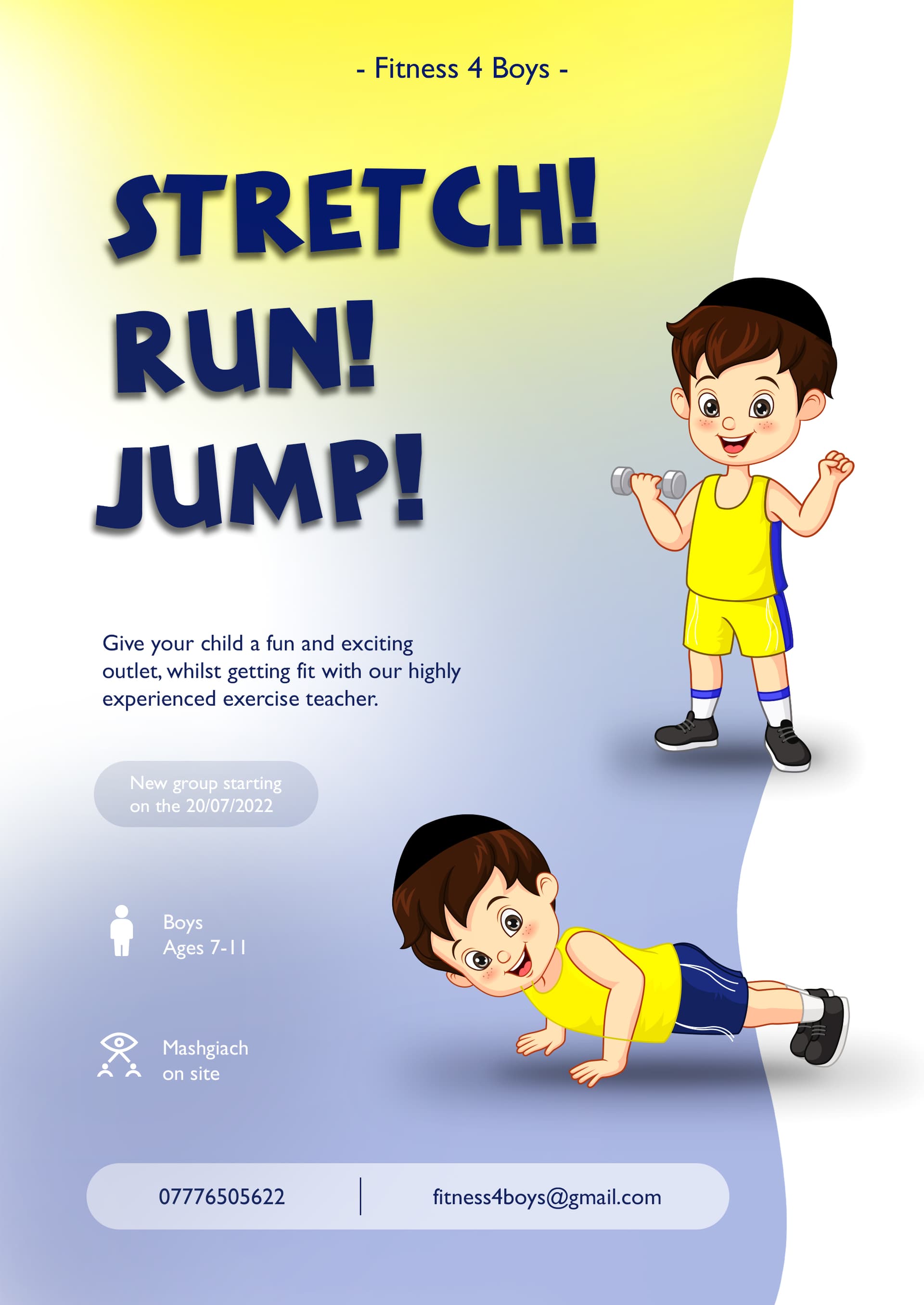
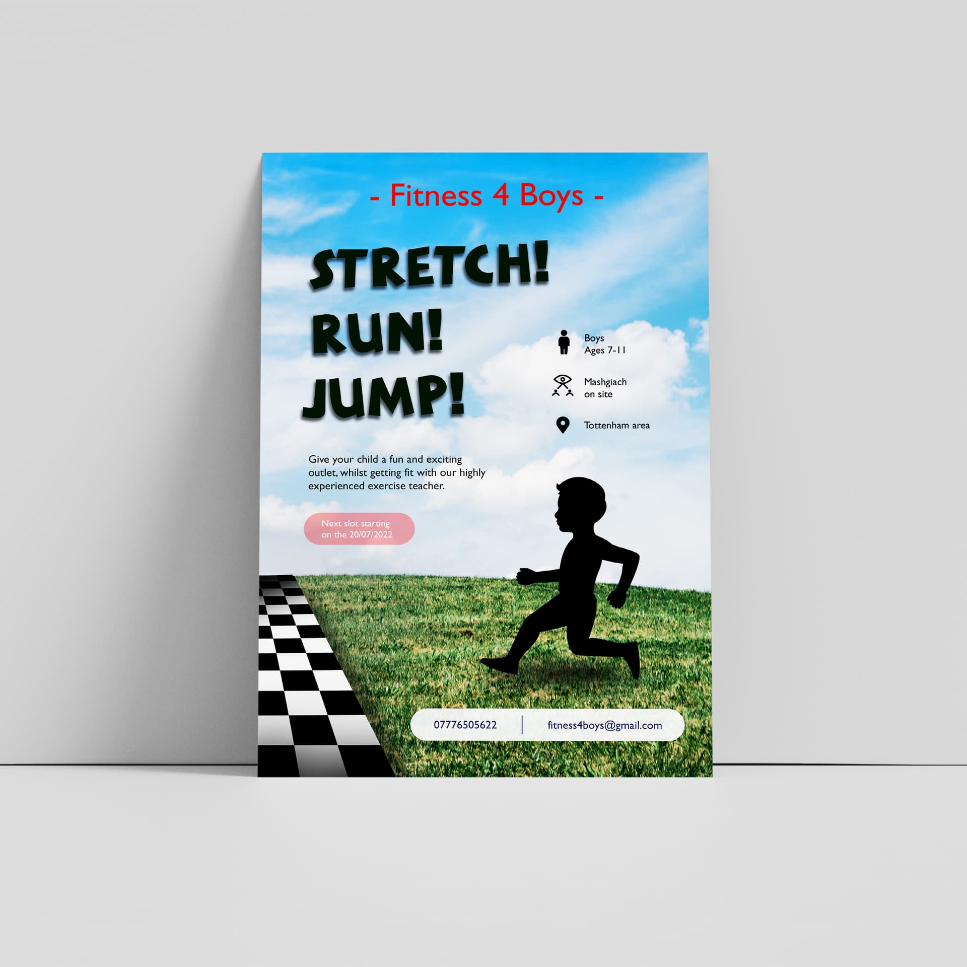
Maybe if you straighten the colorful side to straight,![]()
it will give it a more mature look?
Thanks i agree… tried it straight but takes away too much🙈
No I like the curvy look!!
7 - 11 year olds are still a young audience so you could still keep it fun, but maybe try another version without the cute boys
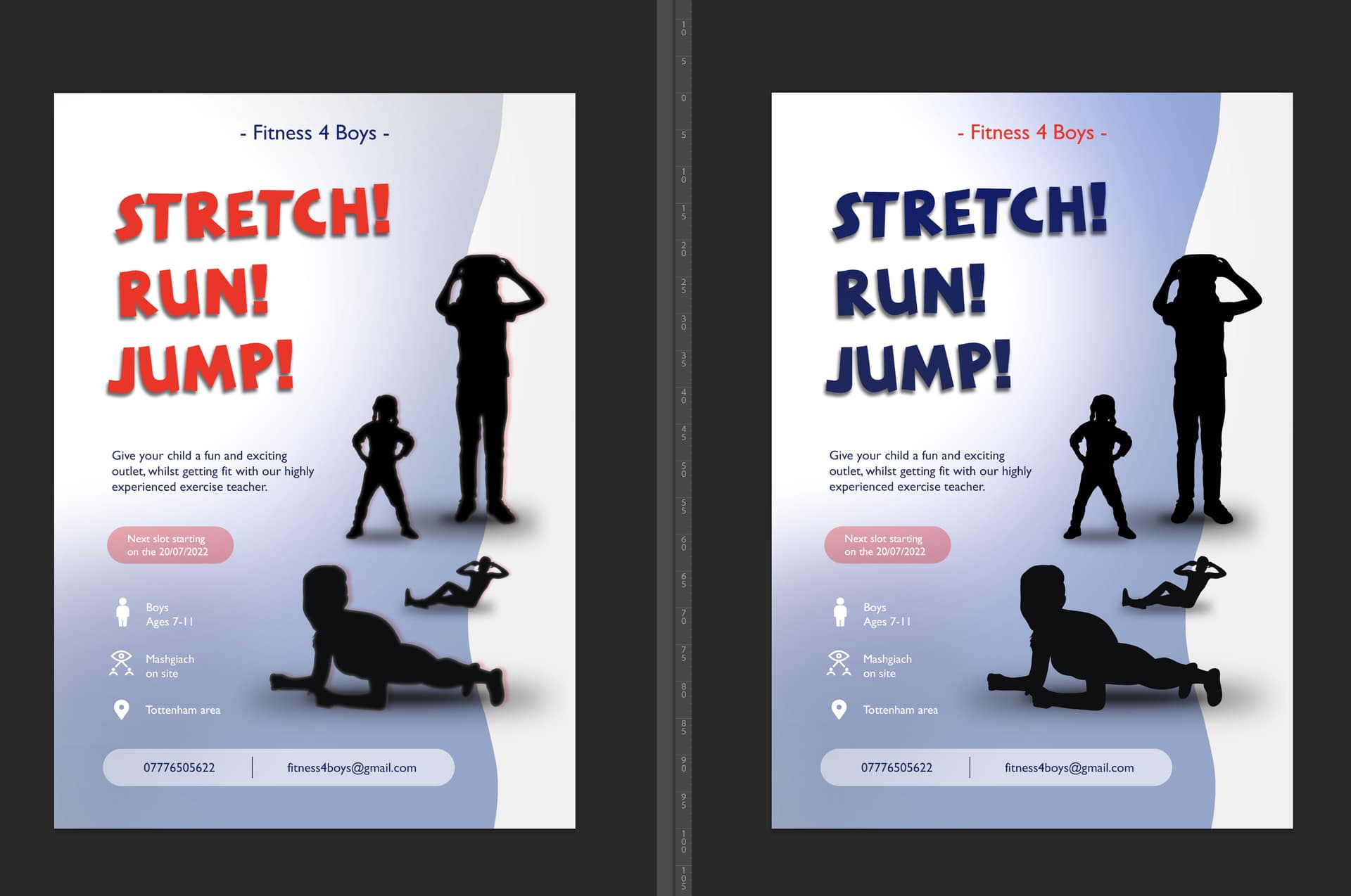
Hi! wanted to update you… having a bit of a rough time with this one…
see below i changed the ad a bit to give it a more mature look which i thought will make the client happy…
but then the client got someone else to give their opinion and she was like no u need to do the whole thing different… so i tried something like this:
but then she got angry at me and said its so basic😣 and proceeded to give me an exact picture of what she wants i should do… obviously most things going against every design principal possible! and different to what the client told me originally…
I tried listening to some of what she wanted and this is what i got… I really dont like it and don’t think its fit for purpose as the classes are taking place indoors… but gotta do what we gotta do…
what do you guys think?