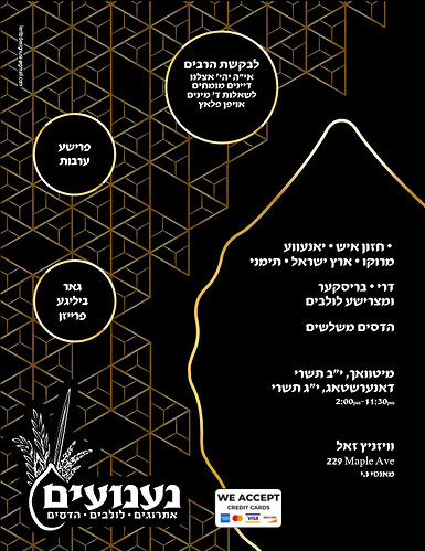
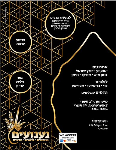
any critique on this? im trying to match it to the banner and signs
its to much black it needs more color
where would you put it?
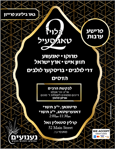
these are the other banners that i’m trying to copy the style
and here was my original idea:
make everything on yours bolder.
Overall it needs a bit better hierarchy-there is a lot of info here and it is all running together somewhat because there is no clear order of importance. Use more dramatic difference in size, whiteness/brightness, etc. to make a stronger focal point and hierarchy among the other text. Proximity can also be strengthened, by grouping info into clearer groups so it doesn’t all look like one big unit of info…


