Email signature vs logo

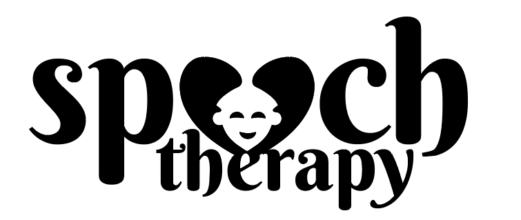
When creating a logo, I like to keep it simple and clean.

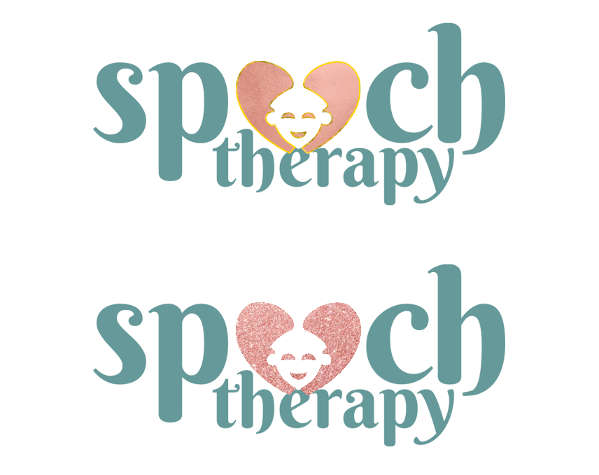
I am now creating an email signature logo for a client who wants the sparkles and all.
If the logo is just being an email signature, would it be ‘ok’ to give it the gradients and sparkles that she wants?

Thanks :slight_smile:

do you want to show what it may look like?

I don’t think sparkles and gradients sound professional…

She would love either swirls or sparkles.
I told her it might take away from the logo, but figured I’d see what I can do to implement what she wants the most.
I didn’t do the coloring yet

This is what I am playing around with.
But don’t love it.

She wants it to be a motion graphic. Can I just leave the sparks and glitter to the motion designer?

Honestly - neither. Sparks and glitter are for camps. Does not look professional. Ask her what messaging she wants to give off? Sparkle, fun and glitter? Or professionalism, care etc - whatever fits speech therapy.

I agree…

Any suggestions to find a balance?
Pastels?

Maybe just a strong colour contrast ?

How would that help Rivki_Levin?
Can you explain?

And once the logo is up on the JDF, any critique on the actual logo?
Specifically, does the speech read out clearly?

I have been back and forth about this with her. Haven’t convinced her yet!

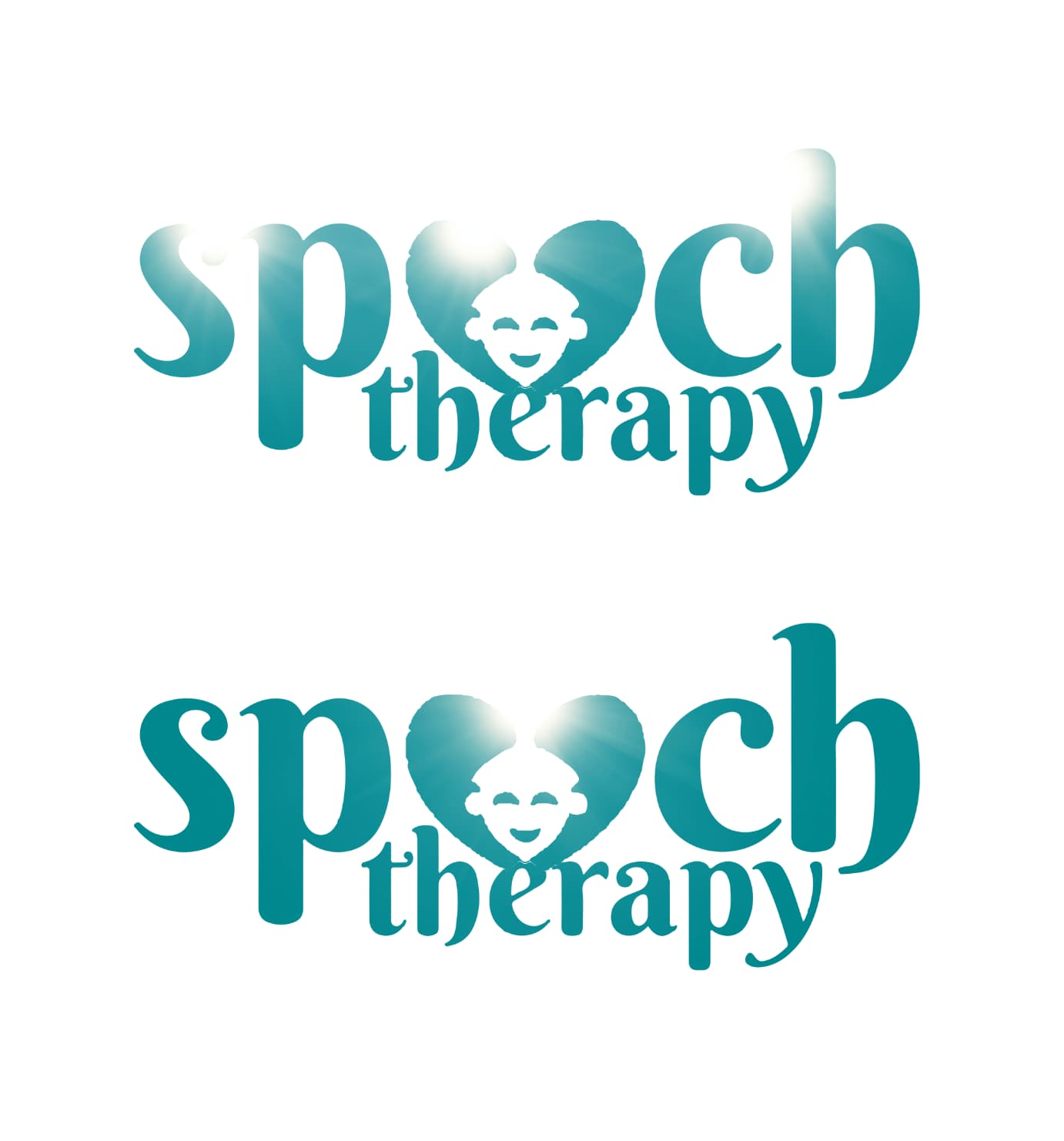
Maybe you can do a stronger color and then the motion person can put on a light flare… so it would give a “3D” effect so to speak but not glitter… It would just “sparkle” in that sense.

Clients are complicated people :grimacing:

1 Like

That’s a good idea.
Love that sun coming out the middle of the bottom one :slight_smile:

She works with kids. She prefers girly, but agreed to go in the direction of motherly. That’s why I was thinking pastels.