Looking for critique on this flyer. Thanks ![]()
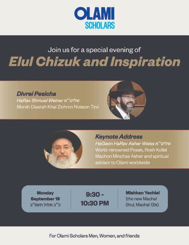
I think the colors are a little bit off here
it’s nice and orderly…i agree to brighten up the tones a bit, esp the ‘elul chizuk and inspiration’ and the pale blue box. Maybe a more interesting font for the Elul Chizuk line…
Would it be fitting to have Rav Asher Weiss larger? Since I presume he’s more the appeal to the event? Either way, I would make the names of each Rabbi larger than the rest of the text in those boxes and maybe int he same font as the Elul Chizuk if you change it to a more unique font to draw attention to those areas.
maybe mention if it’s free admission or not… or maybe it’s obvious to that audience…
Thanks! It sounded like they wanted me to only use their font family, which of why I used that one for the whole flyer. I’ll tweak it and then see what the client says.
ok but can you use the uppercase condensed font for emphasis like they have in the logo? if it’ll look good…
There’s no upper condensed, but I did change it to uppercase.
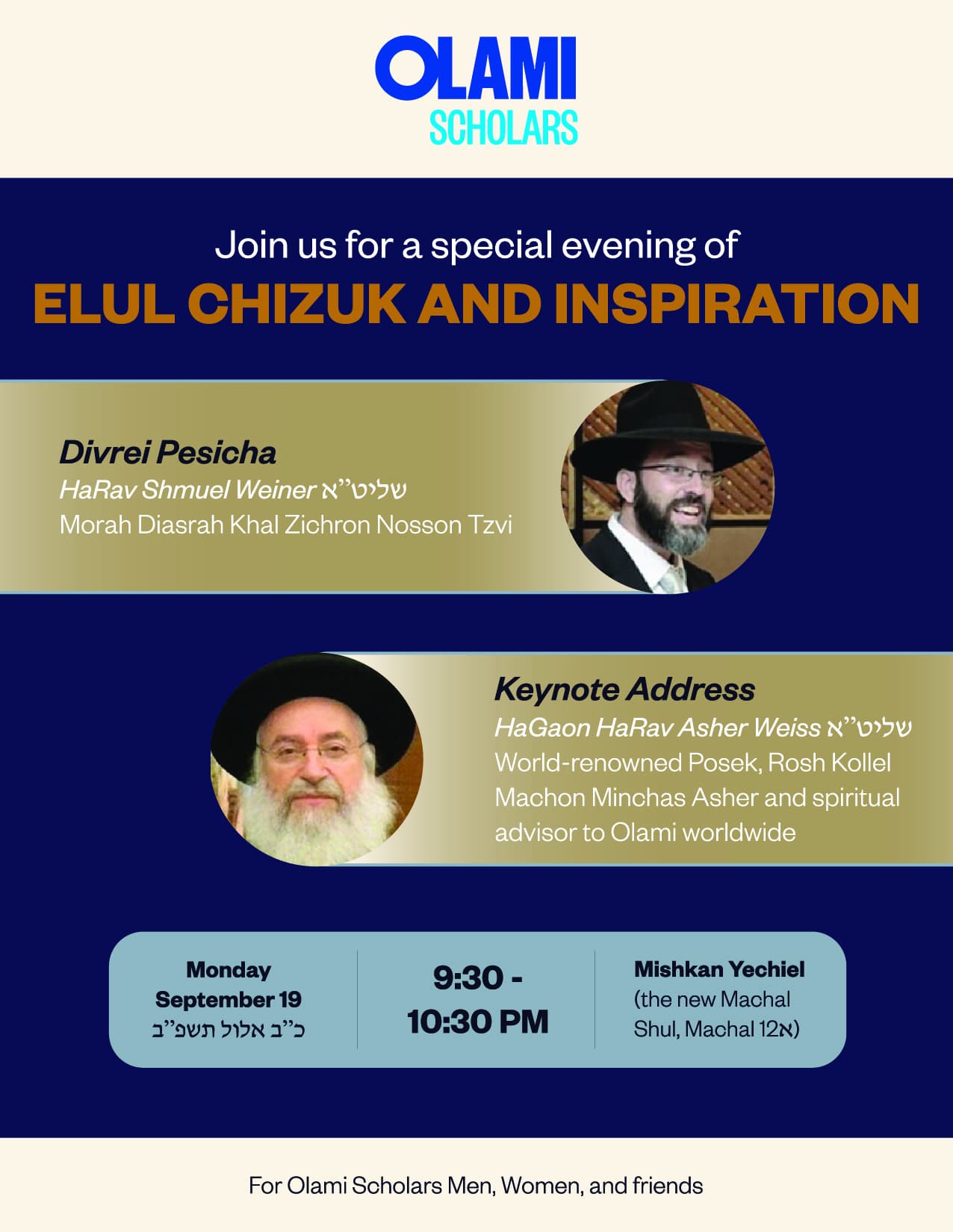
anything else jumping out that should be corrected before I forward it to the client?
Nice. Very neat and orderly.
I feel like it needs a bit more life though. Maybe add texture to the background?
yes i prefer the uppercase for title. can you make the blue box the same brightness/tone as the blue of ‘scholars’ or at least a bit brighter?
i still feel Rav Weiner and Rav Weiss names should be what pops out… but no need to listen to me!
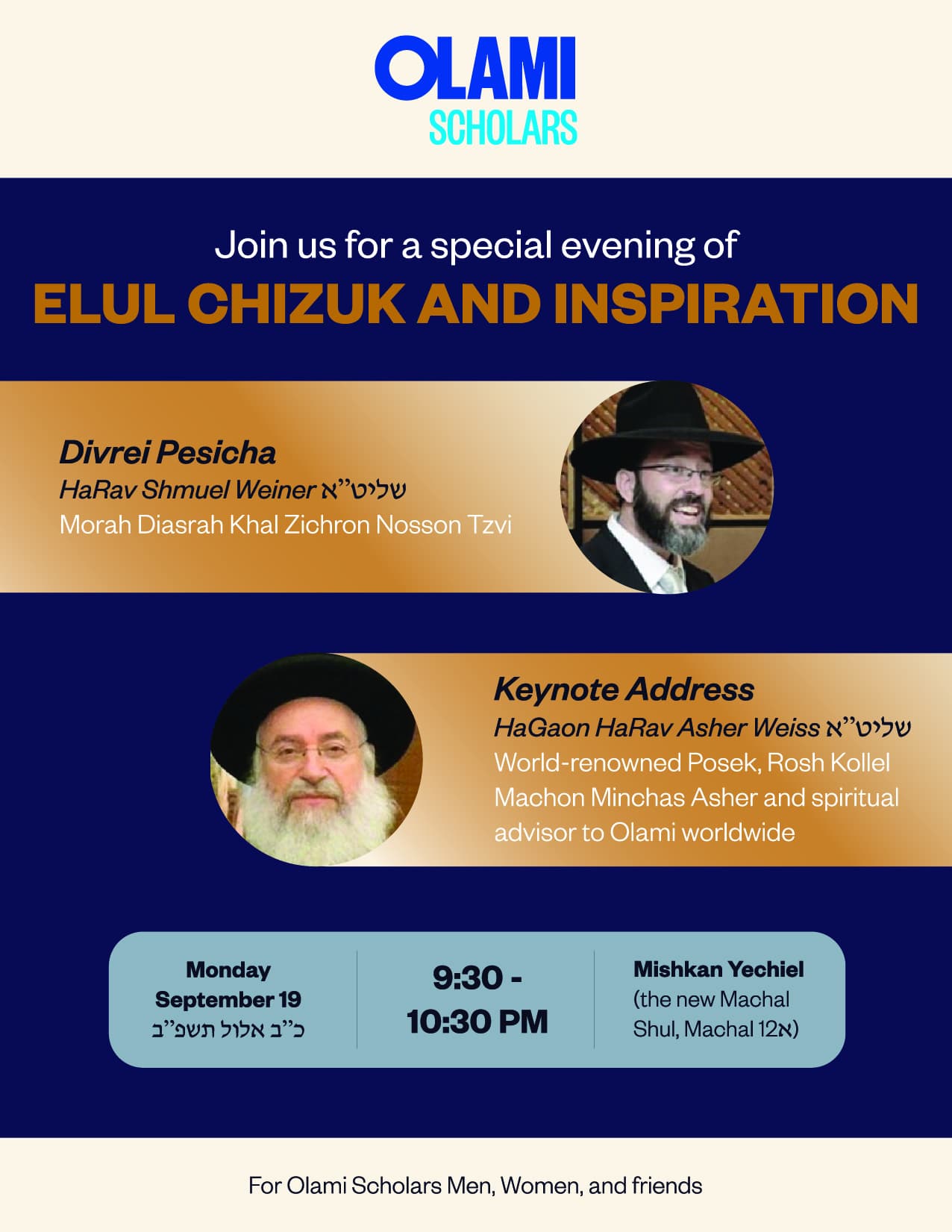
@rivkah I agree with you but I want to see what the client says. Sending this one to the client now.

Also, I feel like this is amateur of me, but the colors are much bolder here than on my screen. What am I doing wrong?
maybe when you saved as jpg it was rgb rather than cmyk?
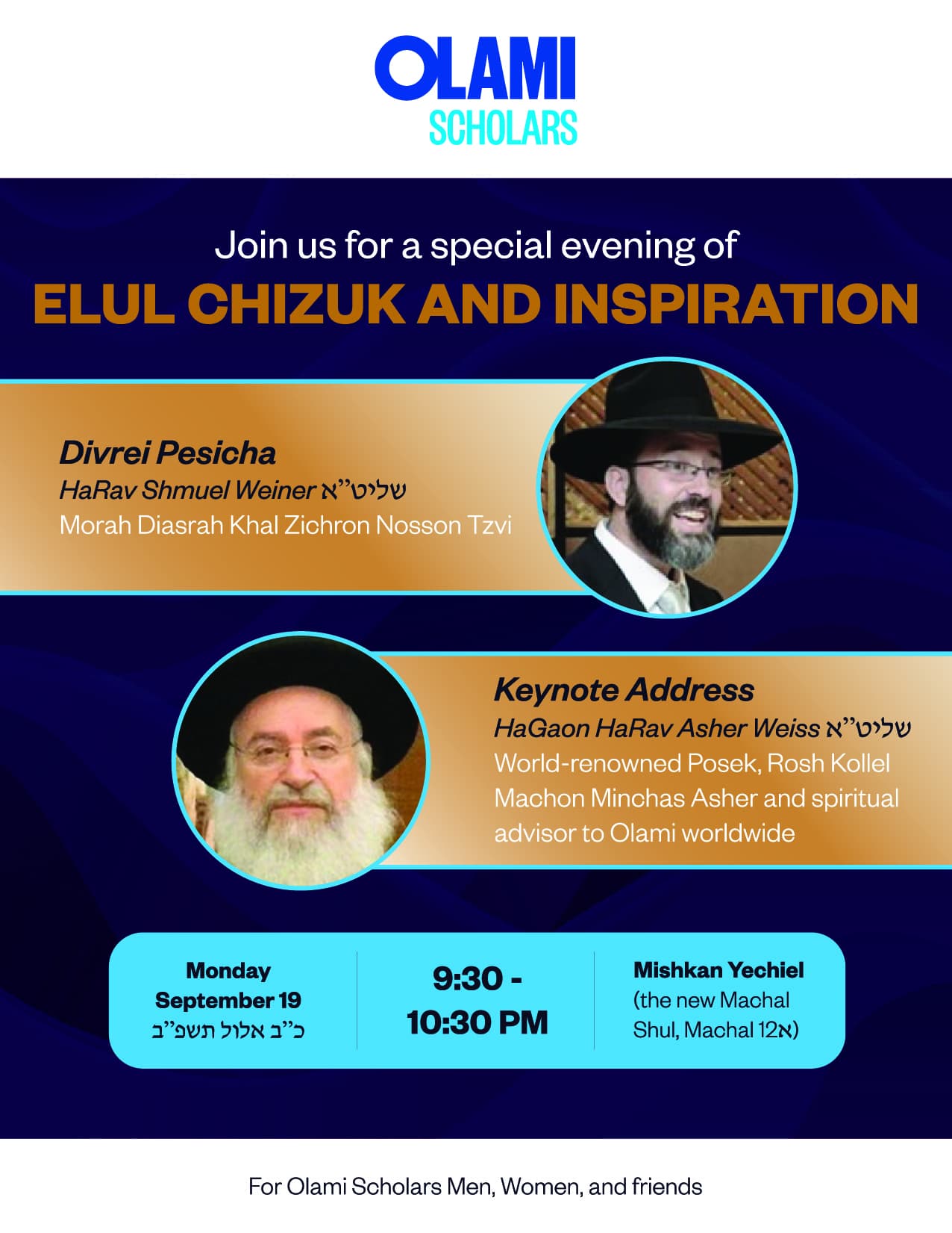
i would move the honey thing away from the text of rav weiss, i actually probably wouldn’t use that image as it doesnt feel like the chizuk part of elul, a shofar/tallis/siddur or even a pomegranate feels more inspiring but dont think would match your colors - they have some nice shofar/tallis scenes on freepik but premium license, i can send you if u like. (email rivkahwolfson@gmail.com)
Wow, really looks amazing! I love how you changed the rounded rectangle to an outline. The bottom line under the spaekers is very creative!
Maybe break up the Elul title onto 2 lines?