Hi,
Any ways I can make this more exciting? Critique and feedback will be much appreciated!!
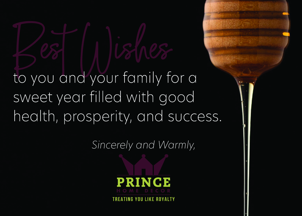
First thing I’m noticing is that the purple text/logo is hard to read. Can you change the color? Maybe pick out a color from the honey…
I changed the logo to have a color in the background and changed the text to the green… Are the revisions better?
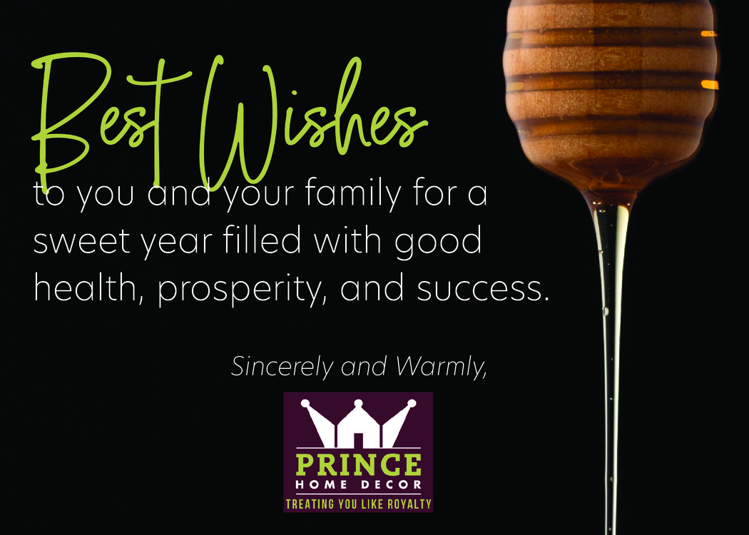
Can you take the background off the logo? Or make the entire card bkgd purple
I would suggest using a honey/orange color for ‘Best Wishes’ to keep it more elegant, unless this is their brand color they want to stick with
Another thing, would you try aligning the logo and text above it to the rest of the text?
okay, thanks! I’ll work on making those changes.
Where should I try aligning the logo and text to? To the left or right side of the text?
I agree that the green color doesn’t have the elegance that you are looking for. I also wonder if you could show more of the honey dipper on the top and/or more of the honey dripping, sort of forming into a swirl on the bottom in an elegant way, rather than just the vertical drip.
Logo and signature might look better aligned to the right along the vertical of the honey. P
Perhaps a subtle texture in the background, maybe faded in a graded way, could look good, something that looks like a spot uv or doesn’t add color in anyway, just texture.
Looks nice! I find that the text is broken up a bit weird, making it hard to read. Maybe try arranging it better? “Sweet year filled with”, and then the rest on the next line- then it needs to be arranged differently…

I liked the black background 
And I would align the logo to the left… not sure I love the honey on the surface but curious to see it with the black bkgd
I also liked the black background. I like that you show more of the top of the dipper, not sure that you needed the whole bowl on the bottom, was thinking more just like the honey swirling a bit so it wasn’t so vertical. Any way you can work the green of the logo in somewhere else, as it feels a little out of place? Not loving the right aligned logo even though I know I recommended it, somehow doesn’t work so well now with the image there, feels unbalanced…
I put the black background back, changed the color of the logo (is that acceptable to switch the brand colors to match the design?) and moved the logo to align with the left side of the text… How does it look now??
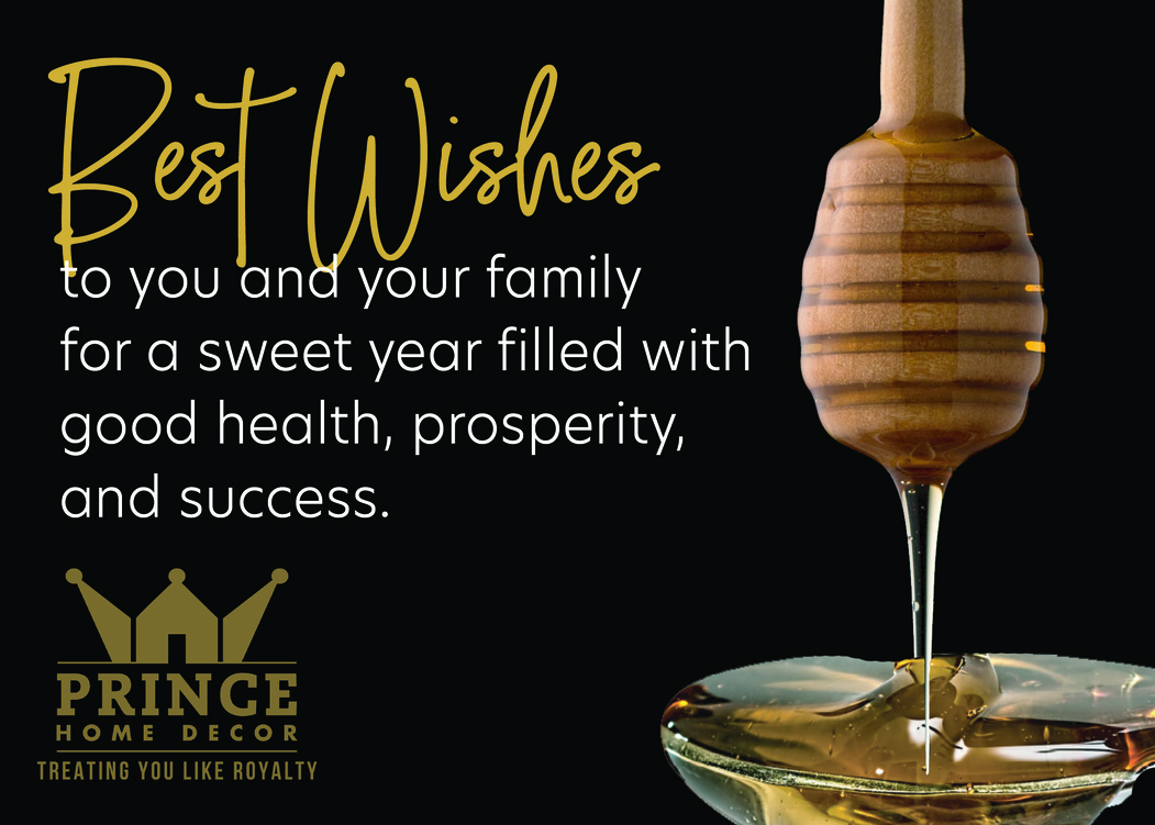
I think it looks a lot better. Would shift the white text a little to the right so the “t” of to is just to the right of the piece hanging down from the B and the the “t” of best would come down between the two words. So basically the Best Wishes would hang off to the left a little, aligned with the logo.
Thanks so much!!
Looking beautiful!!
Great to see a great end product!