If anyone can give me feedback on this I would really appreciate it!
They wanted everything to fit on one page, plus a cover…
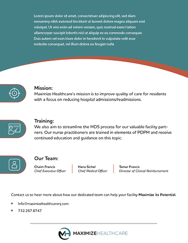
I’m seeing now that when I open the image in a new tab it has grey on the bottom - Not sure why but if anyone else sees it like that - its supposed to be plain white.
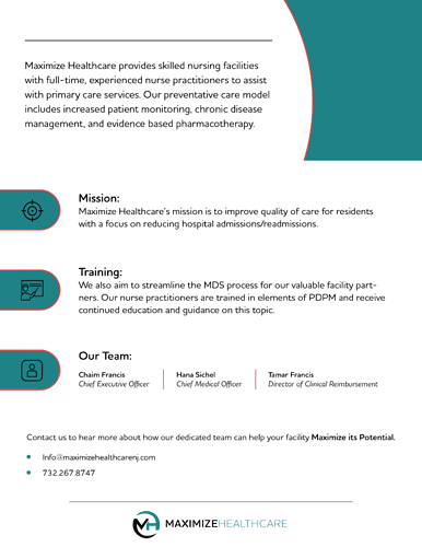
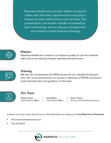
It’s looking nice! Thinking the orange strokes on the cover should all be the same width. Also, maybe on the 2nd page do that rounded circle coming from the top and have the top paragraph on it in white, just to break it up a bit. Maybe icons should also be white?
Great idea! Yes, will try that and see how it looks. Thanks!
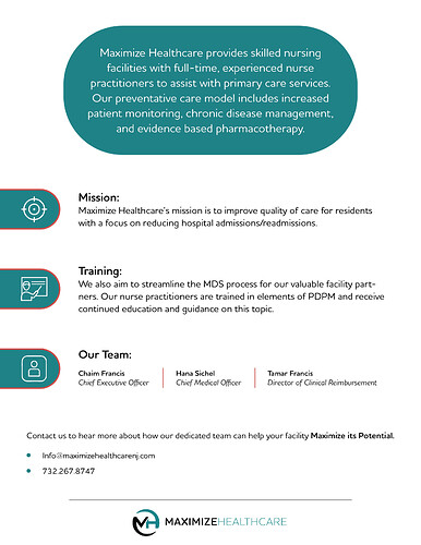
I was thinking a full circle, not a rounded rectangle… might be more interesting.
P.S. is this Sarala?
If a circle doesn’t work maybe have this shape a bit wider, and fully on the page, not cropped off.
Nice design. I would also work with circle and not rounded rectangles. I am personally not fond of the red stroke. Try it possibly without it and keep the red really just as an accent color.
Thnx everyone! I Will try those ideas and see how it comes out… @goldie-mezei yeah it’s me;)
Make sure to show it to us! And Mazel Tov to you 
Nice layout! For the cover, would suggest a stronger focal point and hierarchy. Your for main elements, title, image, logo and slogan are all basically equal weight and therefore compete. At least one of those items should be a stronger focus, for example the title on the left significantly more noticeable than the image. Or join elements more to create strong focal area, for example, enlarge the title and visually connect more with the image through color connection, stroke, proximity, etc, so those two elements can work together as a focal area.
May also consider joining some elements in terms of proximity-you have a bit too many visual groups on one page, considering that you don’t have so much info there. I.e. the logo can be grouped with the title, then the whole middle area would be shifted up somewhat for better balance, and perhaps enlarged for a stronger focus. Then the slogan would be secondary in the hierarchy.
Or maybe logo and slogan can be joined on top, and body text moved up a bit. Then you could enlarge the title/image area as a focal unit, and the logo/slogan unit would be secondary.
Just some ideas…
Thank you e/o! Loving this forum! I’m attaching it again… I’m not loving the top paragraph on the second page, if anyone has any more ideas… I tried the circle but the text didn’t fit nicely…
Another idea to add interest… Maybe try the bottom 3 icon text as 3 columns to make it look more designed and not just text across the page. So have 3 icons in circles and the text underneath each one.


