Overall great job!!!
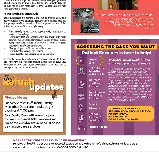
There are a few styles of rounded corners going on. Maybe make them all the same radius.
the text on the right could perhaps be a bit smaller to create more of a visual hierarchy
Really nice job!
Love what you did with the oval around the first icon!
Looks great as is!
You might want to make additional stripes so that there’s equal spacing between them. You can also cut off the bars before the text… but its a matter of personal taste:)
Hatzlacha!
Does anyone think that the deep purple on the leftmost side looks odd because I am not able to do it with a gradient feather?
