
This is what I have so far, obviously didn’t work on it much yet because I’m totally open for complete turnaround changes, just a bit stuck with inspiration.
Looking nice!
Maybe put date and address at the bottom?
Then the schedule part can be more of the main focus, center of the page
Hmm… this could have potential but @gila-garber Im thinking it should be more sophisticated like a navy background with some gold
like something professional to attract that kind of crowd…
Thanks! I know…I just need more design ideas but not coming up with much online for some reason. DOn’t want to do navy because I always do that for them…

I made this for them a while ago and now it’s the only thing in my head! You know when that happens?
totally but thats way more the type I feel!!
let me see if I can send you some good ideas
Maybe try a deep maroon or deep green…
That old flyer is beautiful!
I think that you can use the same colors and elements, because it’s for the same yeshiva an it’ll give a branded look.
Just change it up a bit: layout, shapes, images, etc…
I don’t know about using the same idea. I feel like when someone reaches out to you they want something original, and I’m kinda getting bored of the same colors always matching the logo, etc etc
And don’t think if they’re using any images in this new one
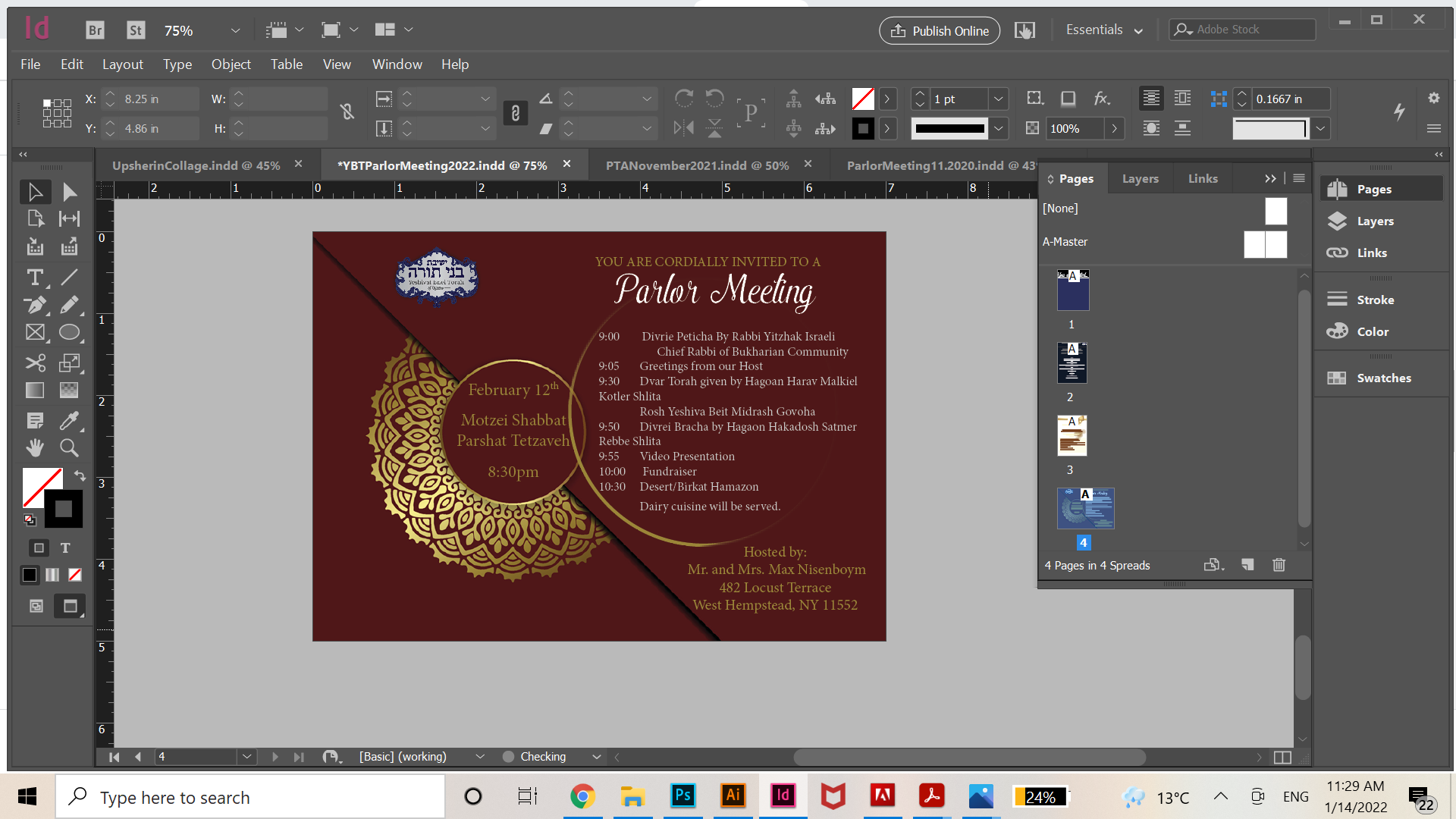
Okay here’s the new idea in the works. Any ideas of what color I should make the body text? And I think I need better placement for the address, and to make the date and time more bold. And obv gradients needs to be worked on, etc
1 Like
I like #2 coloring the best.
The maroon is very nice. maybe do one half positive, one negative?
And maybe try right aligning the text?
Maybe put the address along the bottom left of the pg.
Center the text more evenly in the circle- lessen the leading, leave a bigger margin around the edge.
Add more space on the right of the flap before your text. or maybe just move the whole flap down and left…
is the text staying the way it is? the tabs don’t all look consistent. Make sure that there are no extra spaces in the text after the tab so that it all aligns nicely. And when a line extends to two lines, make sure that it is obvious that it is together- it should be closer to the line above than the line below. And have it align to the beginning of the sentence.
Thanks! What do you mean by half positive and negative?
instead of doing the whole thing in maroon, do half of it white
what do you think of moving down all the text/design a bit and putting the logo on top of the words Parlor meeting… I feel like its a little hanging and not part of design. and writing “you’re invited” where the logo is ( basically switch the 2 around)