I’m designing an email blast for a school fundraising program and I’m looking for critique… (see attached)
All ideas or critique welcome!
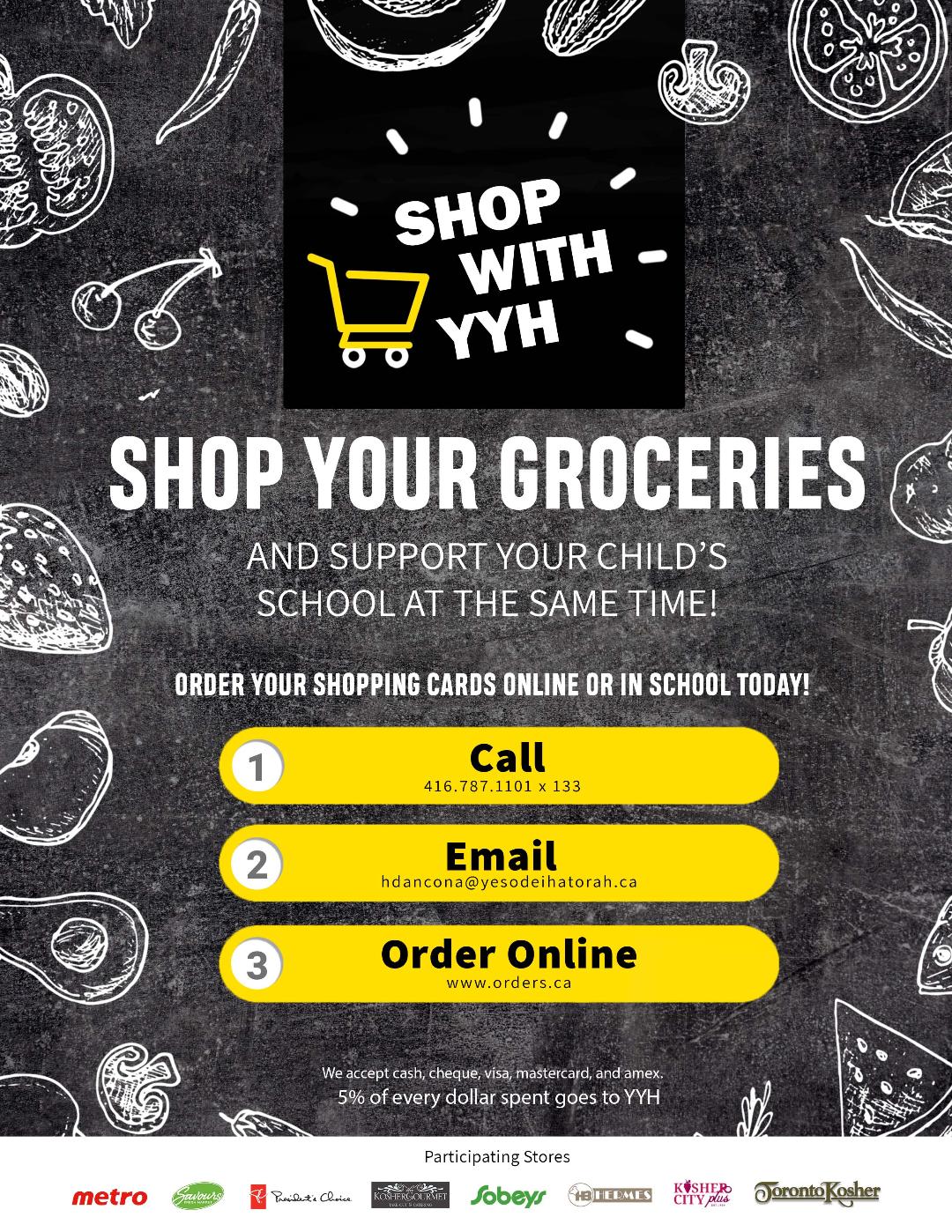
Looks beautiful! I would just make the YYH larger
Otherwise I think its clean , sharp and still fun!
adorable! maybe go slightly lighter on the whole background?
I like the dark, looks more chalkboard like which fits with the drawing, I would even say go darker a bit if you are aiming for more contrast
Thank you all for your comments! I’m attaching the final piece.It was an animated gif together with a signup form that I’m going to try to upload as well.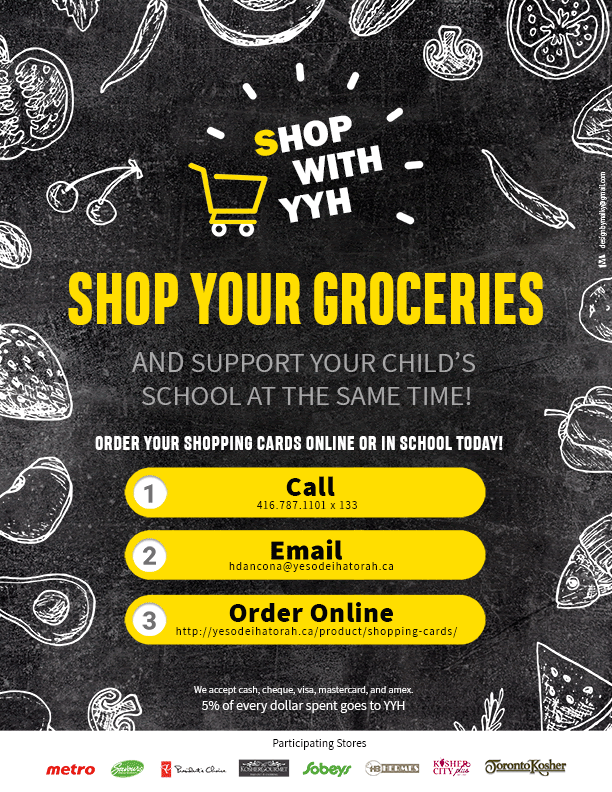
Very well done!!
Hi,
I am designing this ad for a personal organizer, but the ad is very blah. Any ideas on how to make it look more interesting?
Thanks!
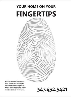
I think using contrast in fonts can help it a lot. Like a sans serif along with a script…
Also, does this ad have to be black and white?
If not, I would use color to give it more interest. But if it must be black and white, wondering if it would work to have the whole background black, and the fingerprint/maze in white. I feel like it could look very sharp.
Your title should be much more dramatic. Bring the two lines closer, try different font combinations, make it much bolder and bigger.
Bottom two text blocks should be bottom aligned. Why a different sans serif font for the phone number?
description text is a bit too small, should be a little bigger, longer line length so it takes up only 3-4 lines. Perhaps bold or semibold the last line to break up the text. Check spelling in the body text.
Consider some areas with black background and white imagery/text, maybe a black strip across the top with title in white, and image slightly overlapping that box to create focal area/proximity with title and image. Then image a bit smaller so body text can fit centered underneath, with phone centered below. Or group body text with phone number side by side with vertical line dividing, correctly aligned. (i.e. right align text against vertical line and phone number on other side of line, the whole unit in right bottom corner.
Can the image be more interesting? Maybe a black/gray/implied dusty background with the fingerprint/maze making white mark in it, implying that the house currently needs to be “straightened” or dusted or cleaned. Or maybe a different image, not sure if focusing on the word fingerprint in the title is the most descriptive image. Or maybe add some little illustration graphics of household items along the maze in various places, like a messy desk icon or crooked lampshade/lamp, etc.
Always a good idea to look at sample ad layouts that you like to get ideas…
Thanks so much!
I didn’t really love the way it was coming out, and as Alyse said, the image could use some more interest.
I redid the entire thing (smaller size as well), what do you think about this version?
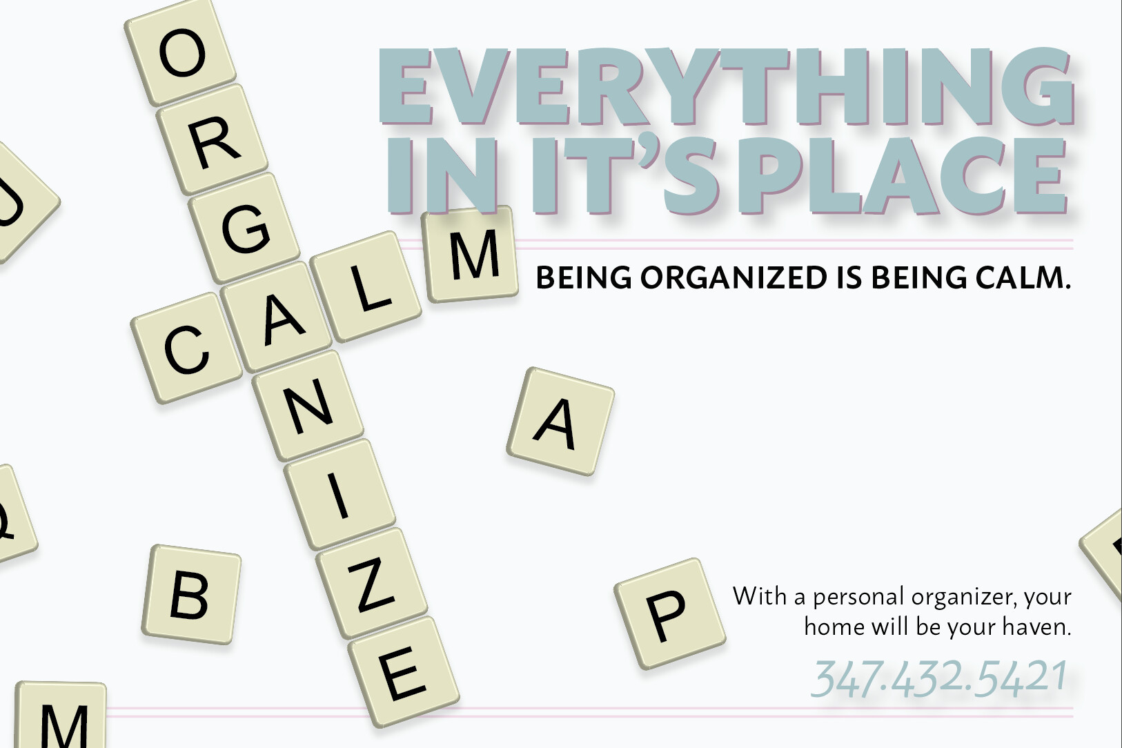
Yes, it definitely looks better.
I would take away, or greatly reduce, the drop shadows, as they seem to add unnecessary busi-ness to a design that should be clean and simple considering the “topic”. Also think it might look better with the title not overlapping the M of the scrabble, though keeping it overlapping the line. Would have to compare, though.
Nice!
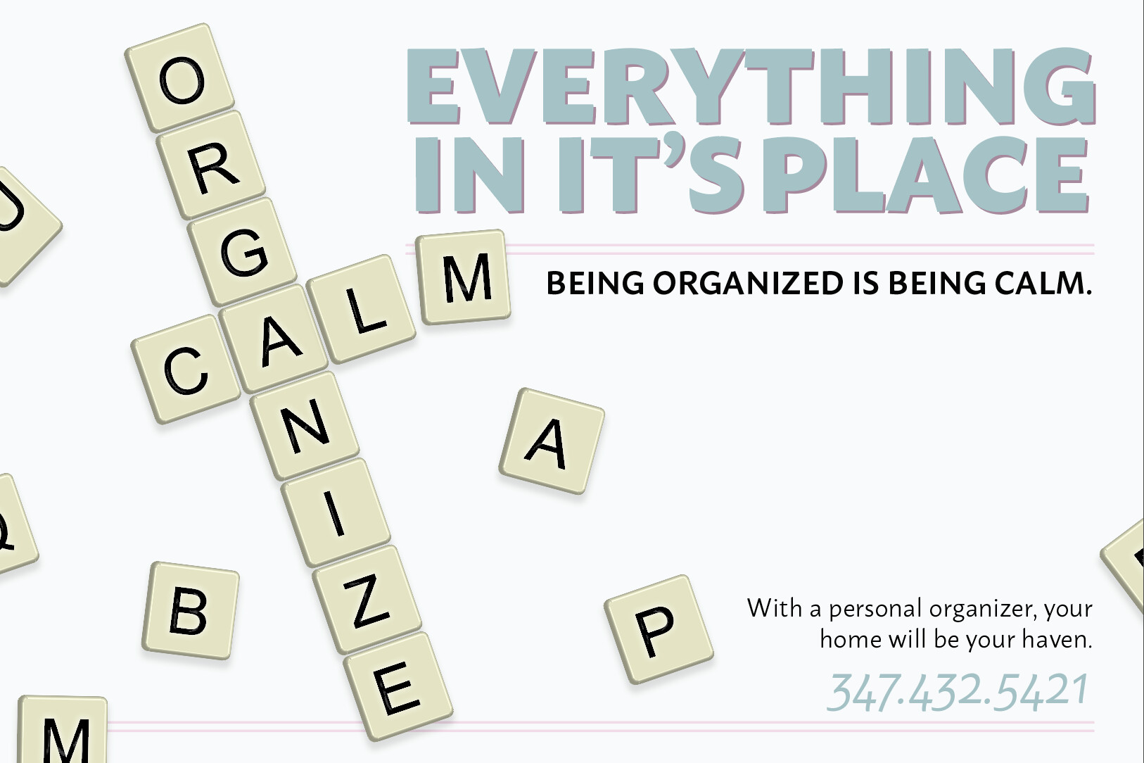
Yes, looks good! I don’t think there should be an apostrophe in it’s , as that is “it is”. I think possessive for its has no apostrophe, maybe check.
Good job.
Ok thanks so much!!