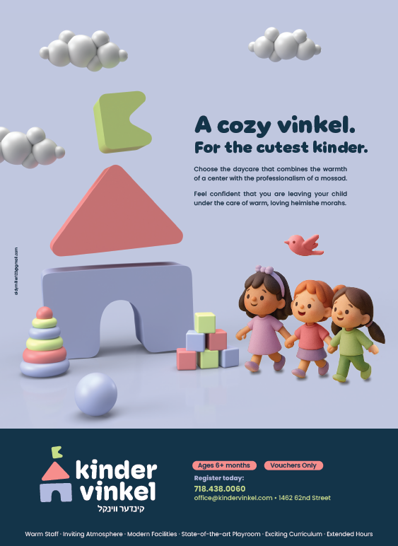
Need critique on the following ad, somehow I feel like it’s still missing something… Please help! TIA
1 Like
Also, I based the kids heavily off of this ad, is it too similar? If yes, any suggestions how to change it?
I don’t think it’s similar at all… It’s really cute!!
I would move the bird higher up the advert.
Not loving the shadows underneath the kids, they look unnatural.
Maybe try “a cozy” and “vinkel” on 2 separate lines and a lot bigger.
The clouds look a little copy paste, anteing you can do? Not even sure if they are necessary… .Maybe you can add a flat shape on the background to give some more dimension …
Still working on those kids… Rest was done in dimension, I can change the clouds…
I felt like it was very disjointed when I did the headline on 2 separate lines… Maybe I’ll post both to hear ppls opinions…
What do you mean by a flat shape?
Should i add more background in dimension, ex. trees, bushes etc…?
I love it!
Love it! I’d make ‘for the cutest kinder’ a bit smaller so that kinder doesn’t stick into the right ‘margin’.
Otherwise, lovely layout and colour scheme. Did you design the logo too?
How did you get the logo to be 3d?
Interesting that they go for English copy when so many words are Yiddish… Mossad jumping out at me, wonder if there’s a better way to spell for it to look more correct ![]()
@RivkyH I was also wondering what would be a better spelling… ![]() Anyone have suggestions?
Anyone have suggestions?
I didn’t do the logo, was done by Pivot Group.
Pivot is my boss at work’s brother… He gave him a good deal…
This is for the school I work for…
Now they wanted a cheaper ad… ![]()
Kids are yiddish speaking, but the parents speak more in English… ![]() chassidish but not satmar…
chassidish but not satmar…
For a 3D logo, I made the flat design 3D in Illustrator and then exported it as an obj so I can bring it into Dimension…
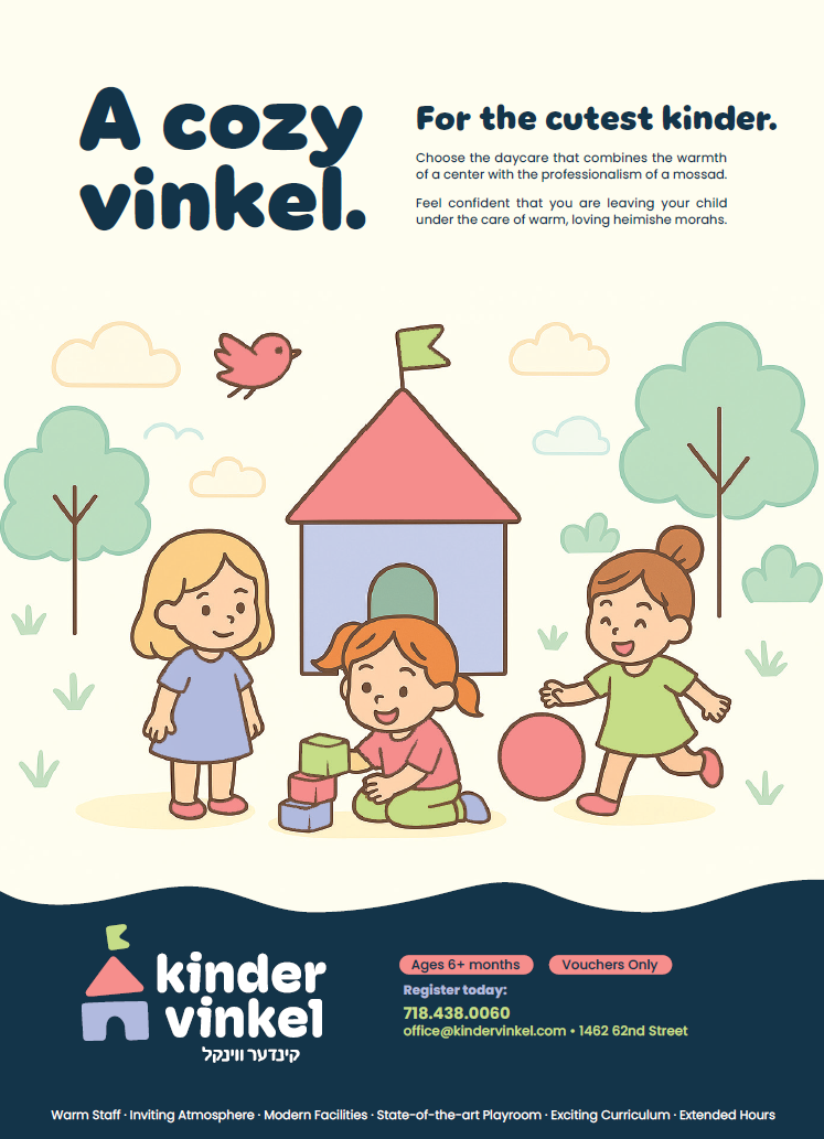
This one is also very cute! the cream background is throwing off, should be the soft purple, I think! Mossad is spelt ‘Mosad’. The text can be lower down on the advert, maybe shrink the picture so that the margins are wider on the advert. I would put the warm staff - and all the benefits in the space above the logo when you make the picture smaller.
This one looks more alive to me.
Hmm… Difficult choice!
They’re both great but very different in style
Here as well, I wouldn’t leave ‘kinder’ sticking that much into the margin
Already fixed it… ![]()
@Tali I’ll work on it…
Waiting to hear back from the client…
How about moisad?