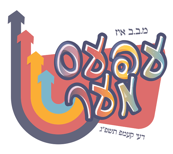
I need to create a logo for elemantry school day camp, I think that this logo is a bit too ‘mature’… any other ideas to work with for this theme?
It could be that the arrows are too perfect in comparison to the letters.
Try making them more fun.
Would you be able to brighten up the colors?
already thought of changing the colorings
Looks great!!
I agree with what al1 said - make the arrows a bit more playful and try some brighter colours.
Maybe try taking the rounded rectangle shape out of the background?
I’l trying to opne my Ai file but is says ‘an unknown error has occurred’. How do I solve this?
