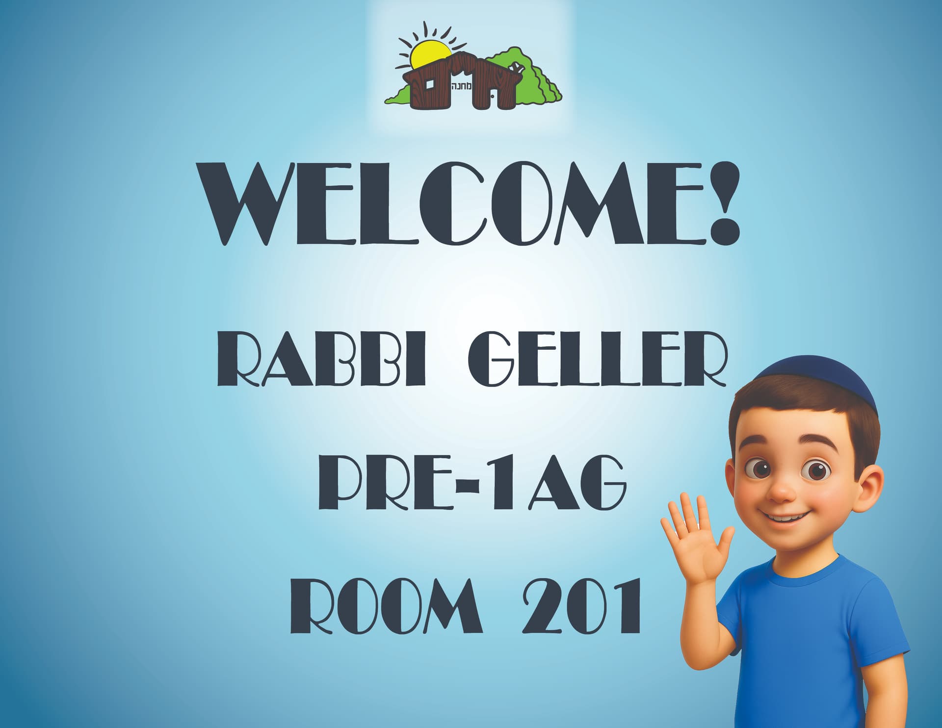
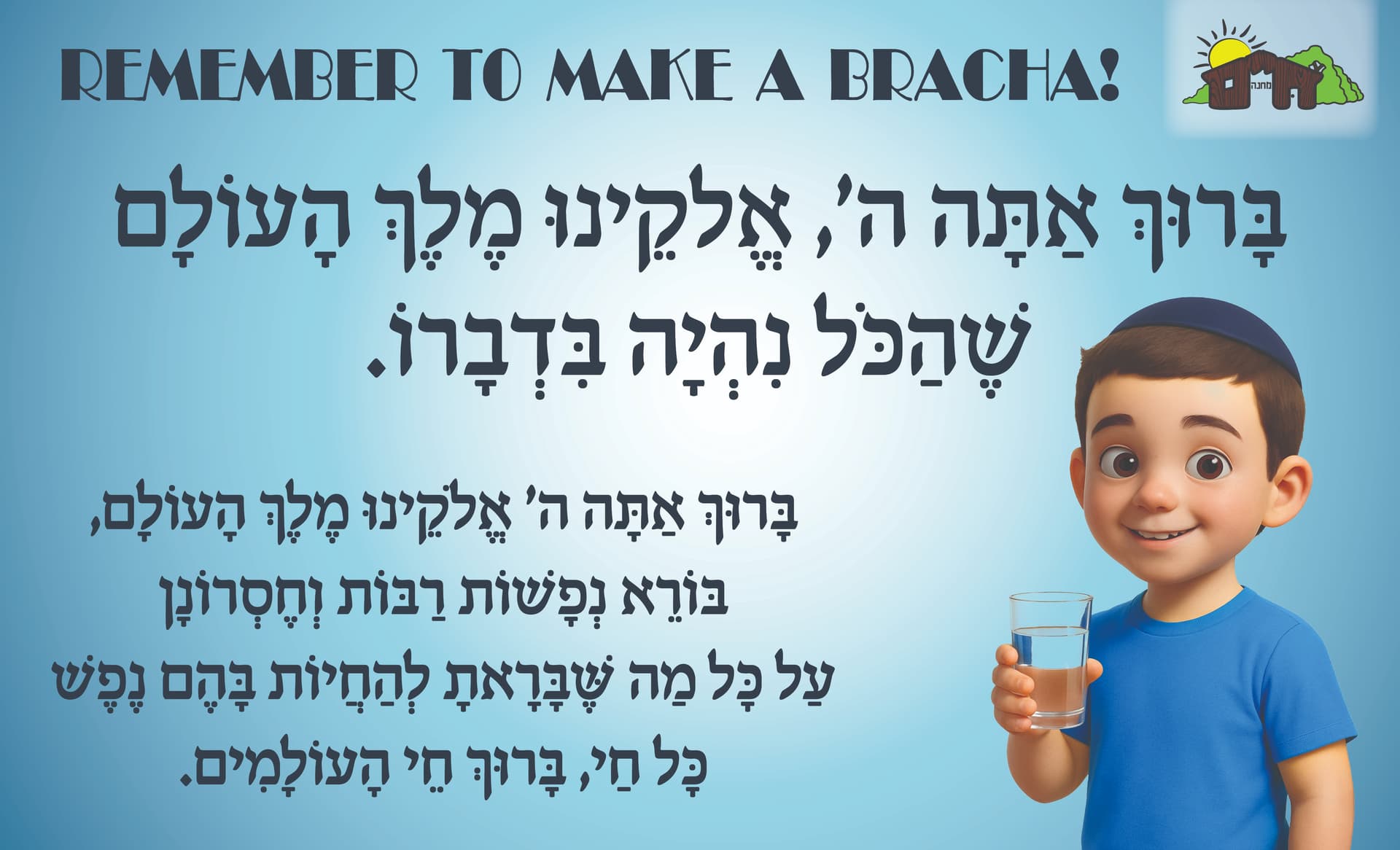
Hi,
I am designing posters for a day camp that I work for. They want the door signs on each classroom and the signs by the water fountains, etc. to be coordinated, but easy and clear for all age campers to read.
What are your thoughts??
Hi,
I am designing posters for a day camp that I work for. They want the door signs on each classroom and the signs by the water fountains, etc. to be coordinated, but easy and clear for all age campers to read.
What are your thoughts??
I would choose a more bold font for the English. Give more room to breath. Work with a solid background.
agree with @schlomithsassoon comments. I think I’d also prefer the logo without the glow behind it.
Give it more margins and work with a bolder and blockier sans serif for the titles.
The character is very cute!
I’d also move him in a tiny bit to give more margin.