Hi all,
I’d love your input on this flyer.
Thanks so much!
I love this!!
So clean and organized!
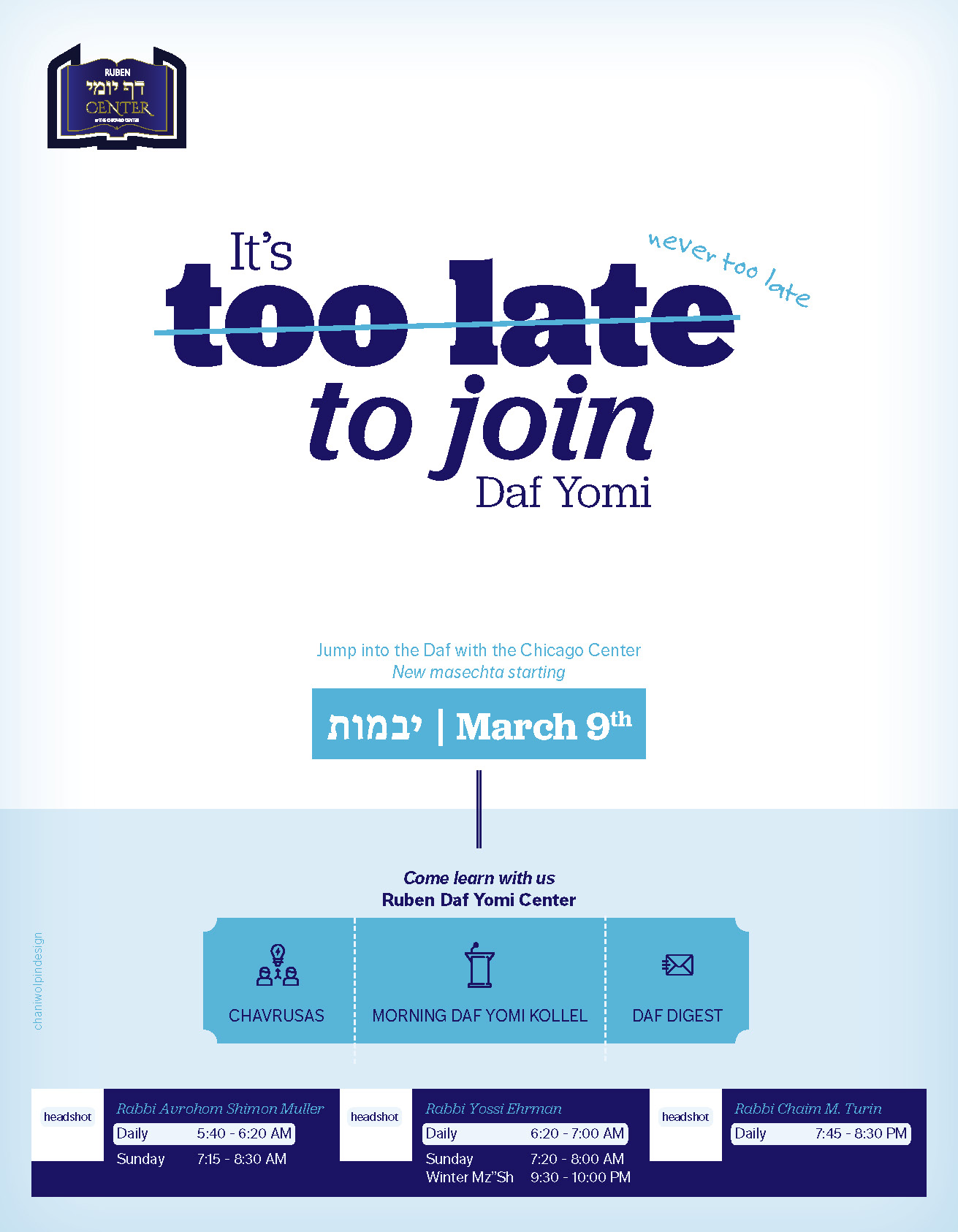
maybe make the never too late bigger as well as the jump into the new mesechta…
1 Like
Really nice! I agree that the NEVER has to be bigger and way more obvious, hard to see now
Love it!!
agree with everyone’s comments…
wow looks great! agree what everyone else said about the never needs to be bigger, but I also think too late is too bold and emphasized and no matter how big the never is it will strike out more so as well as never needing to be bigger I think too late needs to be made more inconspicuous…
I agree with @malky-h
looking better! maybe add an exclamation after the never too late to emphasize it a bit more
Love it. i would do the never too late even bigger.
Maybe try instead of crossing out ‘too late’ just put a huge stamp (like the picture below) slanted over it that says ‘never’

Yeah agree with everyone, I don’t think the words “too late” has to be the biggest of everything. I feel like it’s too striking and that’s what I read first.
Maybe the stamp would be a cute idea… technically all you have to add is the word “never” either as if it’s been added before too with such a mark (v) or the stamp
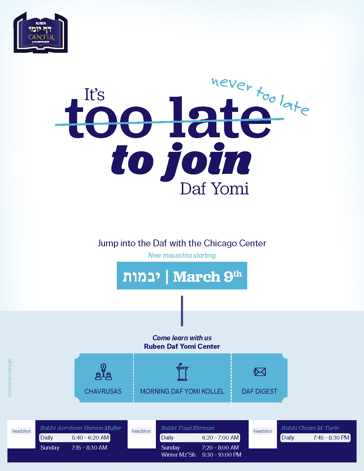
wow looks much better!
I feel like it’s a little hard to read like this
I think it looks good but i would make that whole top part bigger now, to take up more space.
I dont think its too hard to read. The never pops out at me first and then I see too late to join…
I’m not sure you need to make it bigger - I actually like this with a lot of breathing room.
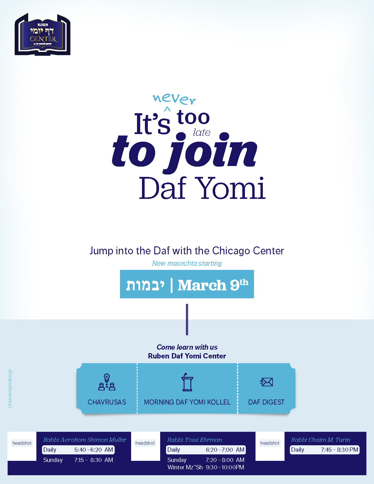
Job well done!!