What is this for?
it is for someone who creates custom hair pieces
oh cute!
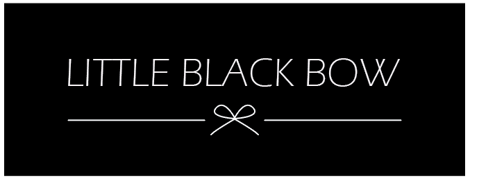
Is the logo going to be in a rectangle or you just put the white words on a black background for us to see…?
I like it, but I’m wondering - is the logo too long?
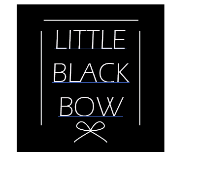
Here are some ideas that Im thinking:
- You can make it in a square - have each word on its own line and then have the lines make a square and leave the bottom open for the bow (and a bit of the lines on each side near the bow)…
- You could try this long layout but have “little” and “bow” tracked out and put on top of the lines and then put “black” over the bow in a semi circle
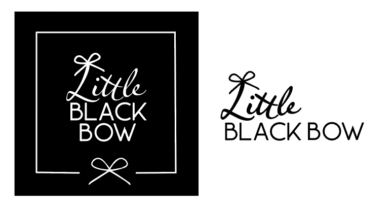
- play with some other fonts… maybe use the bow as a B as it looks like a B a little…
whoops this
thank you ill ask her what she thinks
I really like the simplicity of this! but make sure to kern the type!