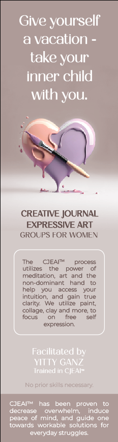
Hi I made this for a client and she likes it.
I would love to hear critique on it anyway, its a lot of text and I feel a better job could be done to display it all…
Thank you!
1 Like
The smallest size text is 9.5
I think it looks really good!
Some of the justifications are bothering me though- specifically the one in side the box (the CLEAN process etc…)
also “no prior skills necessary” is a bit hard to read- maybe make it semibold?
but overall really looks great!
I am friends with this client of yours, and she has told me that she loooves your designs!!!
I think it’s gorgeous! I would tighten up the line spacing of the top text - Give yourself…
Can’t wait to see it in print…
Had no clue that you are on the JDF
Looks amazing
I would make the text at the bottom and in the box smaller so the ad can have more breathing room. Unless that would make it too small
overall a gorgeous design. I live the fonts and colors. Look super polished
Thats so cute! Thanks!!
I was thinking the same thing, but how small can I make the text so that it wont be too small?
I need to ad the Logo and contact info too!
where???
Maybe make the leading on the text on bottom 1 pt tighter, and make the bottom rectangle a bit bigger
Move up the bottom text and put the contact info and logo on bottom (try to make room
On that bottom rectangle)
Not sure if it would look too squished- just and idea
Thanks great idea!!
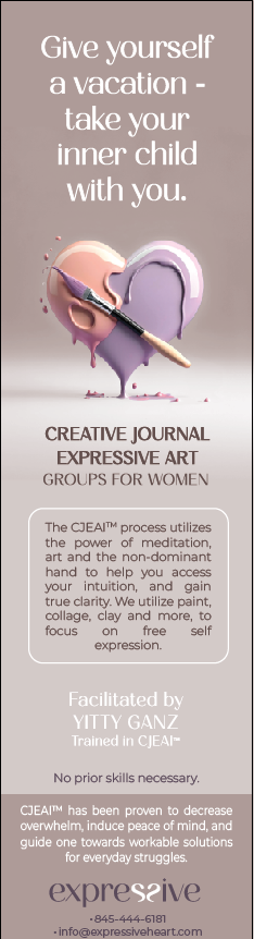
bottom text needs a bit more of a margin. You can make some text a bit smaller, I think the middle rectangle - where it says about the process, can go a bit smaller. The text can even be 6-7 pts.
maybe put the logo at the top of the darker pink rectangle, and the info - CJEAI has been proven… at bottom of it in smaller.