
Any critique would be greatly appreciated. What should the back of the card look like? Thoughts? Ideas?
The font is a bit hard to read.
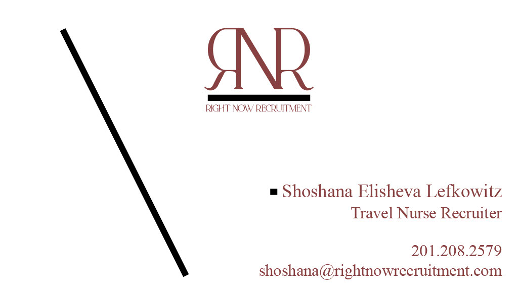
I like to use some element from the logo subtly in the card design- in this case maybe the straight black line on top of the info and change. text to clear neat font…
Which font would you suggest instead? I am open to suggestions.
Ok. Not a bad idea. Pesach break made me forget some important steps in business card design. So thank you for the guidance! Much appreciated
I am trying to create a negative spaced N… Is there a way? Would it work here?
Where else can I put the black line? Is this font better?


I like the color on the back with the logo on it in white!
The black line under your logo and dividing the other info is very thick can you make it thinner?
Can you try to left align your info so it lines up with the divider line. You can also center your info horizontally so its even with your logo on the left.

Nice! The logo on the back page should be centered within the square. i would make the black lines thinner.
you could also try to use the same design white logo on colored background for the back as well.
Yes much better!
Can you try another version of the divider line in the middle being the same size as our info, it should be aligned from top to bottom, get rid of all the extra line past your info.
How do you mean?

I like it better with the long line simply because instead of it being just a separator, it’s also a decorator. At least in my perspective. And a space holder…no?
@ShoshanaElisheva
I really love it!
I like it better with the short line
Which one?
I sent it into Vistaprint. I’m expecting it to be delivered on the 12th of this month, after Shavuos.