I am looking to open a business for gifting and I’m in need of someone else’s opinion of what I’ve got so far. Something seems off. I am trying to incorporate the bow as a K for my business name and it doesn’t seem to connect or feel right. Please help! I’m barely on here, so… I hope to come on to some guidance when I will be on. Gentle critiques appreciated.
I am offering the presenting of the gift, (if necessary) gift wrapping, delivery, poems, art pieces by artists, and some sticker graphics. So I want to stay true to that but let people know I’m not just a gift wrapper. If that makes sense. I am a bit tired. And still have the K.
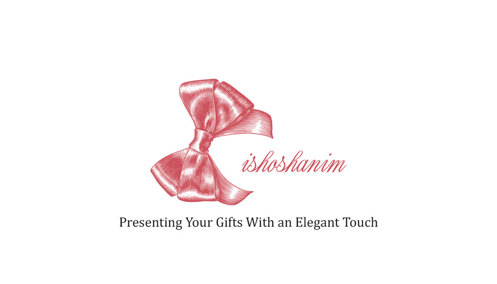
That’s because it isn’t connecting… ![]()
The bow is way bigger and heavier than the rest of text.
I actually like your bow very much, it’s just very disjointed from the rest of the logo.
You can try making the bow smaller, and using a thicker and bolder font for the rest of the word. You might want to try a font that has a similar texture to the bow, or try filling in the bow.
I think that if you fill in the bow it’ll lose some of that cute look, which would be a shame, but I’m not sure how a textured font would work and what kind of vibe it would give…
Which type of font best suits the k?
Still waiting…
1 Like
So which classification would best suit my logo, would you know?
Thank you for sending the link