
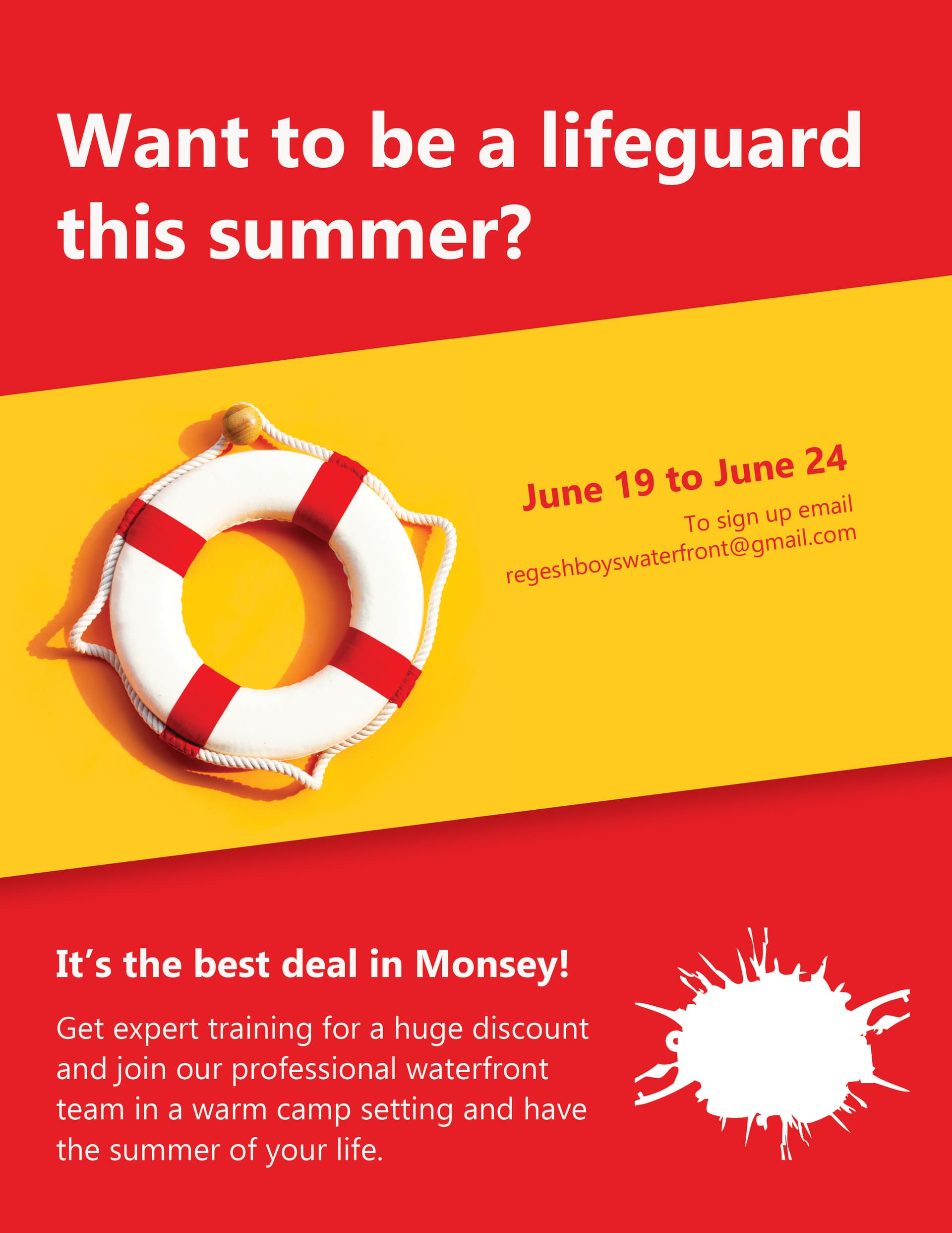
This is a flyer for a lifeguarding course.
All critique is welcome. (I’m not sure why the logo is coming out like that- I’ll attach the logo separately so that you can see what it is supposed to look like)
Thank you!
1 Like

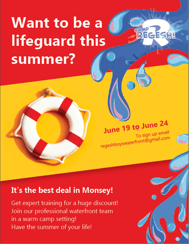
Looks good. Maybe add some water.
Not about the design, but the text on the bottom is a run-on sentence. They should probably break it up. For example: “Get expert training for a huge discount! Join our professional waterfront team in a warm camp setting. Have the summer of your life!”
thanks! the sentence was bothering me…
My only concern is that it is really meant for teenage boys…
is it too childish?
Looking great!
Love the added water!
I don’t think it looks at all too childish.
I’m not clear about what this is from the title - whether it’s a course to become a lifeguard or a job opportunity as a lifeguard.
Also, maybe make the dates stand out more + fill up more of the yellow space?
Hatzlacha!
thanks!
it is both. a lifeguarding course to become a lifeguard for that camp
Very sharp and eye-catching!
Maybe change the font of the title to a more exciting one.
Also the water is a little pixelated and there is some pink in it. maybe you can do real water (not clipart) as the tube is a real life pic.
looks really good! i would just put the dates and sign up at the bottom and the other text first so the viewer sees everything in a better order… and yea the water looks a bit too pixelated so maybe change that
Thank you for all of your suggestions.
The pic was blurry cuz I hadn’t bought it yet.
I had to send it in already so this ended up being the final.
Thank you again!
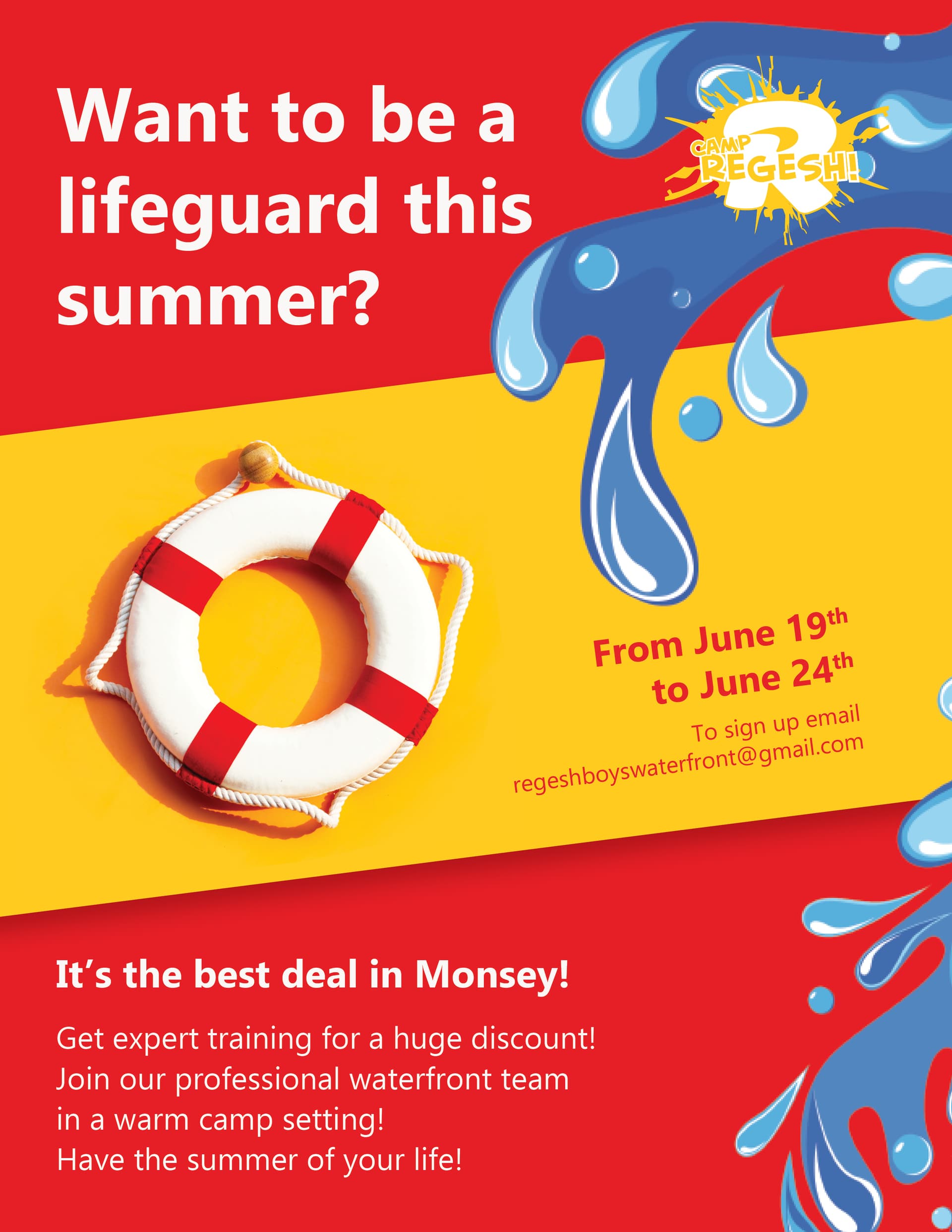
Really nice! Fresh, fun and summery!
The water does look a little childish, not sure if would appeal to teenage boys. Would perhaps make the lifesaver bigger, extending beyone the yellow borders to tie the sections of the ad together and make a stronger focus. You could possibly take out the water and add some blue into the background or layout-the strong red makes me think a little bit of medical associated designs (Red cross) Funner, more dramatic heading, could be larger if water isn’t there. Maybe some ocean waves more along the bottom coming higher on the right side, more realistic to match the style of the lifesaver.